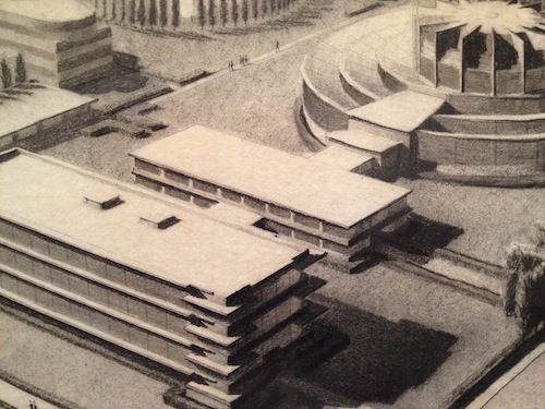
(Image credit: Harry Ransom Center)
The other day I was walking through the Harry Ransom Center and noticed some very cool designs for office buildings that Bel Geddes penned in the late 1920s (pictured above). I wasn’t surprised that he had come up with such things, of course – the ongoing Bel Geddes exhibition at the Center, “I Have Seen the Future: Norman Bel Geddes Designs America,” features an exceptional range of content, from baseball stadiums to cruise ships to Worlds Fair exhibits. By I did stop for a second and wonder “Why an office building?” It’s Bel Geddes design for the Toledo Scale Factory Machine Shop. What’s so striking about the design is its focus on aesthetics. This isn’t surprising, of course, given that in most everything Bel Geddes ever designed, function follows form. But this notion is quite contrary to the Modernist architecture of the period, and I couldn’t help but think of Frank Lloyd Wright’s Johnson Wax Building. Aesthetically the structures are similar, but Wright’s focus is on his building’s interior, which he made into a temple of work. The exterior of Wright’s building is completely in the service of its interior. But somehow Wright’s trademark consideration of lighting resulted in a building that looks like Bel Geddes’. Yet they are vastly different structures, despite appearances. Except for cost considerations. When Toledo Scale’s president presented Bel Geddes plans to the company’s board of directors, he warned that the building “would cost lots of money and be extremely different, even weird looking.” Wright’s plans inspired a similar response.
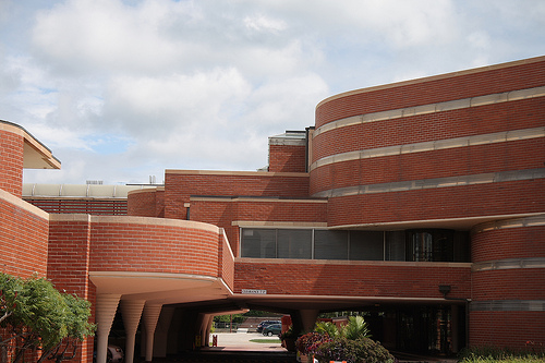
(Image credit: zeospot.com)
Wright’s Johnson Wax building (above) shares much of the abstract futurism of Bel Geddes’ design. In the Toledo Scale Factory Machine Shop design, why two buildings and a circular structure interconnected by a pathway? As for the Johnson Wax Building, why stacked ovals combined in weird angles? Which of course makes me wonder what Bel Geddes was up to in the first place. If one’s an architect, their work is entirely dependant on clients. Clients are one half of architects’ equations. If an architect has no clients, their work will rarely materialize. If Frank Lloyd Wright never had one single client, it’d be as if Beethoven never had one single orchestra or quartet willing to play his music. But Bel Geddes approach to his work is much different (granted, I know Bel Geddes was not an architect by trade). He had "clients," but seeing some of these projects through seems to have been the last item on his agenda. Bel Geddes seems to have been quite content that some of his designs remained in the abstract, though a few of them did actually materialize. He’s like a fashion designer, I suppose. And so why dapple into corporate aesthetics?
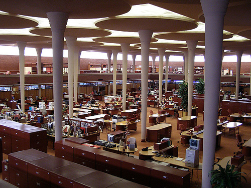
(Image credit: worldarchitecturemap.org)
I’ve always thought that the main room in Frank Lloyd Wright’s Johnson Wax Building is one of the most elegant spaces in America (pictured above). For this room Wright designed lily pad-like stems out of concrete that are strong enough to support something like twenty times their own weight. These stems undergirded a glass ceiling, and in between the pads natural light falls easily on the workers below. More so than most other office buildings in America, Wright created a workspace in which the outside weather conditions determined the working interior environment. This space is a celebration full of respect for all that those inside are up to. It is not some cynical glass cube that inadvertently makes its residents specimens. It’s a democratic space celebrating the American brand of ambition. And this is not to suggest that Bel Geddes merely designed zoos, of course. Rather, I can see Frank Lloyd Wright taking a note from the designer’s earlier building. Wright was not the kind of person who could admit something like this.
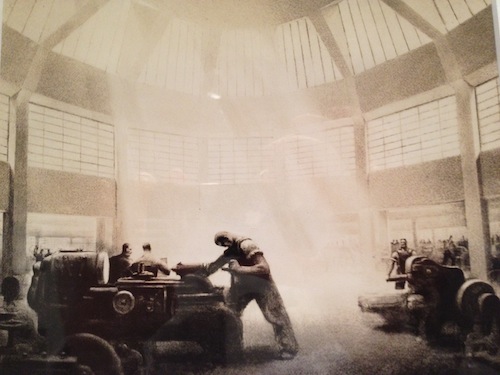
(Image credit: Harry Ransom Center)
Check out the Harry Ransom Center’s Bel Geddes exhibition if you get a chance – it’s well worth the trip.
The views expressed herein are expressly those of a graduate student, and they have nothing to do with how the Harry Ransom Center thinks or feels about Bel Geddes, although I’m nearly certain they’d be sympathetic.


Recent comments
2 years 29 weeks ago
2 years 44 weeks ago
2 years 44 weeks ago
2 years 50 weeks ago
3 years 4 weeks ago
3 years 4 weeks ago
3 years 4 weeks ago
3 years 6 weeks ago
3 years 6 weeks ago
3 years 6 weeks ago