viz.
Visual Rhetoric - Visual Culture - Pedagogy
Site informationRecent Blog Posts
|
the pew research centerColorful Geographies of Beliefs
Submitted by Calliope on Fri, 2012-11-16 14:31
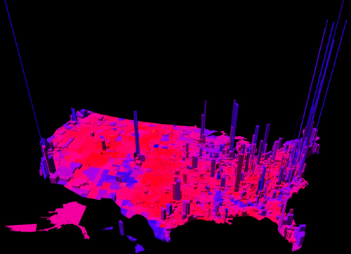
Image Credit: MIT Technology Review This electoral map, created by Princeton mathematician Robert J. Vanderbei, uses a spectrum of colors between blue and red to represent the ratio per county of Democrat to Republican votes. The height of the verticals indicate the number of votes in each county. Vanderbei's representation of the U.S. votes by region accounts for nuances in the data that other red-and-blue-state maps miss: the political dividedness of certain counties, the intensity of partisanship in others, and centers of strong voter turn out. From a visual standpoint, the map is eye-catching because it is purple. Purple is not a color usually associated with political belief. But other data crunchers, looking to complicate our picture of national voting trends, have unveiled maps this year with a similar palette. See my fellow viz. contributer Chris Ortiz y Prentice's post for an electoral map that also reveals (through pointillism instead of 3-dimensional modelling) the nation's purplish complexion. It might be mere coincidence that Chris and I both decided to write about visualizing ideological regionalism; but it's possible that our posts register an increasing need to redraw and redefine assumptions about voter demographics. That said, I'll leave the actual work of redefinition up to political analysts and turn to the far more obscure aims of this entry: to discuss the rhetorical role of color in images that chart belief systems and controversial policies.
|
|
Recent comments
2 years 29 weeks ago
2 years 44 weeks ago
2 years 44 weeks ago
2 years 50 weeks ago
3 years 4 weeks ago
3 years 4 weeks ago
3 years 4 weeks ago
3 years 6 weeks ago
3 years 6 weeks ago
3 years 6 weeks ago