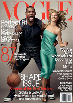
A couple of discussions online of late have got me thinking about what happens when we interpret an image one way and are called on the carpet for "mis"interpreting it or reading too much into it. What do we reveal about ourselves and our own possibly subconscious biases when we publicly interpret an image, especially a problematic one?
A couple of weeks ago, a blogger on Feministe.com posted the cover of the current issue of Vogue, which features LeBron James and Gisele Bundchen in a pose that the blogger felt was racially insensitive:

Note here that her commenters were pretty much split in their assessment that they couldn't see the problem with the image or that Jill was spot-on in her analysis.
Many people thought it was a cute image, and others argued that on the spectrum of things, this image wasn't worthy of getting one's knickers in a twist. When pressed for an explanation for her outrage (she didn't provide much commentary in her original posting; she added the image from King Kong later), she replied, "I see a scary animalistic black man, a primal scream, and a beautiful white woman." A later commenter added, "If LeBron wasn’t hunched over and roaring, with his left hand curled into a paw…" And that's when things got ugly. To wit, "Oh wow. You’ve officially crossed over the line between interpreting racism and putting in a whole bunch of your own."
That's where things get interesting to me: at what point are we crossing over pointing out racist "dog whistles" and instead telegraphing our own prejudices based on our word choice in interpretation/analysis?
Another example is a Wrestlemania billboard in Florida that appears to have the men's nipples airbrushed out of it:

Boing Boing linked to the original post on this image from the Sociological Images blog, which argues, "It may illustrate that it is women's bodies that we think of when we think of bodies on display because of the adoption (by men and women alike in this culture) of a (heteronormative) male gaze."
What's interesting about this image is not Sociological Images' analysis of the image (mostly because I don't buy this blogger's argument and find that statement fairly meaningless), but the comments on Boing Boing, which take offense at SI's "pomo babble" and the "insularity of academia."
All of this to beg the question: How do we engage in ethical analysis of visual rhetoric without alienating our audience? And who, ultimately, is our audience?
Comments
Ethics of Response
There was a discussion of this cover on slate.com as well.
This comment is partially a response to this blog entry and partially to the one on the Obama magazine cover, and the question that is sort of being asked in these conversations about what constitutes racism or how we can engage in an ethical discussion of racism and the visual.
In my opinion, what matters more in conversations about racism (or sexism, gender bias, or homophobia) is not necessarily the determination made as a result of the conversation (something is or is not racist) but rather the process, the discussion itself. With regard to race: I think it is difficult to specify when something is an objectively racist image. In other words, any given image may be interpreted by some as racist and not so by others (although I do think there is a scale of intensity: hanging a noose on a professor's door, or in the branches of a "whites only" tree, does seem pretty objectively racist to me).
This image is a good example of that ambiguity. But if it strikes someone as racist, then there is value in listening to what they have to say about why they feel that way. In "The Uses of Anger: Women Responding to Racism," Audre Lorde writes, "The angers between women will not kill us if we can articulate them with precision, if we listen to the content of what is said with at least as much intensity as we defend ourselves against the manner of saying. When we turn from anger we turn from insight, saying we will accept only the designs already known, deadly and safely familiar."
No one in these blog posts is talking about anger, I know, but I do think Lorde is articulating something useful about the ethical dimension of our response to racist imagery. Discussions of racism often do lead people to feel uncomfortable, defensive, and sometimes angry, but her point is that the ethical choice is to engage and to listen to others in good faith.
Another example would be the
Another example would be the French Obama cover below. To answer your question, I think we'd have to first learn how to parse out the various ways people police polysemy, alternately endorsing the subjectivity of images and then resisting other readings. My sense is we'd have a better sense of visual rhetoric if we attended less to coding the content of an image and more to the ways readers, bloggers, viewers, etc. imagine their relationship to the text.