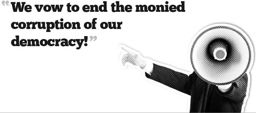
Image: Screenshot from occupyaustin.org
If you couldn't tell from the past few days of viz.'s coverage, the Occupy Austin protests continue, if attendance has mildly abated from this weekend's high. This blog is not an appropriate venue for the discussion of the movement’s goals (you can find more intelligent discussion about Austin’s own version of the movement here and here). However, I am interested in the ways in which the Occupy Austin movement represents its constituents. The Occupy Wall Street / Austin brief—which aspires to represent 99% of the American (some Austin material intransigently claims “world”) populace—faces a particularly clear set of representational challenges even as social networking allows its images to proliferate in ways unimaginable even five years ago. For the rest of this post, I’ll highlight some images from Occupy Austin’s affiliated website.
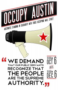
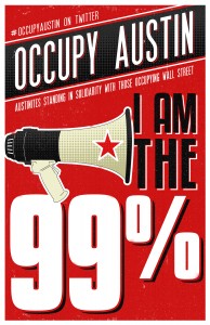
One of the ways—particularly prominent on the Occupy Austin website—is to simply erase personal identity and to focus on a paramount tool of protest: the megaphone.
Images: occupyaustin.org
The megaphone, of course, literalizes the protest’s desire to make voice audible: “Come and make your voice heard” is a central talking point in various posters and placards the local movement has authorized. At their best, these kinds of images have an extraordinary symbolic power in the clean graphic design. The ideologically potent red star manages to be central to the design without being the eye’s resting point, slipping in without emphasis an inherent socialist claim (it’s worth noting that the red star doesn’t appear on any direct content on the Occupy Wall Street page that I had a chance to view).
Less successful may be the image this post leads with, which is also the main graphic on the Occupy Austin homepage. While replacing the protester’s head with a megaphone conveys the desire to be heard that’s at the center of these protests, I wonder if the substitution of a bullhorn for a brain is necessarily desirable (of course, subbing in a megaphone also allows the designers to sidestep questions of identity politics).
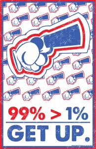
Image: occupyaustin.org
And then there's this image, which cleverly transforms the megaphone into what appears to be an appendage being crushed in a handshake. Graphically the poster is relatively impeccable in the way it quotes the visual motif of the other posters while subjecting it to a transformation. Symbolically, though? While it's hardly an act of despicable violence, it seems at odds with the general tone of peaceful civil disobedience cultivated by the Occupy Wall Street movement.
I always feel the end of a post is a good time to come clean, ideologically. I stand in solidarity with the Occupy Wall Street movement. Its idealism, and even its pluralistic free-form ideological naivete, are really refreshing to me in a time when being a liberal and a leftist has seemed to be all talk and not much action. The academic in me wants to praise the movement's embrace, whether conscious or not, of a flowing, Deleuzian rhizomatics. But the praxis-oriented person in me wonders how long the movement will be able to avoid significant political and social splits and fissures. Two final examples to illustrate that:
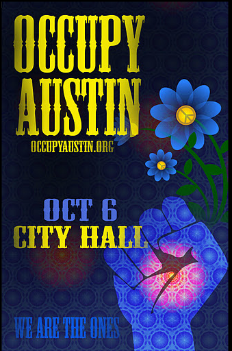
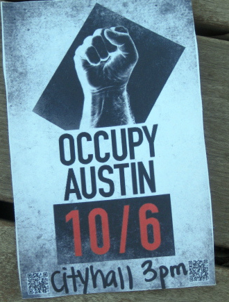
Screenshots from occupyaustin.org
As these images make clear, for the moment that fist of solidarity can find a rapport between the stark brutality of the right hand images color-inverted fist and the eco-aware, pastoral, post-hippie consciousness of the left hand poster. But how long can these positions hang in together? The one poster is pre-dirtied, smudged with toner ink, and hand-markered. It's a callout to political propaganda the world over, as well as invested in a specific hardcore aesthetics. It's definitively urban, and it seems invested in overthrow. The other image is twilight-blue, with a heartbeat center of consciousness in the clenched fist. The Texas cornflowers have peace signs within the petals. It's expansivist, and it wants you to belong: "We are the ones," it proclaims. Fair enough. But for how long can these "ones" be the same?
Comments
imaging the 99%
excellent observation on erasing the personal and indentity (politics) with the bullhorn. the star is a significant symbol for Texas as well. And I think the hand in the second graphic is not crushing an appendage, but rather is pointing with an exclamation mark. thanx for the post!