Image Source: Up in the Air website
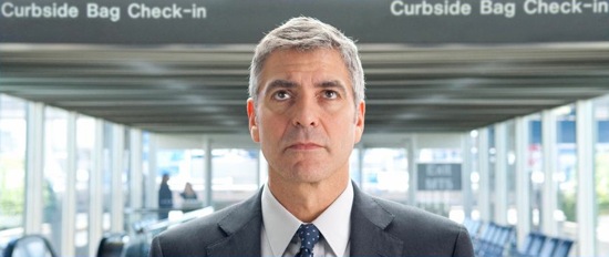
During the break I ended up watching Up in the Air at the Alamo Drafthouse on a Thursday night. While driving home, stuck in traffic, I suddenly drew a mental connection between my physical position (waiting to pull into traffic on busy South Lamar) and the movie I had just seen. Up in the Air centers on the adventures of George Clooney’s Ryan Bingham, a man who dreams of reaching ten million miles traveled on the road for his work. By necessity, the movie features a lot of airport scenes.

Image Source: Up in the Air website
In one early bonding moment between George Clooney’s Ryan Bingham and Anna Kendrick’s Natalie, Ryan is trying to pose a cutout of his sister and her fiancé in front of the Lambert-St. Louis International Airport. When Natalie questions why his sister would want a picture in front of an airport, Ryan returns that this airport is the home of Lindbergh’s flight and The Spirit of St. Louis—symbols of Americana itself. For someone like Ryan, who describes his home as “up in the air,” the St. Louis airport connects with a wide history of air travel that must, indeed, feel like a home to him. Yet, what kind of “home” is constructed by the aesthetics of the movie? What is the visual rhetoric of the airport?
The New Yorker’s review commented that
Airports are the seedbed for all that is most alien, angering, and atomized in our twenty-first-century days, and there are times, in this film, when Clooney’s eyes appear to glaze and say, Come die with me.
As a frequently traveler through the Lambert-St. Louis airport, I have to agree that its aesthetic is fairly plastic and alienating. While the main ticketing area has high arching ceilings, the gating area is filled with uncomfortable plastic chairs and old carpet. The only touches of personalization are the St. Louis shirts with the Arch on them that you can buy from gift stores in the airport; most of the shops are populated with national chains like Starbucks, Chilis, and other fast food options.
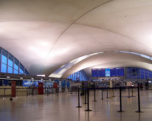
Image Credit: Flickr
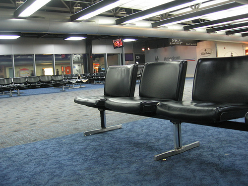
Image Credit: Flickr
Walking around Lambert, it is easy to feel disconnected—the cool colors of the tile floor do not invite you in. However, the routine shops create continuity: if you go from this airport to Denver, for example, you will find the same restaurants, the same souvenirs to make you feel grounded, even at the moment of radical departure. Do airports work to make travelers feel at home even as they ship them around?
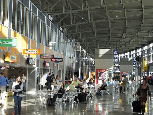
Image Credit: Flickr
I think Austin’s International Airport presents an interesting contrast. Austin’s airport features local Austin restaurants like Mangia Pizza, the Salt Lick, and Amy’s Ice Cream, and decorates the baggage claim area with large, highly colored guitars. However, it shares with Lambert a certain alien aesthetic, as it has high ceilings with visible pipes and structural components. The airport has to walk a fine line between suggesting its locality and creating continuity between destinations—constructing an open feeling that reflects travel and flight within the grasp of limited local construction budgets.
These things aren’t usually brought to constitute a home; however, if home indeed is where the heart is, maybe that home is as relentlessly mobile as airplanes themselves. Ryan Bingham may be alienated, but he’s happy being so. Americans are always ready for change and travel; so is the airport.
Comments
Whenever I'm in the Austin
Whenever I'm in the Austin airport, I can't help but think about the old Austin airport. What strikes me about the new one is how slick it is. And that's probably not a fair assessment. It's just that the old one lacked a lot of style. It was pure function. It was small, which could make it more chaotic, but I was less aware I was in an airport and was more aware of how close I was to home. Now, in the new airport, which is what it will always be to me, I'm much more conscious of the image of Austin that is being sold, and it feels plastic. It kinda creeps me out.
Austin City Limits
Although I never had the opportunity to see the old Austin airport, I can understand your point--it is consciously trying to create an image, with all of the statues, guitars, Austin shops, etc. The airport wants you to think about Austin as "weird," but in a kitschy-cute way. If you look on Flickr, there are some gorgeous photos of the airport--there's one in particular that is done on a grayscale that brings out the shiny floors. But I suppose this is all at the cost of creation--and yet, if you look at a lot of modern airports (like Denver's in particular), they're all about this sort of experience. But when I see the Austin airport from the sky, it does feel like coming home--so I wonder how much that experience is being successfully created for me as a particular kind of Austinite as opposed to other kinds of Austin natives.