Image Credit: xkcd
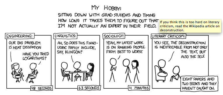
I’ve been following the webcomic xkcd for the better part of my adult life, despite its warning that it may contain “strong language (which may be unsuitable for children), unusual humor (which may be unsuitable for adults), and advanced mathematics (which may be unsuitable for liberal-arts majors).” (Clearly, I was always already a liberal arts major, any way you slice it.) Randall Munroe’s bare-bones aesthetic consistently privileges an idea above the attached illustration; each entry thrives on an invented ethos of the supremacy of text to convey this idea, rather than the illustration itself. This ethos is also heavily grounded in an empirical interest in physics, mathematics, and programming culture, and this empiricism translates quite cleanly into any comment the comic makes on the condition of being human; that is, that it is always based in lived experience, but that this experience is best crystallized in the juxtaposition of concrete, minimalist illustration and sparse but highly suggestive prose. Its only flourish is that each comic contains a “hidden” joke in the roll-over text—often one that works to undo the rhetoric of the initial panel.
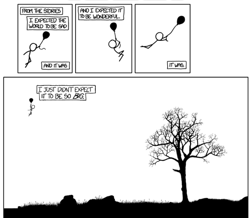
Munroe set aside his reluctance to utilize the possibilities presented by a web interface on Wednesday, when he posted a toggle-able webcomic. Titled “Click and Drag” (but with no explicit instruction within the comic to do so), the final panel is navigable in the same fashion of Google Maps, which, in drawing on common procedural memory, brings attention to unnaturalness of the act of click-and-drag navigation. In short, while most of us consider navigating Google Maps to be intuitive, it is, of course, a learned motor skill.

The navigable panel is the last. Image Credit: xkcd
The landscape Munroe constructs if vast, and, of course, I took to exploring it. Within 10-20 minutes, I became curious as to how the interface was constructed and examined the script, looking for a way to view the toggleable-panel in landscape mode. For instance, did the navigable landscape exist as one large image within the frame? Could I access that image?
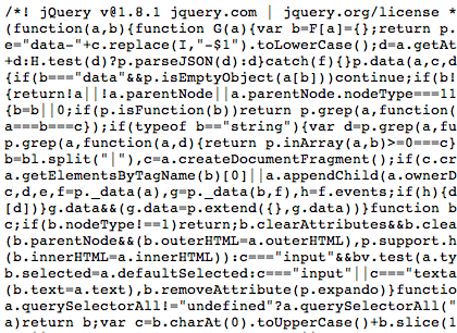
What I discovered was that the artist created the interface in java with a series of NSEW quadrants (again, much like Google Maps), and so I immediately started to try to assemble them.

An extremely cropped version of Munroe's js--Isn't it beautiful? Image credit: Screencapture from source code, xkcd
After an hour or so of this, I discovered that at noon, mere hours after the comic was posted, an ambitious blogger had already fully mapped out the “click and drag” universe and blogged about the process. As disappointed as I was to be scooped, the process of trying to construct that same map made me appreciate the aesthetics of this particular comic on an entirely different plane. The script’s construction and its seamless marriage with the visual material is a piece of art in itself—an additional layer, if you will, of the aesthetic experience.
Ultimately, having the complete landscape undermined my personal experience with the visual components of the webcomic interface, but the process of trying to construct it—of deconstructing (sorry, Randall), if you will, Munroe’s project, revealed another component of creativity, but one which I would still argue privileges language (that is, that "most horrible kluge," JavaScript). So I ask, how can a piece like this help us expand our boundaries of what constitutes language and reshape our concept of the interaction between the textual and the visual? What sort of media artifacts might we group with it? And how can these artifacts continue to change our notions of how multimedia works rhetorically, aesthetically, and cognitively?
Comments
Configurable Media
This art is amazing and I am further impressed that some people, like this post's author, can see the art in the code (like reading the Matrix!). You say having the complete landscape undermined your personal experience: I see how that could be. It calls up Michel de Certeau's (1984) question in The Practice of Everyday Life. Looking down on New York from the then-extant World Trade Center, de Certeau asks, "To what erotics of knowledge does the ecstasy of reading such a cosmos belong? Having taken a voluptuous pleasure in it, I wonder what is the source of this pleasure of "seeing the whole," of looking down on, totalizng the most immoderate of human texts" (92). He goes on to show, historically, how the "desire to see the city preceded the means of satisfying it," and he concludes that "the fiction of knowledge is related to this lust to be a viewpoint and nothing more." Here is primary evidence to back up that speculation. The totalitarian lust to see the whole set people right away to working out a means to see the whole of the navigable panel. For my part, I went immediately to the whole, and my pleasure in configuring this art has been to zoom out to find a spot to investigate, zoom in to discover the beautiful detail (e.g. the jelly-fish floating in the sky), and then out again to find a new spot. Without the whole, I would have become frustrated and wrist-tired with searching, searching, searching.
A better map
The best map implementation of the full strip is here:
http://xkcd-map.rent-a-geek.de/#9/0.8967/0.2802
One small point I'd argue is that claim that Munroe privileges the text over the visual. Just because the drawings are line figures doesn't mean they're not integral to many of the strips. Just consider the details in the trees, grass, and water in "Click and Drag" as an example. A great part of the joy of this particular strip is in the exploration and discovery of the carefully drawn details. And this strip is far from the only one where the visual element conveys most of the strip's meaning.