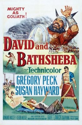
Image Credit: Posters 555
All those who wander are not lost—in fact, wandering is sometimes the point. I did a little of this while touring the Harry Ransom Center’s new exhibit on The King James Bible: Its History and Influences. I particularly enjoyed examining the numerous visuals on display: exquisite Jacob Lawrence and William Blake illustrations, colorful posters for The Ten Commandments and David and Bathsheba, and patterns for Robert DeNiro’s Biblical tattoos in Cape Fear. While some might oppose word and image, the Harry Ransom Center’s combination of both in a single exhibit highlights illustration’s importance within the King James Bible and the wider biblical tradition. Visual illustrations, which once served to transmit biblical stories before widespread literacy or vernacular bibles, work hand in hand with the Bible’s narrative techniques—specifically, Jesus’s parables in the Gospels. In this post, I’d like to briefly consider how one major biblically-inspired text—John Bunyan’s novel Pilgrim’s Progress—incorporates visual illustration to complement its narrative parable, and how tropes of wandering in particular reoccur in both kinds of illustration.
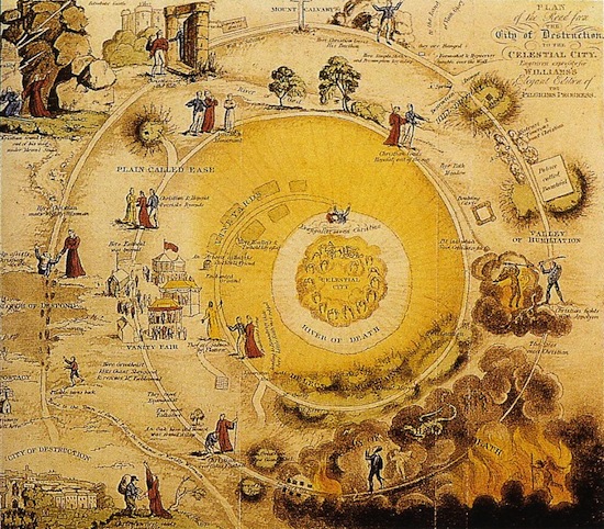
Image Credit: Strawdogs
The image above (of which a slightly larger version is available here) is a frontispiece for the 1833 edition of The Pilgrim’s Progress, to which is prefixed the Life of the Author, with a Key to the Allegory, and a Critique on its Beauties. The Pilgrim’s Progress, an allegory originally printed in 1678, tells the story of Christian, a man who leaves home for a journey to the Celestial City. On the way there, he gets waylaid in variously places—mostly famously, Vanity Fair. According to the University of Texas’s library catalog entry for the book, the frontispiece was tipped in, which means that the illustration was a loose page incorporated into a bound volume. The image, called “Plan of the road from the City of Destruction to the Celestial City,” was originally published by George Virtue, who made his reputation producing illustrated books. While frontispieces generally depict specific incidents or characters from the text (like the frontispiece to Gulliver’s Travels, which presents Lemuel Gulliver to his readers), the “Plan” does not merely serve as précis for the text. This picture, like the Key to the Allegory and the Critique on its Beauties, glosses the Progress’ meaning.
The “Plan of the road” presents a visual representation of Christian’s path to salvation. It shows all of his stops along the way, including the Slough of Despond and the Hill of Difficulty. Yet the illustrator does not draw the path as a straight line—he instead illustrates it as a spiral. But here, the spiral’s direction moves inward, not outward. As Christian wanders in his journey, even at moments when he feels lost, he continually draws closer to his intended destination. Bunyan’s allegory and the accompanying illustration suggest that all Christians approach salvation, even if they stray off the preferred path. This message appears several times in the Bible, specifically in Luke 15 where Jesus recounts the parables of the lost sheep and the prodigal son.
As recorded in the King James Bible, the prodigal son leaves his father’s house and “waste[s] his substance in riotous living. When he is in need, however, he remembers his father’s beneficence:
“I will arise and go to my father, and will say unto him, Father, I have sinned against heaven, and before thee, And am no more worthy to be called thy son: make me as one of thy hired servants. And he arose, and came to his father. But when he was yet a great way off, his father saw him, and had compassion, and ran, and fell on his neck, and kissed him. … the father said to his servants, Bring forth the best robe, and put it on him; and put a ring on his hand, and shoes on his feet: And bring hither the fatted calf, and kill it; and let us eat, and be merry: For this my son was dead, and is alive again; he was lost, and is found. And they began to be merry.” (Luke 15:18-24)
When the Pharisees object to Jesus’s communion with sinners, he uses this parable to illustrate the message that God accepts those who return to him, even if they might spend all before then. God’s compassion celebrates the return of the wasteful son: “he was lost, and is found.” This language, transformed by a late eighteenth-century poet into a famous English hymn, directly sets the two states in relation—being lost doesn’t mean you can become found. While the King James Bible contains no visual illustrations, embedded in the text are images in words that have the same effect. Jesus argues his meaning through recourse to illustrations, just like the owner of this copy of Pilgrim’s Progress.
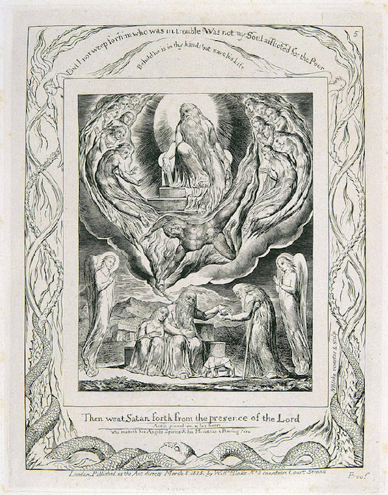
Image Credit: The Blake Archive
What this exhibit highlights for me is that while there is a rich tradition of images in the biblical tradition—as the exhibition carefully demonstrates with hieroglyphic Bibles and frontispieces like the “Plan,” the King James Bible appears within the rise of a hard-line Protestant movement, in which particularly strict sects like the Puritans interpreted the Bible’s commandment against worshipping false idols as critiquing practices of visual representation. Eamon Duffy’s excellent histories The Stripping of the Altars and The Voices of Morebath record how the Henrician Reformation removed artistic aspects of worship—including altar pieces and stained-glass windows—from churches to implement Protestantism. Duffy’s work explains how worshippers adapted Catholic traditions to new religious dictates which threatened communal forms of worship like feast days. While the Bible embeds illustration within its text, it has often been perversely read as against the visual. Perhaps what the Harry Ransom Center’s exhibit shows best is that binaries of word and image collapse into each other—while images of word are not processed by the brain in the same way, both kinds of illustration carry powerful rhetorical effects.
The opinions expressed herein are solely those of viz. blog, and are not the product of the Harry Ransom Center.


Recent comments
2 years 29 weeks ago
2 years 44 weeks ago
2 years 44 weeks ago
2 years 50 weeks ago
3 years 4 weeks ago
3 years 4 weeks ago
3 years 4 weeks ago
3 years 6 weeks ago
3 years 6 weeks ago
3 years 6 weeks ago