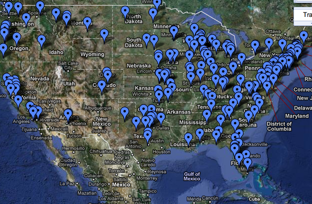
Image: Partial Screen shot from Google Maps
How do you make a topic like censorship visible? After all, the goal of censorship is to make things, in a literal sense, invisible, un-seeable. But in a world where (sometimes wonderfully, sometimes insidiously) the visual has come to be paramount, how can you visualize censorship, see what can’t be seen? A few weeks ago, I posted about a few of the visual images highlighted by the Harry Ransom Center’s new Banned, Burned, Seized, and Censored exhibit related to this topic. Inspired by Banned Books Week—it’s this week, in case you didn’t know—I want to examine some modern representations of censorship.
First up is a project originated by Chris Peterson of the National Coalition Against Censorship and Alita Edelman of the American Booksellers Foundation for Free Expression, “Mapping Censorship”. As viz.’s own Lisa Gulessarian noted last week, Google Maps has been instrumental in helping us reorganize our relationships to the real world, and the “Mapping Censorship” project—now maintained by the American Library Association (ALA)—makes visible what can seem all-too-theoretical.
The project is simple: the ALA marks the location and records the details of book ban or challenge in the US from 2007 on. A flag on a map indicates a challenge, sometimes of multiple texts. I should note that the map is incomplete: the ALA records all challenges reported, but estimates that those challenges are possibly less than a quarter of all incidents nationwide, as the majority of challenges are never reported. Nonetheless, there’s an astonishing amount of information available, as each flag will provide you with a summary of the challenge and, in some cases, take you to further resources: blog entries, letters from concerned parties, and so on. Even without that additional content, the map makes an elegant ideological point—we’re a country awash in censorship.

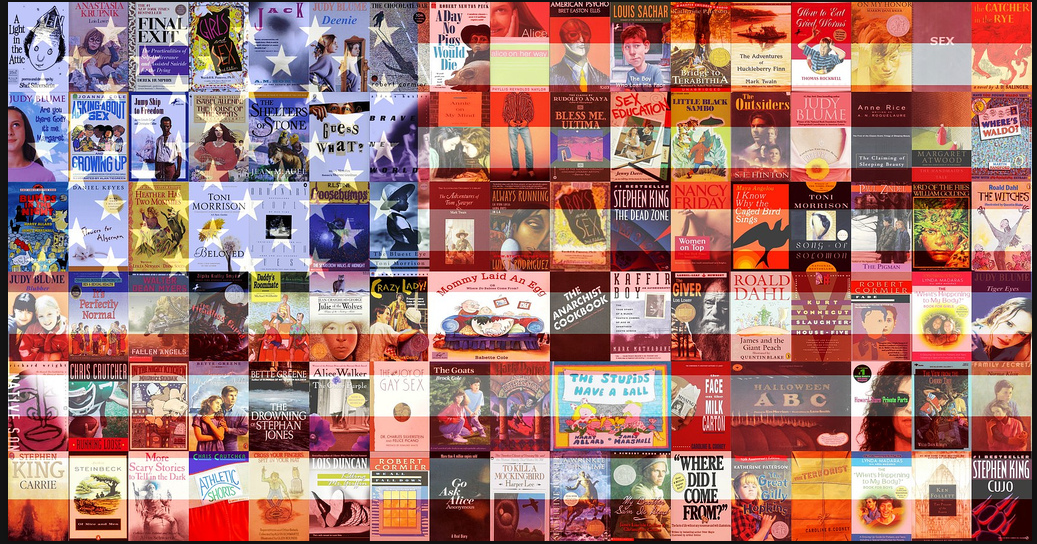
Image: Screenshot from Flicker
While “Mapping Censorship” makes censorship visible geographically, this banner—constructed by the staff of the Dayton Metro Library in Dayton, OH—constructs its appeals ideologically. And while it’s nothing new to lay claim to the American flag in quest of public support, I can’t help but find this image impressive. The books are 99 of the 100 most-challenged books from 1990-2000 (the missing book is Daniel Cohen’s Curses, Hexes, and Spells from 1974, a fondly remembered childhood classic). There’s a certain power in being able to see the texts in question (you can find a larger version of the image here). While some of the choices are unsurprising—The Anarchist Cookbook, Madonna’s Sex—others seem idiosyncratic, at best: Lois Lowry’s Anastasia Krupnik series? Where’s Waldo?? Plus, the Banned Books Week Banner makes for a fine game of Banned Book one-upsmanship, as you can challenge your friends to find out who has read more books from the list (I come in at a solid fifty-one, if you’re interested).
The point being made by these images is that censorship can easily be dismissed, as its nature is to be invisible, to be registered, if at all, only as a gap in experience. Visual rhetoric is a powerful tool in reclaiming and making visible that practice. Those who wish to ban books understand the power of visual images and language to articulate alternative viewpoints. Those who oppose censorship need images like these to keep that struggle out in the open. While all this sounds somewhat unavoidably leftist (and, full disclosure, I am), I don't want to make it out that censorship is the result of some kind of massive government conspiracy. It's not (usually). The vast majority of books are challenged by parents (good parents, even): parents who read to their children, who encourage a love of books, parents who value how important reading is as a cultural and personal act. That's why it's all the more important that we discuss--critically and out in the open--what kinds of viewpoints we can tolerate and represent. In that debate, we discover who we are (as a person, public, and nation). These images make a good start.


Recent comments
2 years 29 weeks ago
2 years 44 weeks ago
2 years 44 weeks ago
2 years 50 weeks ago
3 years 4 weeks ago
3 years 4 weeks ago
3 years 4 weeks ago
3 years 6 weeks ago
3 years 6 weeks ago
3 years 6 weeks ago