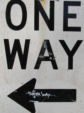
I live on a one way street so I’ve always viewed the “One Way” signs in my neighborhood as good information for motorists and visitors. They are excellent reminders to people that cars should only face east on Washington Street. But this altered image (actually from one block over on Madison Street, where cars travel west) reminds us that street signs are not merely about expressing information about traffic patterns; they are also the banal markers that inform us about the presence of the state’s authority.
In my visual citizenship course last year, the students spent plenty of time talking about the images of state power. Flags, monuments, buildings all serve as powerful reminders of the relationship between citizens and authority. But as I discovered while walking yesterday, the most powerful markers of the state are likely the ones we have casually internalized as the routine images of our everyday lives. I wonder if this isn’t true of visual images generally: that the images we focus on with great attention are not nearly as important as the images we process and dismiss with great ease. When we process visual images with the swiftness of the glance, it may not necessarily mean we are inattentive or dismissive. We may actually be relying on an internalized reading strategy that is predicated on a particular relationship to power. Glancing, under this treatment, suggests a great deal of the rhetorical force of an image can be concealed in its ability to be processed quickly instead of inviting deep contemplation. And this image shows that sometimes it only takes a flippant bit of graffiti to uncover some of the more substantive operations that are implied by the visual markers of our everyday lives.
Of course, the stakes of this particular concealment aren’t terribly disconcerting. I don’t mind that obedience to the state means I don’t have to dodge other cars as I go down the road. And the concealment isn’t terribly tricky in this case either. Most of us would easily identify that the source of street signs is the government. But it still took the little bit of graffiti to spark even this minor bit of contemplation (for me at least—if other readers of Viz. contemplate their relationship to state power every time they encounter public signage, consider me duly impressed, and sympathetic for how overwhelming a drive to the grocery store must be).

Recent comments
2 years 29 weeks ago
2 years 44 weeks ago
2 years 44 weeks ago
2 years 50 weeks ago
3 years 4 weeks ago
3 years 4 weeks ago
3 years 4 weeks ago
3 years 6 weeks ago
3 years 6 weeks ago
3 years 6 weeks ago