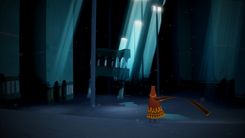
Image source: Thatgamecompany.
Probably all illustrations, and certainly the animated images I’ve discussed in Frozen and Lilo and Stitch, come freighted with a vast history of associations. Striking images can literally provide worldviews—complex perspectives from which to view matters ranging from gender roles to cultural identities to ideal body types. Frozen’s visual aesthetic offers a triumphantalist account of traditional images put to new uses, while Lilo and Stitch offers a harder-edged criticism of our lazy, self-indulgent ways of looking at the world, for instance. Yet both deliberately and meaningfully comment upon the mediating power of their own iconography. Both films are, in short, particularly focused on understanding how images have worked in the past, and how they can be made to work differently in the future.
Journey is a video game whose cartoon-like visual aesthetic draws strongly from the same animated tradition as the first two films, yet its aims are quite different. In both its gameplay and its visual design, I will argue, Journey is not focused on what it means, but rather on the raw experiences it can provide. The game reminds us, in short, that while images have deep and rich rhetorical histories, they are also something more than mere arguments.
At first glance, Journey seems yet another participant in the iconographic tradition of Disney-style heroic adventure. The game's unnamed protagonist wears yet another variant of the cape worn by Sleeping Beauty's Prince Phillip or Frozen's Anna: a red, flowing cloak whose bold coloration differentiates him or her from the various backgrounds he will visit. Fittingly, this character will go on his own quest, making his or her way through dozens of different landscapes and ruins in order to reach a distant mountain peak. Not surprisingly, the primary figure this character finds among the ruins is dressed in a pure white gown that carries at least two markedly female associations: that of a helpful nun, and that of a bride on her wedding day. Her beak-like face, on the other hand, nearly literalizes the cultural ideal of a woman as a "mother hen."
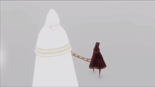
Flowing, red clothing for adventurers: the one unchanging truth of the fashion world. Image source: Youtube.
Yet while one could perform a gender analysis (or, for that matter, a cultural analysis) of Journey's treatment of archetypes of a lone adventurer in an exotic foreign place, to do so would be to miss one of the most notable and immediately striking features of the game: its insistant attempt to minimize or obscure any ability of its images to refer to anything outside of themselves. This design aesthetic stretches from the game's costume design (just ornate enough to defamiliarize the reader and yet not ornate enough to betray any one particular origin) to its art style (frequently, the game presents such clean lines and well-defined spaces as to make the background seem neutral), to its narrative (a serious of wordless, simply-illustrated cut scenes hint at a deep religious subtext to the journey, but provide no clarity as to what the significance might be), to its very protagonist (all gender, race, and class markers are obscured beneath his or her robe, and any distinctive voice is replaced by a small variety of musical notes.) For the most part, the game goes out of its way to limit the degree to which it reflects the world outside itself.
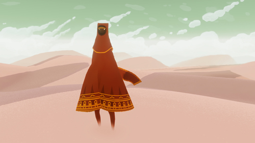
The landscape, like the character is often a nearly blank canvas. Image source: Thatgamecompany.
Two things, however, receive much more focus than in a traditional video game. The first is light. Not only are all the game's various locations carefully differentiated by their color palate (as is common in video games), but the use of light and tonality is often taken to dramatic extremes. One segment of the game takes place in a harsh, snow-and-wind haunted mountain pass, where the screen is at times almost entirely white. On the other hand, an early visit to a sun-drenched temple demonstrates the game's lighting effects at their most impressive; the sun reflects vibrantly off the golden sand, an effect dazzling in itself yet made more impactful when suddenly encountered within a game otherwise willing to stick with relatively bland backgrounds.

Image source: Forbes
At such moments, the game becomes a meditation on the power and significance of light and vision; while architectural details may be visible, much more powerful is the play of light and shadow, gold and brown. The relatively desaturated and low-contrast images before this climactic relevation of light, for instance, only serve to de-sensitize the mind of gamers, so that what could be a merely standout moment in another game is transformed into a revelation.
Yet the game's most powerful use of constraints involves not images themselves, but rather PS3's multiplayer functionality. Amid the loneliness of the game's single-player campaign, the game randomly brings two human-controlled players together in a single universe. As with the game's visual presentation, this interaction takes place within strictly-enforced limits. Communication comes from watching what the other person does, or pressing a single button that (depending on how hard or quickly you press it) triggers one of a small number of musical notes. Cooperation is limited to the ability to assist each other in making higher than normal jumps.
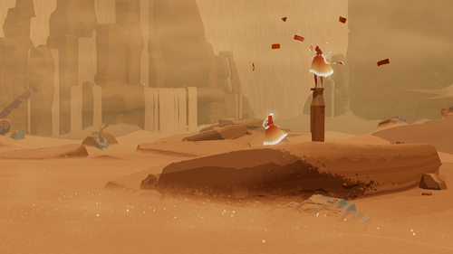
Image source: Thatgamecompany.
As with the visuals, the game's careful limitations provide an intense focus. These interactions obviously lack many of the hallmarks of day-to-day encounters: human voice, facial expressions, language, posture, distinctive clothing, and so forth. Yet the knowledge of that the character accompanying you is played by a fellow human being makes all the difference in the world. Indeed, the very difficulty of communication only increases the wonder when communication does emerge, as when two players spontaneously develop a quick two-note call-and-response to check in, or when a new player is greeted with a sudden shower of notes that serve as an unmisible signifier of welcome. In these multiplayer sections, the game became less about the designed narrative than about the experiences it enabled: experiences of recognizing, working with, and above all communicating with a fellow human.
Both the game's presentation of light and its treatment of human interactions signal that the game is not being "about" something so much as it is interested in creating something. The glorious sunset walk is not "about" the power of beauty in the way that Lilo and Stitch is about the danger of mis-read stories; nor is it (like Frozen) "about" the revision of the Disney adventurer narrative in order to include women (and sisters) as protagonists. Instead, the most significant thing that Journey does is to provide us with carefully cultivated experiences, where a simple iconography allows players to focus on certain aspects of life while ignoring others. The final effect is very different from that of other forms of visual narrative, and arguably significantly less rhetorical. Yet it is no less real for all of that, and no less worthy of consideration and analysis.


Recent comments
2 years 29 weeks ago
2 years 44 weeks ago
2 years 44 weeks ago
2 years 50 weeks ago
3 years 4 weeks ago
3 years 4 weeks ago
3 years 4 weeks ago
3 years 6 weeks ago
3 years 6 weeks ago
3 years 6 weeks ago