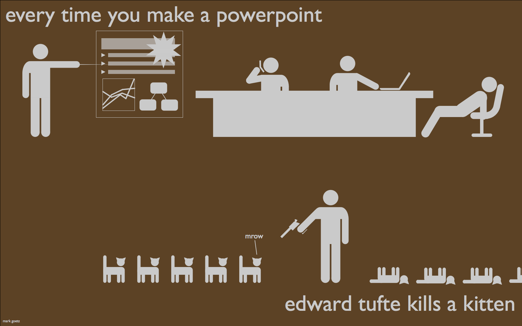
Source: Mark Andrew Goetz
About 2 months ago Austin was lucky enough to be among the handful of cities selected as a stop on a one-day presentation and workshop featuring Mr. Edward Tufte. What's more: The DWRL agreed that covering the cost of admission for a few of their staffers to be money well spent (thanks, Will Burdette).
For the uninitiated, Mr. Tufte is the granddaddy of all things related to visual representations of large amounts of data, complicated concepts, historical trends, and- quite literally- just about anything else you could think of. Hailed as “The Leonardo Di Vinci of Data," by the New York Times. Tufte was synthesizing massive amounts of information into beautiful visuals before the term “big data” had even pushed “the cloud” out of the way as the buzzword(s) of the moment.
In Tufte’s 2006 book, Beautiful Evidence, Tufte discusses at length an entirely new means of data visualization he called Sparklines (which, according to his workshop, he created in the mid-1990s). Sparklines can depict thousands of measurements in graphics that are generally small enough to fit within a longer piece of regular-sized text (like the one you’re presently enthralled by...yeah, right).
 Source: Edwardtuft.com
As the above illustrates, sparklines are “dense, word-sized line graphs that can show, in less than an inch, the last 100 readings of a patient's glucose, a year's worth of stock activity or the win-loss record of a baseball team.”
So, Tufte’s Sparklines came along at a point when a new way to visualize the unprecedented amount of data people were being exposed to was sorely needed. Evidence of this can be seen in the proliferation of the handy little graphs that Tufte came up with. Sparklines have been incorporated into Excel for Windows and Mac. Google introduced sparklines into their API data products in 2007. As of this writing, a google search for “sparklines” returns nearly twice as many results as a search for “steve jobs” (106,000,000 vs 46,000,000; I chose “steve jobs” for the comparison because Tufte did the same thing in 2011, at which time he had merely twice as many returns as “steve jobs”).
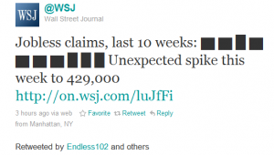
And it’s not just massive corporations and data aggregation sites that are finding utility and compelling aesthetics in Sparklines. Just click here #sparktweets the next time that you’re going to go bouncing around twitter. Sparktweets are simple, Unicode sparklines, and so can be included in the body of a tweet). There’s even a Twitter Sparkline Generator out there!
 Source: Data Driven Consulting
However, even though Tufte has embraced technology in creating his visual representations, to describe Tufte as a zeitgeist with an unequivocal belief that “newer is better” would be to miss his message completely. Although his presentation on Sparklines was an amazing demonstration of how we can make sense of seemingly infinite amounts of data in the digital realm, there was a larger theme underlying Tufte’s presentation that might temper any overexuberance for technological progress one would otherwise have. A point he kept driving at was that the latest isn’t always the greatest, and that new technologies should only be implemented when they actually better lend themselves to a particular function. He displayed a recent picture of NASA’s Mission Control room in Houston (not in a PowerPoint, of course), pointing out that the technology employed when sending people into space consisted largely of Windows 95-based computers and landline telephones (remember those?). Tufte said that the reason NASA was still employing these older technologies wasn’t because they couldn’t afford to implement the Next Big Thing whenever they so desired. Rather, the technologies of Windows 95 and landlines, because of their stability among things, were determined to be the best technology for the particular function they were employing it for.
Towards the end of his presentation, Tufte rendered the bibliophiles in the room awestruck when he pulled out an original copy of Galileo’s “Istoria e dimostrazioni intorno alle macchie solari” (“History and Demonstrations Concerning Sunspots and their Properties”). He left us all awestruck when he demonstrated the ways in which this 400-year-old book contained better examples of data visualization than anything we had seen on his projector or on our own laptops: to illustrate the movements of the earth that he had observed, he created a small movable, fold-out, 3-D cutout of the rotation of the earth around the sun, as he had observed it.
The computer screen, for all of the praise we give it, Tufte, hasn’t really taken us that far forward in our abilities related to visual representation than the book that preceded it. Further, the book had not really relieved us of the principle shortcoming of the scroll before it…or the slab of stone before that. Why? With all of them, you’re still only writing on and looking at a flat surface.
Tufte gave another shout-out to the actual, paper and ink book that we seem to be so desperate to abandon by showing us a book that was even older than Galileo…about 200 years older. Tufte said that, despite having been printed on the medium of paper that we presently see as unquestionably inferior to the digital medium, the pages of Euclid’s Elements STILL had better “resolution” than last season’s Dell Laptops.
The workshop didn’t end there, many more interesting facts, graphics, and visual demonstrations followed. I’m sure he had enough material to stay up there all day. Instead of doing that, however demonstrated first-hand one of his fundamental techniques for successfully conveying your message: Always end early. I enjoyed the hell out of the presentation, but ending unexpectedly was really nice!
(As a concluding aside, I did stay long enough to meet him after the lecture and to give him a DWRL t-shirt…which, I might add, he seemed to be genuinely interested in.)

 Source:
Recent comments
2 years 29 weeks ago
2 years 44 weeks ago
2 years 44 weeks ago
2 years 50 weeks ago
3 years 4 weeks ago
3 years 4 weeks ago
3 years 4 weeks ago
3 years 6 weeks ago
3 years 6 weeks ago
3 years 6 weeks ago