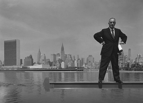
(Image credit: Harry Ransom Center)
It shouldn’t be surprising, but I was drawn to the photographs of architects in the Harry Ransom Center’s ongoing exhibit, Arnold Newman: Masterclass. They made the exhibit for me. Those of you who’ve kept up with my blogging in recent months know that I appreciate the art of designing interior and exterior spaces, and so to see photographs of architects in the Arnold Newman exhibit…it was a highlight. Jim and Rachel posted earlier this week about how Newman liked to place his subjects in front of something relevant to their work. Thus Igor Stravinsky was photographed next to a Steinway. I suspect this strategy served two purposes. First, and perhaps most importantly, framing subjects with their objets d’art allowed Newman to establish an aesthetic through which his own audience could gage his portraits. (We’d assume the JFK portrait was by Newman even if the photograph wasn’t attributed, because of the contrived way the White House sits in the background.) This surely eased Newman’s routine, as he had a formula to bring to each new shoot. Secondly, framing subjects with their objets d’art allowed Newman to comment on his subjects’ work, in much the same way that we might consider a modern Shakespeare production to be an interpretation of a Renaissance text. All of this is obvious and provocative in Newman’s photographs of architects.
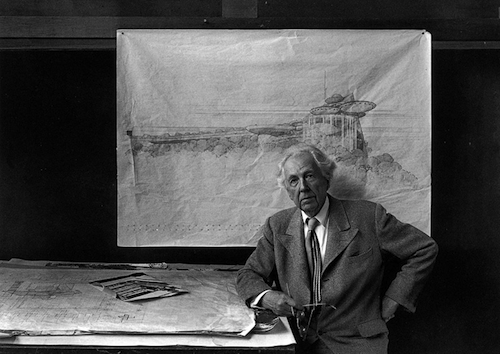
(Image credit: Harry Ransom Center)
Newman’s 1959 photograph of Robert Moses stands at the top of this post because I think it’s a nearly perfect model of this reading. Moses, of course, was successful architect and urban developer in the post-war period. Here he is photographed holding onto some plans on a beam over the Hudson, with Manhattan in the background. The plans suggest architect, and the cityscape behind suggests the scope of his design. But other photographs of architects in the Arnold Newman: Masterclass exhibit drift from the subject/objet d’art paradigm a bit, and I’m surprised that one of these in particular doesn’t have Ransom Center visitors protesting in every modicum of communicative media. I’m talking about Newman’s portrait of Frank Lloyd Wright (above). This was taken in 1947. By that time, there were any number of Frank Lloyd Wright masterpieces that Newman could have framed his subject. (Over the course of his career Wright started revolutions that made his earlier work passé.) So why then did Newman choose to situate Wright in front of a bunch of plans? I think it has something to do with Wright’s renown as an impractical artist. He was always concerned with the visual success of his buildings, sacrificing the more obvious concerns for lofty aesthetic ones. (When one client complained to Wright that the roof leaked, Wright suggested the client move a trash can to catch the drip.) Newman’s framing certainly does suggest a rather conservative understanding of architecture, especially for the 1940s. By that time, many great Wright buildings were tragically being repurposed, and from this picture I suspect Newman might have been OK with such refashionings. How you take a prairie home like the Dana-Thomas House and turn it into an office building is beyond me.
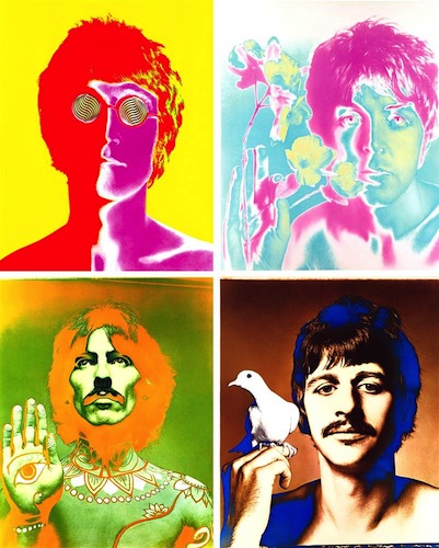
(Image credit: Richard Avedon)
In closing, Newman’s aesthetic is classic in part because it harkens back to a long tradition of portraiture. (In Britain’s National Portrait Gallery, Samuel Johnson is seated next to a table on which stands his lovely dictionary.) But Newman’s aesthetic is also classic because of how influential it proved to be, both in his day and ours. Richard Avedon might not have photographed the Beatles in his way had Newman not photographed Frank Lloyd Wright in such a focused context.


Recent comments
2 years 29 weeks ago
2 years 44 weeks ago
2 years 44 weeks ago
2 years 50 weeks ago
3 years 4 weeks ago
3 years 4 weeks ago
3 years 4 weeks ago
3 years 6 weeks ago
3 years 6 weeks ago
3 years 6 weeks ago