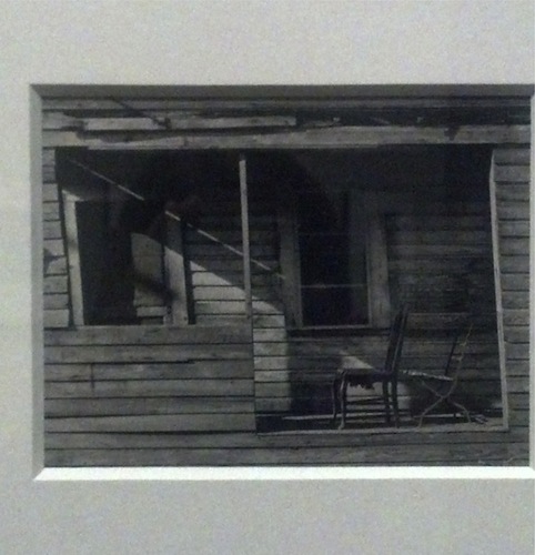
Image Credit: The Harry Ransom Center
Porch and Chairs, West Palm Beach Florida, 1941
In between portraits of famous luminaries at the Harry Ransom Center's Arnold Newman Masterclass exhibit, there are a group of images from the photographer's early career that feel anonymous and private. They include pictures of landscapes, nameless figures, and modest structures--all subjects that seem to have been chosen for their compositional character rather than the associations they bring to mind. The above photograph from that period of a decontextualized porch and chairs resists our curiosity to see the whole house and place it in a particular setting, focusing us instead on form and line. The un-forthcomingness or formal starkness of this picture seems dramatically foreign to the photography of Newman's later career, the period of his well-known "environmental" portraits, which situated iconic individuals in settings that explained or extended their identities. (Rachel's post further glosses and complicates this term). Despite this, I'd like to point out some unifying threads between this quaint little study from West Palm Beach and a few, more recognizably Newmanian photographs, all of which are currently on display at the Ransom Center.
"Porch and Chairs" derives its charm from a few compositional elements. The first is the picture's close crop. Newman left a very small margin around the porch, especially to the right and left, which highlights its distorted shape. The lateral boards at the top of the photo give us the sense that Newman's camera is held level, but all of the lines one would expect to be vertical in the picture--the shutters, the right and left panels of the door frame, the porch's central support and the two cut-away walls--are slanted, making the structure appear unstable and droopy. Our eyes search the bowed and jagged siding for ninety degree angles to no avail. As much as they purport to be squares, the spaces within the porch frame are more like rhombuses that lean faintly to the left. Yet the tilted aspect of the porch doesn't overwhelm or unsettle the photo, because the two chairs in the lower right corner "lean" in the opposite direction. These backward-bending chairs may have no effect on structural soundness of the rickety building but they do provide the balance needed within the composition.

Image Credit: The Harry Ransom Center
Pablo Picasso, painter, sculptor, and printmaker, Vallauris, France, 1954.
The crop planned here, which resulted in the famous Picasso portrait below, accomplishes something a little different from the "Porch and Chairs" framing. Newman begins with an image of a leaning subject, reorients it, and restores balance and energy to the painter's mien. Even after these modifications, there are still signs that he was leaning over in the original pose. The rightward pressure of Picasso's hand visible in the creases on his forehead offsets the positioning of the subject toward the left side of the frame. The hand, in other words, acts as a frame-within-a-frame that repositions and counterbalances the visual weight of the leaning subject.

Image Credit: www.mymodernmet.com

Image Credit: The Harry Ransom Center
Ernest Trova, Sculptor, Pace Gallery, 1971
Several other Newman portraits at the Harry Ransom Center feature leaning subjects and frames-within-frames. In this photograph of the sculptor Ernest Trova, for instance, the white jutting walls of the gallery (instead of Newman's red crayon) crop nearly half of his body from view, and what's left of Trova's trunk is pictured leaning against this "environmental" frame. We get the sense that the thrust of his lean is the only thing keeping him from being squeezed out of the picture.

Image Credit: www.mymodernmet.com
In this shot, Ansel Adams appears comfortably wedged between a beam and the frame of a sliding glass door. Behind him and inside his house a group of frames hang on the wall. The placement of the photographer in front of a pane of glass that, in turn, superimposes reflections of the trees outside on the framed artworks within the house suggests a communicability between each of these layers that may refer to Adams' work. Indeed, capturing the photographer, his beloved trees, and the art on his walls within the same bounding line suggests the inseparability of all of these things.

Image Credit: The Harry Ransom Center
Joel Meyerowitz, photographer in his studio, New York, 1993
This final photograph of Joel Meyerowitz leaning against what must be the entry to his darkroom emboldens me to talk more directly about the importance of leaning and internal frames for Newman's work. From a compositional standpoint it seems to me that, like the tilted porch frame and the crooked-backed chairs of our first image, the lean and the frame of Newman's later pieces give them a crucial sense of counterpoise. In Newman's portraits of artists, these frame-like structures inevitably take on a more definite significance because of the inescapable relationship between artists and frames. Deliberately positioning these art makers within at least two sets of frames--the borders of Newman's photograph and what I've been calling its internal frame--emphasizes the fact that they have momentarily relinquished artistic control and have become art. Perhaps leaning or pushing back against the frame is the only way they can reassert a modicum of control.
The opinions expressed herein are solely those of viz. blog, and are not the product of the Harry Ransom Center.


Recent comments
2 years 29 weeks ago
2 years 44 weeks ago
2 years 44 weeks ago
2 years 50 weeks ago
3 years 4 weeks ago
3 years 4 weeks ago
3 years 4 weeks ago
3 years 6 weeks ago
3 years 6 weeks ago
3 years 6 weeks ago