viz.
Visual Rhetoric - Visual Culture - Pedagogy
Site informationRecent Blog Posts
|
Jenn Shapland's blogSifting through the "Spaceship Junkyard"
Submitted by Jenn Shapland on Thu, 2013-10-24 17:02
Jonas Bendikson RUSSIA. Altai Territory. 2000. Image via Harry Ransom Center Exhibitions page. Jonas Bendikson's photo, used in many of the Harry Ransom Center's promotional materials for their current exhibit "Radical Transformation: Magnum Photos in the Digital Age," caught my attention even before visiting the galleries. Before seeing it in person, the image reminded me, strange as it is to say, of the 1939 Technicolor version of The Wizard of Oz.
"Boy" Cuts: Part II
Submitted by Jenn Shapland on Thu, 2013-10-17 16:27
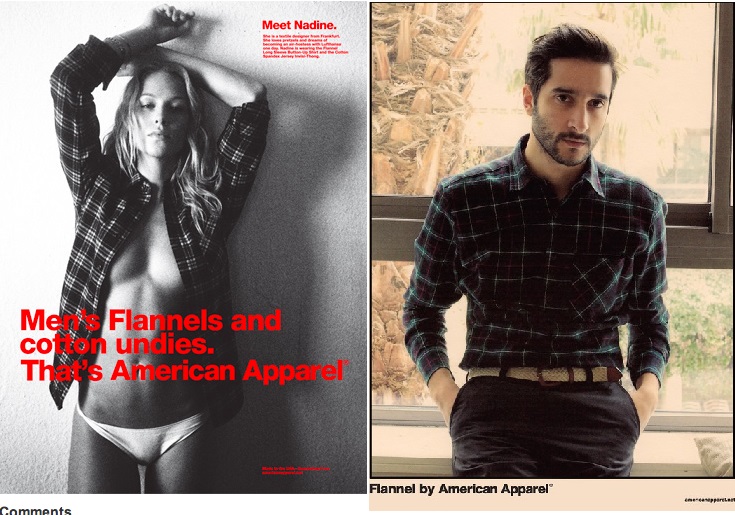
Images via www.americanapparel.net In my last post, I asked a pretty basic question: “why is it that most women’s clothing is designed to either a) show off or b) hide the body, while most men’s clothing is designed to comfortably fit the body?” When I say designed, I want to emphasize that I’m looking at the shape and cut of the fabric, first and foremost, which determine how a garment fits. Let me give a few examples. Some days, you wake up and all you want is to wear a goddamn white t-shirt. For me, it’s barely a step up from just-not-even-gonna-get-dressed-today,-hope-that’s-cool. It’s also a fairly classic, chic, minimalist choice if you can pull it off. But I think it’s particularly hard to find that just right white t-shirt. My current option isn’t exactly cutting it. It’s a v-neck from (no surprise here) American Apparel, a brand notorious for it’s staunch policies on labor justice and equally staunch ad strategy of degrading women. You know this shirt was designed for a woman because: "Boy" Cuts: Part I
Submitted by Jenn Shapland on Mon, 2013-10-14 10:00
Compiled from www.madewell.com Fall clothing lines are out, which means the online window-shopper in me is happy as a clam. I’ve been scrolling around, looking for new sweaters or jeans or blazers that would be appropriate for the drastic change in seasons we collectively imagine here in central Texas. And here’s what I’ve noticed: all the things I like right now have names with the word “boy” in them. Tomboy jackets, boyjeans, boyfriend shirts. Perhaps this is just indicative of a (never-ending) androgynous trend at the places I shop; as the image above shows, just one store—in this case, Madewell— capitalizes on the boyish qualities of their women’s clothes four times in their fall lookbook. Menswear-inspired women’s clothes are nothing new, but they’re definitely on trend in the retail world this fall, in a very self-aware way. Dressing across gender lines can be cool and even a means of subverting traditional gender roles or images. But labeling these styles “boy ____” has, I think, the opposite function. It got me thinking about some of the strange, patriarchal, normative, and bizarrely long-lasting differences between men’s and women’s clothing design. In particular, one of the most basic differences: how they’re cut.
Graffiti that Annotates
Submitted by Jenn Shapland on Thu, 2013-10-03 09:55
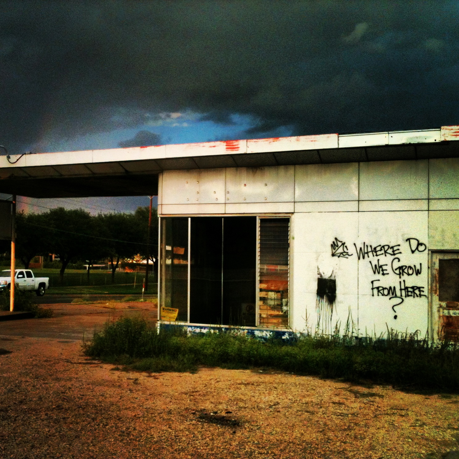
My favorite genre of graffiti is work that comments on its immediate surroundings. In east Austin, this type of graffiti tends to refer to the seemingly unending gentrification of neighborhoods further and further out. Remember the fancy convenience stores I mentioned last time? Ones where you can buy $6 ice cream sandwiches? The image above is a defunct gas station that appears to have been purchased recently, so I think we can all imagine what's coming next. This graffiti artist—in their own, special, nostalgia-soaked way—wants to encourage visitors to the area to be critical of this expansion. See also: the time Hillside Farmacy's sign was edited to read "Hipster Farmacy." The Hidden Perils of Q&As.
Submitted by Jenn Shapland on Thu, 2013-09-26 13:45
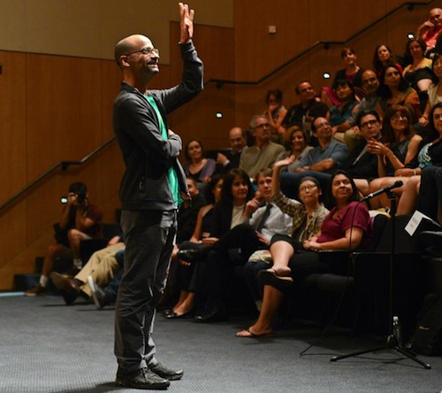
Image from TILTS. If you attend enough talks and readings, you start to get pretty familiar with the basic elements of the Q&A session: the rambling question; the non question; the irrelevant question; the already-answered question; the indecipherable question; the adoring fan question; the tiny soapbox disguised as a question. If you’re cynical like me, you’ve realized by now that most questions are asking something very different from what they claim to ask. Q&As with contemporary writers always contain at least one version of the following: What’s your writing process like?/How often do you write?/Where do you write?/What do you wear whilst writing?/What snacks do you eat?/How productive are you?/Do you wear socks? You get the picture.
Graffiti as Advertisement
Submitted by Jenn Shapland on Thu, 2013-09-19 10:00
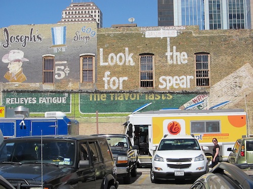
Photo credit: Flickr user elizaO It’s nice to think about graffiti as a free, democratic art form. Anyone can participate—all you risk is a fine or possibly jail time! But in Austin, lately, graffiti has been taken over by the big green capitalist monster (a monster, some might say, who’s slowly but surely encroaching on the town with heinous condos and hip, remodeled convenience stores that stock only local beer and kombucha).
Imagined Places in Decline
Submitted by Jenn Shapland on Thu, 2013-09-12 13:37
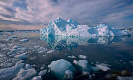
From theguardian.com, "Arctic Sea Ice Delusions" 9.9.2013 I thought I’d pick up this week where I left off in my last post on place and contemporary literature. I was catching up on the news this morning on The Guardian and, several clicks later, I found myself on their Environment page. Two large photos of bright blue ice met me there, one with the headline “Arctic sea ice delusions.” Images of the arctic, especially the dwindling arctic, confront me constantly. I’ve never been above the tree line, though I did live in Vermont for a few lengthy winters, and yet I have a detailed visual construct of its terrain in my head. Because, like me, most people will never visit the arctic, the imagined version is our only access to it, making representations of it in media and literature that much more powerful. At times I wonder how this visual emphasis on the arctic landscape—ice melt being a key factor in global climate change—affects a person’s understanding of the environment and relationship to place. When a picture like this comes up on one’s news feed, does anyone else have the same, problematic gut reaction that I have? That arctic sea melt is really kind of beautiful? What does it mean to aestheticize environmental degradation? Perhaps it’s something akin to ruin porn, like the photos that have come out of Detroit in recent years.
|
|

Recent comments
2 years 29 weeks ago
2 years 44 weeks ago
2 years 44 weeks ago
2 years 50 weeks ago
3 years 4 weeks ago
3 years 4 weeks ago
3 years 4 weeks ago
3 years 6 weeks ago
3 years 6 weeks ago
3 years 6 weeks ago