viz.
Visual Rhetoric - Visual Culture - Pedagogy
Site informationRecent Blog Posts
|
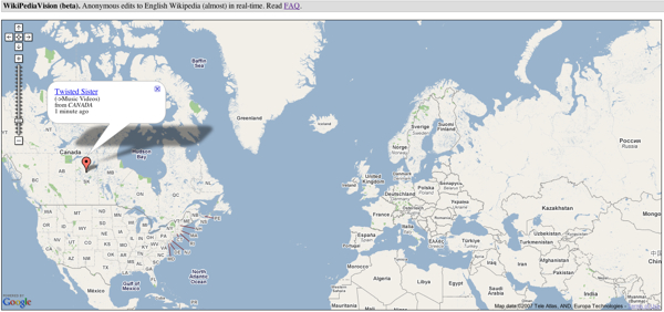
John Jones's blogWikipediavision: Visualizing anonymous edits to Wikipedia
Submitted by John Jones on Tue, 2007-10-30 10:31
László Kozma, a grad-student at the Helsinki University of Technology, has created Wikipediavision a mashup of Wikipedia edits and Google maps reminiscent of Twittervision and Flickrvision. Visualizing time
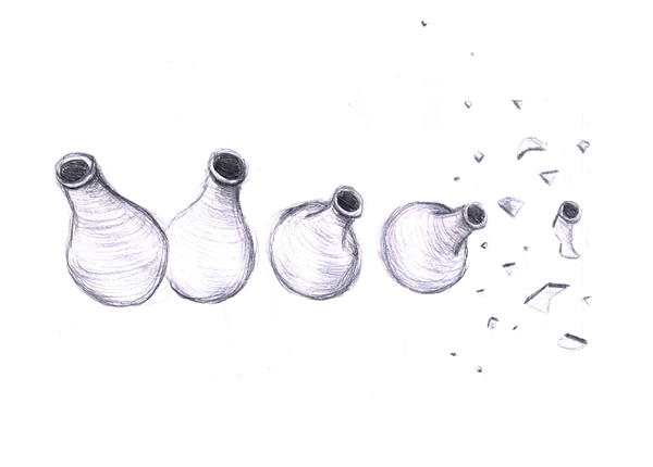
Submitted by John Jones on Wed, 2007-10-17 21:48
Here’s a great collection of freehand drawings where the artists were asked to visualize time. The individual images are usually witty statements about their authors’ views of time. Tags:
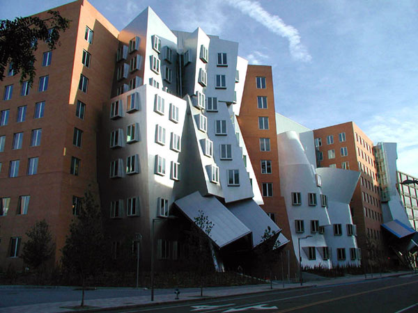
Functional architecture
Submitted by John Jones on Thu, 2007-10-04 11:21
Slate has posted a slide show featuring functional architecture, emphasizing the function and versatility of buildings over Gehry-esque flashiness. This article from Good Magazine makes a similar point. Tags:
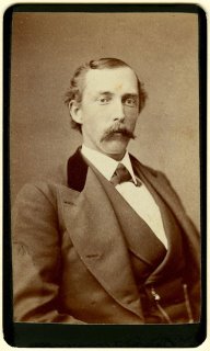
Mustache blog
Submitted by John Jones on Wed, 2007-10-03 18:15
I’ve spent the past hour trying to think of an educational or theoretical reason for posting this link, but I can’t come up with anything. Here it is anyway.
Tags:
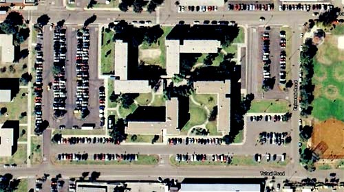
Swastika barracks
Submitted by John Jones on Tue, 2007-10-02 19:52
The image above was taken from Google Earth and shows the barracks at the U.S. Naval base in Corronado, California. Aparently the buildings are lovely from the ground, but from the air they’re, uh, offensive. The Navy is planning to spend “$600,000 for landscaping and architectural modifications” to alter the way the barracks look from the air. What I find interesting about this story is that Google Earth “created” this problem for the Navy. The technology literally allowed people to see this symbol. It reminded me of this passage from Jorge Luis Borges’s “The Aleph”: Digital forensics
Submitted by John Jones on Mon, 2007-10-01 23:09
The New York Times has posted an interview with Dartmouth’s Hany Farid, the creator of “digital forensics.” Here’s how Dr. Farid describes the field:
Dr. Farid makes some other interesting claims as well. Since 1990, the percentage of fraud cases involving photos has risen from 3 percent to 44.1 percent. While the majority of the interview focuses on digital manipulation in scientific research, clearly photographic forgery is becoming a significant problem in all areas of society. Scientists investigate paintings for clues about volcano eruptions
Submitted by John Jones on Mon, 2007-10-01 12:05
via Boing Boing Microscopic photography at the Micropolitan Museum
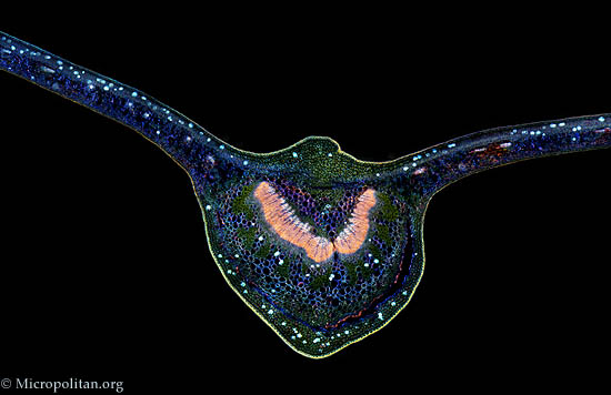
Submitted by John Jones on Sun, 2007-09-30 16:44
Those of you interested in the rhetoric of science should enjoy The Micropolitan Museum of Microscopic Art Forms, which is supported by the fantastically-named Institute for the Promotion of the Less than One Millimeter. The site boasts some beautiful imagery which, along with the accompanying text, should be able to spark some fantastic discussions about the relationship of visuals and scientific knowledge. Wolrd Freedom Atlas
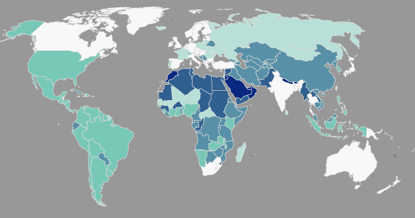
Submitted by John Jones on Wed, 2007-09-26 11:51
The World Freedom Atlas gathers a number of interesting datasets related to world politics and human rights and converts them into a dynamic map display. Interestingly, the visual display helps to foreground the rhetorical choices made by the authors of those datasets. For instance, the map below displays a country’s governmental structure, ranging from a parliamentary democracy (white) to monarchic dictatorship (dark blue) (Cheibub and Gandhi, 2004). Notice that the U.S., a presidential democracy, falls in the middle of the classification scheme, closer to the dictatorships than Canada and Australia, which are both white, as well as Russia, which is a light teal.
Tags:
|
|

Recent comments
2 years 29 weeks ago
2 years 44 weeks ago
2 years 44 weeks ago
2 years 50 weeks ago
3 years 4 weeks ago
3 years 4 weeks ago
3 years 4 weeks ago
3 years 6 weeks ago
3 years 6 weeks ago
3 years 6 weeks ago