viz.
Visual Rhetoric - Visual Culture - Pedagogy
Site informationRecent Blog Posts
|
John Jones's blogRevenge of the attention economists?
Submitted by John Jones on Sat, 2008-06-21 19:00
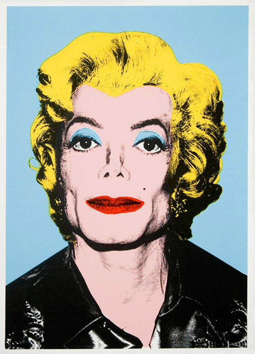
J O’Shea at SuperTouch has posted a review of an art show by Mr. Brainwash (AKA Theirry Guetta). According to O’Shea, Brainwash is a hack, ripping off the style of pop artists like Warhol and street artists like Banksy and Shepard Fairey.
The antics of Mr. Brainwash, and the reaction of O’Shea to them, made me think of Richard Lanham’s at times scathing review of pop art in The Economics of Attention. It is interesting to note that artists like Duchamp and Warhol, who Lanham calls “attention artists” or “attention economists,” were pranksters who may have really liked the joke that O’Shea so deplores: somebody sees how much money and prestige comes from making pop art, declares himself a pop artist, and starts to receive money and prestige through the wholesale copying of other artists’ methods and works. Mr. Brainwash is merely manipulating what Lanham calls the “Interpretive Bureaucracy of Attention Economists,” the establishment of art critics and promoters who can be trusted to find importance and meaning where there is none. I would be interested in hearing from other readers of Lanham’s book to see how they think Mr. Brainwash’s work fits into the author’s description of the Attention Economy. via Right Some Good How to spot a faked photo
Submitted by John Jones on Mon, 2008-06-09 11:46
Scientific American has published a short guide listing five methods that researchers use to spot altered or retouched photographs.
For example, in the image above, some of the soldiers in the background have been “cloned” to make it appear that the crowd was more dense than it actually was. While the guide details the mostly algorithmic methods used by Hany Farid and his fellow researchers, it also has some practical tips which can be used to identify altered photographs with the naked eye.
Related: Tags:
Photo-retouching guru
Submitted by John Jones on Thu, 2008-05-29 10:24
The article should be great fodder for studying the rhetoric of the body and the use of photography in our society. MIT project documents videos removed from YouTube
Submitted by John Jones on Wed, 2008-05-21 11:38
This site should be a helpful resource for online video researchers, particularly those interested in copyright issues. New pedagogy article: Tim Turner on “Visual Rhetoric and Propaganda”
Submitted by John Jones on Wed, 2008-04-23 10:19
Tags:
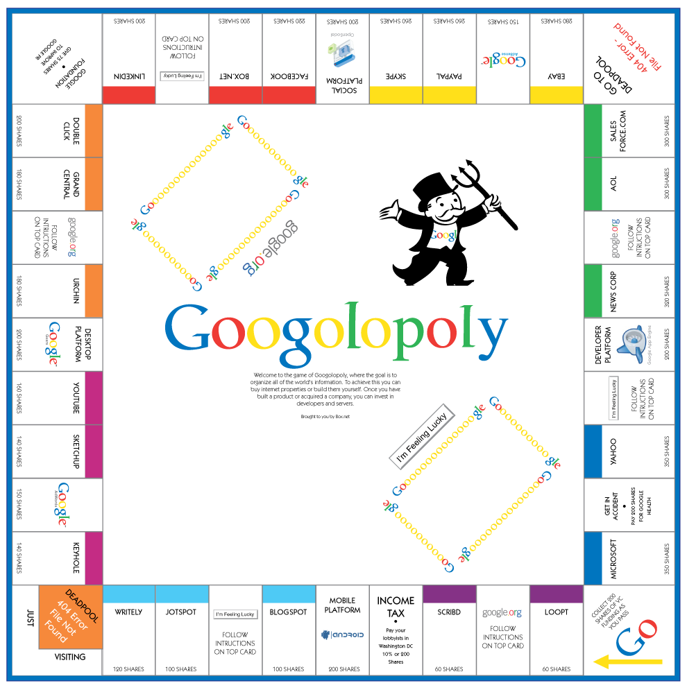
Googolopoly
Submitted by John Jones on Thu, 2008-04-17 15:56
If you teach rhetoric and technology, you might be interested in “Googolopoly,” a version of the classic Parker Bros. game that charts the search giant’s quest for web-wide domination. FYI: Rich Uncle Pennybags’ pitchfork is a clue that the creators are ambivalent about Google’s quest to “organize” your data and “make it universally accessible and useful.”
Those of you who have time to kill in during these last few weeks of class can download the entire game here. via TechCrunch Visual rhetoric on the campaign trail
Submitted by John Jones on Wed, 2008-02-27 13:24
As the Democratic primaries have continued on throughout the winter, columnists and pundits have been reaching out to find ever more ways of distinguishing between Obama and Clinton. Salon has posted an article analyzing the design of the candidate’s logos, while Clay Spinuzzi has blogged on the contrasting designs of Obama and Clinton campaign flyers being distributed in Texas (without any images, unfortunately). Recontextualizing images
Submitted by John Jones on Wed, 2008-02-27 13:05
The blog garfield minus garfield contains some wonderful examples of the ways in which images can be recontextualized to create new meanings. According to the site
Garfield the strip is mostly lame; but, by removing the dull main character, the strip is completely transformed. I particularly enjoy the empty panels, and the effect their silence has on the meaning of each strip. Michelle Obama’s halo
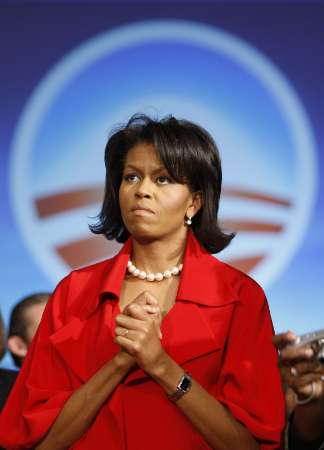
Submitted by John Jones on Wed, 2008-02-13 21:30
Timothy Noah at Slate has been keeping an eye out for evidence that Barack Obama is, in fact, the Son of God. In his latest post, he linked to this picture of Michelle Obama from Reuters:
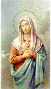
According to Noah, the framing and Obama’s posture suggest a passing resemblance to this woman:
Google, Twitter create Super Tuesday mashup
Submitted by John Jones on Tue, 2008-02-05 23:10
Google and Twitter have gotten together to create a mashup of Super Tuesday related tweets.
via TechCrunch Tags:
|
|
 After following pioneering street art legends like Banksy and Shepard Fairey around, camera in hand, shooting hundreds of hours of footage, however, the lure of cheap & easy fame began to eat away at [Guetta]. The desire to mint an original style proved more elusive. It all began several years ago with a series of uninspiring wheatpaste posters in the style of nearly every stencil artist that came before him depicting Guetta, with trademark facial hair and fedora, holding a camera, fused to the walls of Hollywood’s most heavily trafficked corridors. Further inspired by the success of Banksy’s self-produced “Barely Legal” solo show in 2006 (and with the encouragement of Sir Banks himself—possibly his biggest art prank on us all to date?), and having established sufficient ”street cred,“ Guetta began to plot his own ascent. The result is the exhibition in question, titled “
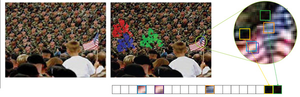
 The New Yorker recently published
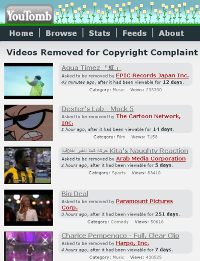


Recent comments
2 years 29 weeks ago
2 years 44 weeks ago
2 years 44 weeks ago
2 years 50 weeks ago
3 years 4 weeks ago
3 years 4 weeks ago
3 years 4 weeks ago
3 years 6 weeks ago
3 years 6 weeks ago
3 years 6 weeks ago