viz.
Visual Rhetoric - Visual Culture - Pedagogy
Site informationRecent Blog Posts
|
Calliope's blogBeyoncé's (Unflattering?) Halftime Show
Submitted by Calliope on Wed, 2013-02-06 21:21
Image Credit: screenshot from Buzzfeed.com Beyonce's publicist has created quite a media stir about photographs taken of the star's Super Bowl performance. On Tuesday this person apparently requested that Buzzfeed remove several "unflattering" images from the "33 Fiercest Moments from Beyonce's Halftime Show" gallery. The request was fruitless, considering the photos are still up; but it may have served a hidden purpose in igniting a flurry of posts, like Huffington's, that deny Beyonce has ever taken an unflattering photo. As the title suggests, Buzzfeed's controversial story adopts a playful, celebratory tone rather than a critical or parodic one. Its string of increasingly intense photos and enthusiastic captions create a mounting sense of the star's "ferocity," culminating in her mock deification ("Beysus knelt down to bless the audience") and popular coronation ("basically every moment was fierce...Because she's Queen B"). So why would anyone view this as bad publicity? My hunch is that the publicist does not actually view the photos as damaging, but rather, understands the popular fascination with that which is deemed "unflattering." Labeling the actions or images of a celebrity as unflattering heightens the public's interest in them, and the resulting mediated exchange of criticism and support for the star is what's known as buzz. But in Beyonce's case, the unflattering label has been applied in an unusual way. This blog post explores why that is, and how the special deployment of this label asks us to readjust our idea of what's artificial and what's real.
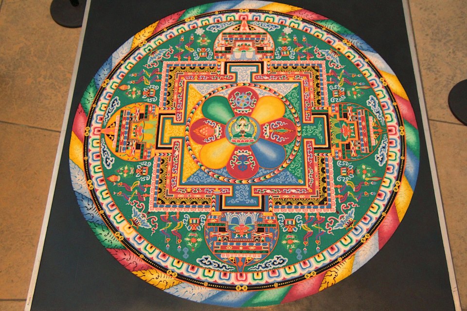
The Sacred City at The Blanton: Competing Ethics of Mandalas and Museums
Submitted by Calliope on Wed, 2013-01-23 16:22
Image Credit: http://hyperallergic.tumblr.com About a week and a half ago I made a spur of the moment trip to The Blanton Museum of Art for the closing ceremony of "Into the Sacred City," a recent exhibit on Tibetan religious art. The day's program included the erasure of a five-foot sand mandala which a group of Buddhist monks had spent five days creating in the museum's main atrium. For those of you who aren't familiar with this colorful ritual practice, sand mandalas are intricate circular designs which can represent, variously, the universe, the interworkings of the mind, or even the palacial dwellings of deities. In Tibetan practice, when the pattern is complete the sands are swept together and dispersed in a stream or river. The monks who created the mandala at The Blanton (above) followed this ancient tradition, blurring the completed design with a few strokes of a brush before hundreds of mesmerized spectators (see image below). Though I braved the long lines and made it into the exhibit, I actually did not get to witness the destruction of the mandala. My view was blocked by the massive crowd that turned out for the occasion. But what I could see, and consequently what I began to think about, was the setting of this creative act, or its context. I began to wonder about the place of religious practice in secular institutions and how the ethos of the space affects the gravity of the ritual. I also reflected on the irony of staging the impermanence of art, through its construction and subsequent deconstruction, in the very church of preservation: the museum.
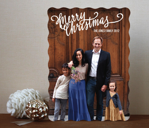
Presenting the Family: A Holiday Ritual
Submitted by Calliope on Fri, 2012-12-07 12:31
Image Credit: minted.com Choosing a holiday card is apparently a big deal. I was not aware of this until my sister (married with two children) called me in distress over designing her card. As we talked and I pressed her to explain how this could possibly be stressful, I learned that the tradition of sending out greeting cards around the holidays isn't just about spreading good cheer. The rise of the photocard has made holiday salutations into an important opportunity for families to make a positive visual impression on friends and relatives. This surprised me a little because I had naively assumed the intent was to express one's hot-cocoa-induced feelings for the cards' recipients. But considering that media today is increasingly social, targeted, and customizable, the practice of creating a visual brand for one's family and sharing it with others should come as no surprise at all. Bel Geddes, Brasilia, and Cities from the Air
Submitted by Calliope on Fri, 2012-11-30 12:17
Image Credit: The Harry Ransom Center Norman Bel Geddes, Airliner #4 rendering, ca. 1929-1932 Touring the Harry Ransom Center's Norman Bel Geddes exhibit a few weeks ago, my fellow viz. staffers and I were struck by how many of the designer's projects never made it past the drawing board. Bel Geddes' sketches of giant, amphibious aircrafts (see "Airliner #4" above) are prime examples of the far-fetched schemes his studio was hatching in the 30s alongside commercially viable designs, like this handsome pair of seltzer bottles featured in an earlier post. But, as other viz. contributers this week have remarked, articulating what is not and will never be seems like an inevitable part of a theorizing and designing the future. It certainly makes strolling through the Ransom Center's "I Have Seen the Future" exhibit feel like a trip into a delightful, hybrid world of fiction and history. Geddes' plans for airborne commercial and recreational spaces (the 451 passengers aboard the flying machine, above, would have access to a gymnasium and a full orchestra) interest me because they present a counterpoint to the "auto-centric America" with which Geddes' work is usually associated. It's likely that Geddes' designs influenced both American aviation and automotive systems, but for an untrained industrial designer like Geddes, the first of these frontiers must have seemed significantly more difficult to modernize, if only from an engineering standpoint. The challenge of hoisting into the air a full spectrum of modern amenities makes Geddes' airplanes look almost cartoonish. Yet, when we recall that the horizon of space travel was not so far off, Geddes' airliners look less dream-like than before. Colorful Geographies of Beliefs
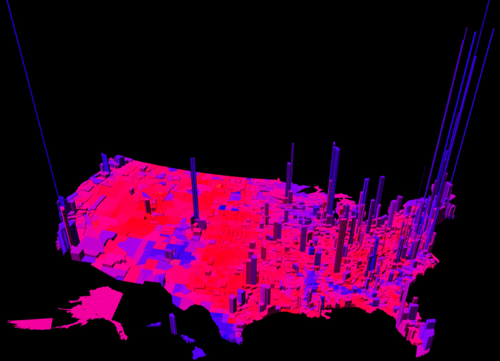
Submitted by Calliope on Fri, 2012-11-16 14:31
Image Credit: MIT Technology Review This electoral map, created by Princeton mathematician Robert J. Vanderbei, uses a spectrum of colors between blue and red to represent the ratio per county of Democrat to Republican votes. The height of the verticals indicate the number of votes in each county. Vanderbei's representation of the U.S. votes by region accounts for nuances in the data that other red-and-blue-state maps miss: the political dividedness of certain counties, the intensity of partisanship in others, and centers of strong voter turn out. From a visual standpoint, the map is eye-catching because it is purple. Purple is not a color usually associated with political belief. But other data crunchers, looking to complicate our picture of national voting trends, have unveiled maps this year with a similar palette. See my fellow viz. contributer Chris Ortiz y Prentice's post for an electoral map that also reveals (through pointillism instead of 3-dimensional modelling) the nation's purplish complexion. It might be mere coincidence that Chris and I both decided to write about visualizing ideological regionalism; but it's possible that our posts register an increasing need to redraw and redefine assumptions about voter demographics. That said, I'll leave the actual work of redefinition up to political analysts and turn to the far more obscure aims of this entry: to discuss the rhetorical role of color in images that chart belief systems and controversial policies.
The Pedagogical and Aesthetic Possibilities of Crowdsourced Films
Submitted by Calliope on Thu, 2012-11-08 19:26
Image Credit: RoseVallentine I teach a class about the new rhetoric of internet commerce. I have my students write a standard rhetorical analysis paper around the middle of the term, and for their primary texts I ask them to use the digital marketing materials of dotcoms. Of all the paper genres I assign (expository, persuasive, etc.) rhetorical analysis is generally my favorite. I prefer these papers because I'm a literary critic, and rhetorical analyses are essentially close readings that use a standard rhetorical methodology. But there's another reason I especially enjoyed reading my students' analysis papers this semester: they introduced me to several fantastic websites that I didn't know about before. I feel compelled to share one of these sites with viz. readers because of its novel interventions in visual culture. (And I want to thank my student, who I will refrain from naming, for the great find!). The company is called hitRECord, an open, online platform for collaborative filmmaking and other artistic expression. For the Love of SF
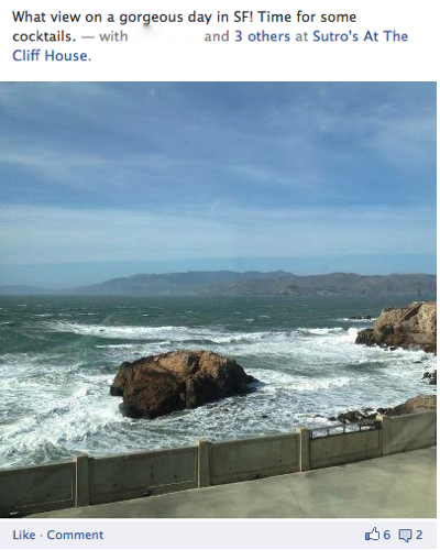
Submitted by Calliope on Fri, 2012-11-02 13:41
Image Credit: Facebook.com About half of my Facebook friends live in the SF Bay Area, and out of everyone they are by far the most active posters. They're constantly touting political views, promoting their startups, recommending good reads, and most of all reminding everyone through pictures and status updates that they live in the "best" city in the country (Businessweek made it official with their city rankings for 2012). As a former resident of SF who once drank the Kool-Aid, it's hard not to sound bitter and hypocritical about the locals' enthusiasm. Who knows, maybe instead of Kool-aid, now I'm just sucking on sour grapes. Let me be clear: there's no reason why San Franciscans shouldn't love there city. It is indisputably one of the most beautiful urban centers in the country. Pastel-colored buildings decorate its famous hills, which look out over the Pacific ocean and the wrap-around bay. And it boasts world-class universities, progressive politics, and vibrant international communities, all of which attract a distinctly intellectual, liberal, and enterprising kind of person. Like I said, it makes perfect sense that SF residents love their city, and that they would want to share this pride through social media. Most of the time I’m grateful for their posts because they offer me a way to vicariously experience the beautiful and eclectic place where I came of age. But the pictures also consistently make me laugh, and I confess they increasingly make me groan. This post will explore why that is. Tags:
Halloween, People Watching, and Fashion
Submitted by Calliope on Thu, 2012-10-25 10:49
Image Credit: Halloweenorwilliamsburg.com Halloween season put me in mind of the hipster-bashing tumblr Halloween or Williamsburg that emerged around this time last year. The microblog features crowd-sourced photos of people in Williamsburg, Brooklyn, whose over-the-top fashion choices cause daily confusion about whether or not it is Halloween. The website’s wittily-captioned parade of fools is relentlessly funny, though it inevitably delivers a slightly skewed version of reality. (I've never been to Williamsburg, but I imagine not every resident reaches for the costume box when they get dressed every morning.) But that’s partly why the site offers such a satisfying experience. Scrolling through its photo logs is like going people watching and seeing only the “gems.” It’s like a walk down Telegraph Avenue sans the drab-looking Cal students. Visualizing Missed Connections
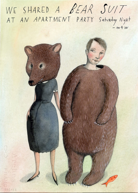
Submitted by Calliope on Thu, 2012-10-18 19:46
Image Credit: Sophie Blackall via Flavorwire.com Some "missed connections" ads have a life beyond Craigslist. Though only a small fraction may lead to actual rendezvous, dozens have found their way into the imagination of book illustrator Sophie Blackall, who published a collection of watercolor interpretations of these ads called Missed Connections: Love, Lost and Found (2011). Blackall's paintings imaginatively visualize the encounters that inspire people to write these heartfelt epistles on missed connection pages (the Internet's version of the proverbial bathroom wall). Her designs have been called "heartbreaking" and "comical" , "wonderful" and "whimsical" , and her book was featured on Oprah's website--a testament to its popular appeal. Presumably, Blackall's illustrations made a splash because they incorporate a delightful mix of the real and the ideal, yoking artifacts of modern life to images of pure fantasy in a style reminiscent of Blackall's artwork for children. |
|


Recent comments
2 years 29 weeks ago
2 years 44 weeks ago
2 years 44 weeks ago
2 years 50 weeks ago
3 years 4 weeks ago
3 years 4 weeks ago
3 years 4 weeks ago
3 years 6 weeks ago
3 years 6 weeks ago
3 years 6 weeks ago