viz.
Visual Rhetoric - Visual Culture - Pedagogy
Site informationRecent Blog Posts
|
Reply to commentColorful Geographies of Beliefs
Submitted by Calliope on Fri, 2012-11-16 14:31
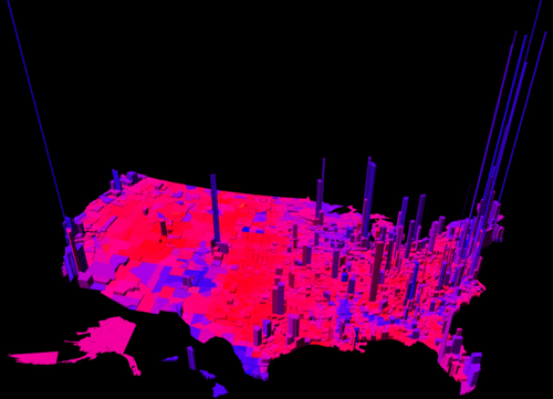
Image Credit: MIT Technology Review This electoral map, created by Princeton mathematician Robert J. Vanderbei, uses a spectrum of colors between blue and red to represent the ratio per county of Democrat to Republican votes. The height of the verticals indicate the number of votes in each county. Vanderbei's representation of the U.S. votes by region accounts for nuances in the data that other red-and-blue-state maps miss: the political dividedness of certain counties, the intensity of partisanship in others, and centers of strong voter turn out. From a visual standpoint, the map is eye-catching because it is purple. Purple is not a color usually associated with political belief. But other data crunchers, looking to complicate our picture of national voting trends, have unveiled maps this year with a similar palette. See my fellow viz. contributer Chris Ortiz y Prentice's post for an electoral map that also reveals (through pointillism instead of 3-dimensional modelling) the nation's purplish complexion. It might be mere coincidence that Chris and I both decided to write about visualizing ideological regionalism; but it's possible that our posts register an increasing need to redraw and redefine assumptions about voter demographics. That said, I'll leave the actual work of redefinition up to political analysts and turn to the far more obscure aims of this entry: to discuss the rhetorical role of color in images that chart belief systems and controversial policies. The distribution of color in Vanderbei's map implies that political allegiances are not as ubiquitous in some regions--like the South and Midwest--as one might suspect. It even gives the impression (which may be misguided) that Americans are politically moderate, since variegation in color usually expresses in-betweeness instead of extremes. But let's talk about the map's predominant hue for a moment. Purple is not a color that Republicans, Democrats, or Greens, for that matter, would claim, probably because it doesn't have any patriotic or environmental associations. The main things that come to my mind when I think of purple are grape juice, Lisa Frank, and Skittles. I also have the unreasonable expectation that anyone who is wearing a purple shirt should be friendly and easy to approach. I'm pretty sure that everyone has their own set of responses to this and other colors--some responses may be arbitrary or psychological, and some culturally-determined. And yet we rely on colors to codify politically important groups and ideologies. The fact that colors have both a particular and universal significance for most people is what makes assigning them to maps like Vanderbei's a rhetorically interesting (and potentially dicey) practice.
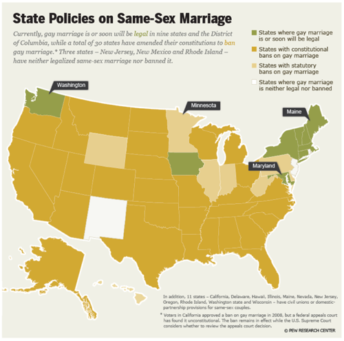
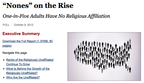
Image Credit: The Pew Forum I looked at some graphics by the Pew Research Center for its project on Religion and Public Life to see which colors are presently being applied to other sensitive attitudes and beliefs. The creators of the chart above, which explains current state policies on gay marriage, chose an earthy palette of green, yellow, tan and white to represent the four main legal positions: states that allow it, states with constitutional bans, states with statutory bans, and those with no legal stance. It's conceivable why green was chosen to mark the states that have or will shortly legalize gay marriage. Green is typically the color of environmentally-friendly and/or socially-conscious causes and gay rights is an issue that fits with this progressive platform. It's interesting that the none of the other colors are linked to political parties, though. The color used to denote the most restrictive of the four positions (states with constitutional bans on gay marriage) is a sallow yellow shade. Conscious color choice? You decide. The think tank's news story about the rising number of Americans who do not identify with any religion is striking for its lack of color. The article includes illustrations and graphs (one depicts the ratio of religious to non-religious individuals in the U.S. with a map-shaped group of gray and black figures) but they are all monochromatic and colorless. Does the term that the editors use to refer to this growing group--the 'nones'--necessitate such a color scheme? I wonder if non-religious people identify with the possible valences of this term and the corresponding color coding (anonymity, absence, indefiniteness)?
Image Credit: The Pew Forum
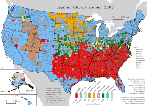
Image Credit: The Pew Forum Lastly, we have one of the only sources I found floating around on the Internet that specifies which Christian denomination has the leading number of adherents in each U.S. county. (The map was updated in 2010, but I couldn't access it for free online). I'm taken by this map because of the way it differs from the one at the beginning of the blog post. The people who built this visualization opted to portray the adherents of each religion as unified and undifferentiated by using flat colors. And the data they collected indicates that most churches hold sway in contained areas of the map--the Baptists in the South, Lutherans in the midwest, and Mormons in and surrounding Utah. Interestingly, the map-makers assigned the two most dominant church bodies, the Baptist and Catholic religions, colors that correspond to the main U.S. political parties. It's worth reflecting whether one can look at a map like this without seeing the color-coded territories as translating to votes for liberal and conservative candidates.
Image Credit: valpo.edu ReplyYour contribution to the blog: Please Read Before PostingThe viz. blog is a forum for exploring the visual through identifying the connections between theory, rhetorical practice, popular culture, and the classroom. Keeping with this mission, comments on the blog should further discussion in the viz. community by extending (or critiquing) existing analysis, adding new analysis, providing interesting and relevant examples, or by making connections between that topic and theory, rhetoric, culture, or pedagogy. Trolling, spam, and any other messages not related to this purpose will be deleted immediately. Comments by anonymous users will be added to a moderation queue and examined for their relevance before publication. Authenticated users may post comments without moderation, but if those comments do not fit the above description they may be deleted. |
|

Recent comments
2 years 29 weeks ago
2 years 44 weeks ago
2 years 44 weeks ago
2 years 50 weeks ago
3 years 4 weeks ago
3 years 4 weeks ago
3 years 4 weeks ago
3 years 6 weeks ago
3 years 6 weeks ago
3 years 6 weeks ago