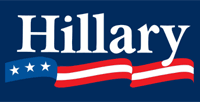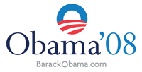

As the Democratic primaries have continued on throughout the winter, columnists and pundits have been reaching out to find ever more ways of distinguishing between Obama and Clinton. Salon has posted an article analyzing the design of the candidate’s logos, while Clay Spinuzzi has blogged on the contrasting designs of Obama and Clinton campaign flyers being distributed in Texas (without any images, unfortunately).
In both cases, Obama is declared the temporary winner. According to Karrie Jacobs in Salon
Of the current campaigns, Barack Obama’s is the best at getting his message across through graphics—think of all those “Change we can believe in” signs—and most careful observers see his as the first sophisticated corporate-style identity to emerge from presidential politics. While the Bush-Cheney W was, in Froelich’s words, “cold,” Obama's symbol is the opposite, literally and figuratively sunny. While the W was crude, Obama’s mark is smooth.
Spinuzzi claims that Obama’s flyer seems more detailed, noting that
the Obama flyer appears customized for Texas from the ground up, while the Clinton flyer seems more generic.
While politics have always depended in some way on visuals for their persuasiveness, it is refreshing that this visual persuasion is getting this kind of attention from the media.
Recent comments
2 years 29 weeks ago
2 years 44 weeks ago
2 years 44 weeks ago
2 years 50 weeks ago
3 years 4 weeks ago
3 years 4 weeks ago
3 years 4 weeks ago
3 years 6 weeks ago
3 years 6 weeks ago
3 years 6 weeks ago