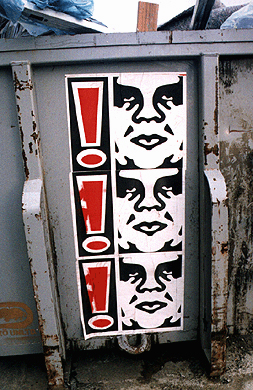
I remember when I used to live in Portland in the late 90s, and I would see these stickers of Andre the Giant in all the bus stops. I never knew what they meant, but I liked them well enough to peel one off a bus stop wall and stick it on my bike.

I discovered several years later that the artist behind the "André the Giant Has a Posse" sticker campaign is Shepherd Fairey , which he created while attending the Rhode Island School of Design (RISD) in 1989. The "André the Giant Has a Posse" sticker campaign later evolved into the "Obey Giant" campaign.
We looked at this image in my class today, and I casually asked them, "What is the rhetorical effect of a visual image if you can't identify the argument - or even the claim?" While my initial answer to this question would be that the visual must not be very effective at all, upon further consideration, this absolutely can't be the case. Visual images are frequently coupled with arguments to which they have no direct relationship in order to sell products or catch the attention of the public. But what I find fascinating about Shepherd's work is that there is often no discernible argument at all, unless you are already familiar with his work and his viewpoints. So what *is* the rhetorical effect? Shepherd himself describes his current work as "[an attempt] to stimulate curiosity and bring people to question both the campaign and their relationship to their surroundings. Because people are not used to seeing advertisements or propaghanda for which the motive is not obvious, frequent and novel encounters with Obey propaganda provoke thought and possible frustration, nevertheless revitalizing the viewer's perception and attention to detail." And people seem to love it.
Recent comments
2 years 29 weeks ago
2 years 44 weeks ago
2 years 44 weeks ago
2 years 50 weeks ago
3 years 4 weeks ago
3 years 4 weeks ago
3 years 4 weeks ago
3 years 6 weeks ago
3 years 6 weeks ago
3 years 6 weeks ago