Image via BGC DML
By Scott Garbacz
Note for Instructors and Students: This is not a lesson plan as such, but rather a non-comprehensive “tool box” of tricks and techniques you can use to make memorable, comprehensible, and above all interesting visual presentations. I am also aiming at some basic, easy-to-implement strategies aimed at academic purposes. Click here for a primer on more elements of Prezi design. On the other hand, if you’re just wanting the very basics of Prezi, their official introduction to the service may be helpful.
What is Prezi?:
For those who don’t know what it is, Prezi is a web-native descendent of the popular PowerPoint presentation software. Like Powerpoint, you create slides that include images and texts (but no animations, alas), and progress from one slide to another. Unlike PowerPoint, however, Prezi has a number of unique features:
- All your slides are laid out in a virtual space, which means that you can visualize the relationship between ideas, and let your audience see the shape of your entire argument at a glance.
- In order to accomplish this, Prezi introduces the concept of frames. A frame is essentially just a place where the camera stops for a while, similar to a single slide in PowerPoint. There can be visible frames (which look quite a bit like PowerPoint slides) or invisible frames (which are essentially nothing more or less than a place for the camera to stop.)
- Prezi is available online, which allows for collaboration. Plus, students don’t need to remember to bring physical copies of their presentations, or email them.
- Prezi is free (for basic uses) and cross-platform. Students can use it on a Macbook, a Chromebook, a PC, a Linux box, or even a public computer without paying a dime.

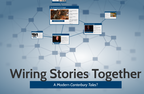
The opening invisible frame for a Prezi used for a class demonstration. Note that all or part of five visible frames are also visible. Prezi credit: Scott Garbacz
The Dangers of Prezi:
First of all, it is important to remember why you should not use Prezi, or, for that matter, any powerpoint-style presentation. Objections to machine-assisted lectures are many, and should not be overlooked. In fact, I highly recommend that any future presenter reads this PowerPoint-style presentation on the Horrors of Powerpoint. At the very least, remember a few quick rules of thumb:
- Never read text that is on a PowerPoint slide. Let it aid your presentation, not replace it.
- Everything should be comprehensible and easy to read—complex illegible diagrams are worse than useless.
- Don’t become addicted to fancy transitions. In the case of Prezi, this means that you should be very careful about when you spin the camera. Don’t cause sea-sickness.
Tools:
1) Visual Organization of Ideas. In a Powerpoint, you march from idea to idea to idea, in one long stream of thoughts. The media gives no sense of progress; slide replaces slide until finally the presentation ends. Prezi presentations, on the other hand, often open with a bird’s-eye-view of the entire argument. Let’s look at a few shapes those views can take:
- Linear Presentation of Ideas. . Even if you only present one slide after another, showing your viewers what slides to expect lets them get an idea about how long the presentation is, and where they are in the argument. Remember, you want it easy for your audience to recognize where they are in your outline, so they can understand when they’ve moved from the introduction, to the midpoint, to the conclusion. Naturally, this can be combined (as Laura does below) with other modes of organization.

Readers can see that there are six main topics to be covered in order, though they also see that most major visible frames (the circles) contain two smaller frames within them. Prezi credit: Laura Thain.
- Multi-stranded Argument. Let’s look back at the Prezi in the "what is a Prezi" section. Immediately, my audience can see that I have three major slides (these will be introductions to three characters from The Wire) and three minor slides (these will discuss the stories that each of these representative characters tell.) My outline primes my reader to expect this organization, making the presentation much less wearisome for them to follow.
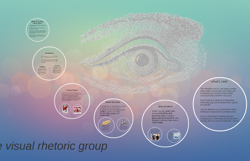
- “Zooming In” on Miniature slides. As you can see in the Visual Rhetoric Group Prezi, you can also nest slides within slides. Generally, it’s useful to have a consistent reason to do this: the slides within slides might represent “smaller” points or details, or they might show local examples of a larger issue.
- Hiding Slides in Images Some of my most successful presentations involve images, rather than premade themes, as my organizing principle. One advantage of Prezi is that you can focus on different aspects of a single image while ensuring that your audience is able to follow your movements. But you can also “hide” a slide within an image, by making it tiny. These slides can serve to illustrate points associated with

Prezi credit: Scott Garbacz
In the case, I wanted students to be able to compare two maps side-by-side, particularly looking at the parallel way that religious and secular quotations were used to justify Empire. By using a Prezi and invisible frames, I was able to highlight different areas of the images while reminding students of the "big picture" comparison between the two. I was also able to make a visual argument when I zoomed out from these maps, revealing a final, larger map that showed the largest extent of the British Empire. Even though this Prezi featured very few words (either captions or map inscriptions), it was able to provide a visual correlary to the outline for my day's lecture.
2) Visual Jokes and Play
- With quick transitions, you can actually have Prezi tell jokes for you (and every presentation is better with appropriate jokes.) I had a great audience reaction when I turned to the medieval “wheel of fortune,” then spun the camera: the King was suddenly at the bottom of Fortune’s Wheel, and the peasant at the top, in tribute to the destabilizing power of rhetorical eloquence. Similarly, what might happen if you set up an invisible
3) Blockquotes as Items
- I like to ensure that my blockquotes include either more or less text than I will read, and are the only items on a slide. That way, they function like a handout—as reference material for my audience to follow along. Again, however, I work hard to not read text from the screen any more than is necessary.
4) Cannibalize Themes
- There is a healthy medium between slavery to a fixed theme and building every visual element from scratch. Find out what in any given theme is editable, and play with it!
5) Adding Sound and Automation by Laura Thain
- Sounds, especially voiceover can be an very useful tool for adding interest, presenting remotely or giving your audience material to cover on their own. To add background music, simply click on the "Insert" option on the toolbar and select "Add Backgrounds Music." This music will play during your entire presentation.
- To add voiceover to your prezi, you first need to create an audio file for each slide. I use the simple tool GarageBand, although Audacity is a great free option for both Windows and Mac platforms, too. Make sure to save your file as one of prezi's supported file types: MP3, M4A, FLAC, WMA, WAV, OGG, AAC, MP4, or 3GP.
- After recording each track, attach it to the appropriate slide clicking on it in the pathway sidebar, selecting the "Insert" option, and clicking on "Add Voiceover to Path Step."
- For an example of a remote lecture, see my prezi on pathos appeals, which I made in response to one of many university weather cancellations this semester.
Recent comments
2 years 29 weeks ago
2 years 44 weeks ago
2 years 44 weeks ago
2 years 50 weeks ago
3 years 4 weeks ago
3 years 4 weeks ago
3 years 4 weeks ago
3 years 6 weeks ago
3 years 6 weeks ago
3 years 6 weeks ago