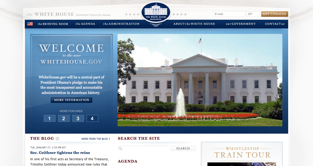
By now this is slightly old news, but in keeping with the previous post on Presidential photography, and because I thought it merited a mention here, I hope everyone has had a chance to check out the newly redesigned whitehouse.gov website:

Since President Obama's campaign had a reputation for design and branding savvy (much discussed on viz.), it's worth noting that the new website is similarly stylish and sleek: not surprising for a man hailed by some as the first "Digital President." Notably, the site retains layout and design elements similar to barackobama.com. Although so far there is no "Contribute Now" button, there is a form at the top of the home page where you can sign up for email updates. The main banner includes rotating photographs and "news" updates. There is also a new feature for the White House web site: a blog. In addition to all this, there is a fairly extensive "Agenda" page, much of the content of which seems to come straight from the "Issues" page of the campaign website.
All of this is in keeping with the usual hybrid function of the White House website to serve as campaign tool (never to early to start thinking about 2012), information portal, and cog in the message machine. But this design in particular seems to aim at a couple of President Obama's stated ambitions: to get people more involved in government and to open the workings of the executive branch to more transparency. It's interesting to think about how (and whether) this redesigned website helps achieve these aims. If I were teaching in rhetoric this semester, I would certainly consider designing an assignment around these questions.
Recent comments
2 years 29 weeks ago
2 years 44 weeks ago
2 years 44 weeks ago
2 years 50 weeks ago
3 years 4 weeks ago
3 years 4 weeks ago
3 years 4 weeks ago
3 years 6 weeks ago
3 years 6 weeks ago
3 years 6 weeks ago