Image Credit: Screenshot from The Atlantic
Every time I sit down to write a blog post for viz, I struggle not only to think up exciting titles but to find striking visuals to decorate my posts. As we all know, the picture that illustrates the story plays a role in helping to draw meaning from the text. The above picture from The Atlantic shows a good relationship between the two: the sign in the foreground looms ominously over the house to stress the anxious idea implied by the headline “Foreclosure Sales Trap.” However, there are times when the visuals work to imply something that the text doesn’t warrant.
Recently, my friend Jillian Sayre drew my attention to a tweet from Rachel Maddow about a story on Politico:
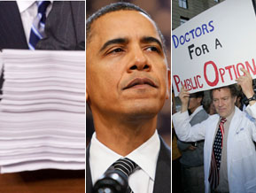
Obama health proposal is 11 pages long. Politico story on it uses a photo of a 12 inch tall stack of paper.
When you pull up the story on Politico, entitled “President Obama releases health reform proposal,” the image that decorates the side is a triptych where Obama is at the center, on the right side you have a doctor holding up a sign advocating “Doctors for a Public Option,” and on the left you have a picture of a large stack of papers, meant to signify the bill. However, the article directly links to the 11 page proposal at the top of the screen—why would Politico deliberately use that stack of paper to illustrate the idea of the “health reform proposal,” especially if they’re providing the proposal for their audience to read? This may be a part of telling a larger narrative about government: that it’s complicated, the bills are too long, and readers need news organizations like Politico to fill in the gaps.

Image Credit: Politico
H/T: Jillian Sayre
However, as Tristram Shandy points out, sometimes the visual is meant to stand in for the text, to say what the text cannot say. In the case of the Politico story, the gap in meaning might be a political message that the picture implies. In Betsy McCaughey’s interview on The Daily Show with Jon Stewart, she brought a copy of the health care bill in a binder to use the visual of the bill to condemn it, just as her significant glances at the camera were meant to reflect to the audience the skepticism and doubt of Washington that she seemed to feel. Too bad her answers to Stewart’s questions were less than convincing.
In thinking about this topic, however, I found an interesting study done in The Atlantic Journal of Communication that sought “to examine the effects of news photo presence and role-congruency in news stories of Hillary Clinton on reader interest and memory.” Its conclusion, according to the abstract, was that “mere presence of a photo meant the story would be ranked as more interesting, but photo presence and role-congruency with the story did not affect recall of story ideas.” While visuals do have the power to make arguments, authors Andrew Mendelson and Esther Thorson suggest, they don’t override an audience’s comprehension of the actual context of the text. Maybe, then, Maddow’s critical reading skills aren’t unique and Politico instead merely intended to draw attention more than make an argument. However, considering the effectiveness of visual arguments in many media, I wonder how readers might be influenced by such arguments, even as they separate them from the text, especially as those readers are receptive to those arguments before hearing them.
Recent comments
2 years 29 weeks ago
2 years 44 weeks ago
2 years 44 weeks ago
2 years 50 weeks ago
3 years 4 weeks ago
3 years 4 weeks ago
3 years 4 weeks ago
3 years 6 weeks ago
3 years 6 weeks ago
3 years 6 weeks ago