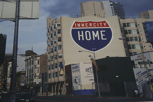
In my "Rhetoric if Protest" class today, I had my students watch We Are Traffic, a documentary directed by Ted White about the xerocratic protest group Critical Mass. This group relies on several key elements of visual rhetoric to both make their points within their local communities and to spread their ideologies nationally and internationally. I find these to be excellent classroom resources.
One way that Critical Mass spreads its message is through their flyer exchange . Each flyer offers a visual representation of how a particular Critical Mass community decided to present their ride - some are more informative, others are more political.
Also featured in the documentary is an artist by the name of Rigo23 , whose murals often take the form of street signs but impart drastically different messages by building eco-friendly meaning onto these pre-existing symbols. He explains (I'm paraphrasing here) that as a pedestrian and biker he found roadway symbols to be nonsensical (he uses the example of the one way street, which only seems to apply to cars) yet if one disobeys these symbols the result can be a city fine or even injury. His protest murals bring attention to the signs themselves, the meanings (or arguments) that we already attribute, and then add another layer of meaning. I found them to be one of the more interesting aspects of the documentary.
Recent comments
2 years 29 weeks ago
2 years 44 weeks ago
2 years 44 weeks ago
2 years 50 weeks ago
3 years 4 weeks ago
3 years 4 weeks ago
3 years 4 weeks ago
3 years 6 weeks ago
3 years 6 weeks ago
3 years 6 weeks ago