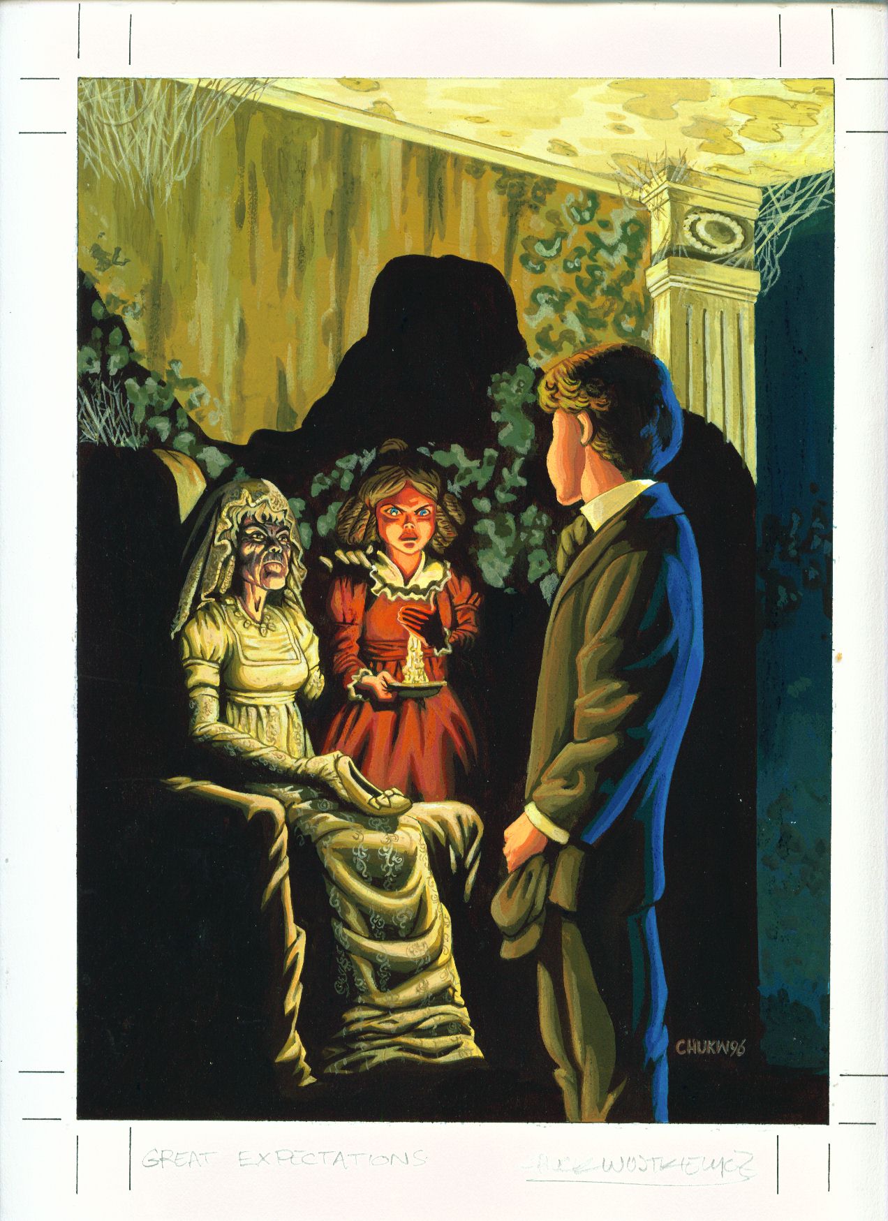
Original cover art for Illustrated Classics Acclaim Edition by Chuck Wojtkiewicz
Image: sonicdan.com
Quick—how do you sell kids on a hundred-and-fifty-year old novel that’s about (among other things) a middle-aged man’s pained reflections on class identity and snobbery, confrontational gender politics, and criminal law reform? If you answered, “Why, turn it into a comic book, of course,” congratulations—you may go to the head of the class. Great Expectations seems the most unlikely of Dickens’s novels to create in comic book form—in fact, it’s one of only two novels Dickens did not commission illustrations for, suggesting that even the Inimitable was skeptical of its visual appeal (Hard Times is the other). Yet comic book versions of the text have flourished since the 1940’s. To join in the early celebrations of Charles Dickens’s bicentennial (and in honor of yet another film adaptation), this week I’d like to discuss some images in the book’s transformation from adult novel to children’s text.
Full disclosure: I’m a would-be Dickens scholar, as well as a long-term Dickens fan, but the inherent popularity of Great Expectations continues to surprise me—it was once again voted readers’ favorite over at The Guardian. Don’t get me wrong. It’s not that the novel isn’t fantastic, and despite my theoretical summary above, full of action, what with all the convicts, evil doubles, cracked old women, sinister lawyers, and femme fatales stuffed into the plot. But it’s also a mellow slice of late Dickens, and Pip’s outrage and embarrassment over his youthful behavior is a hard sell for most teens forced to read it in school (what fourteen-year-old cares about their priggishness?). The nightmarishly carnivalesque street-life of Oliver Twist or the turns of luminescent comedy and tear-jerking melodrama in David Copperfield I find (and found) far more congenial avenues into Dickens’s work.
Of course I say that, but Great Expectations was the first Dickens novel I read, probably around six or seven, in the edition below:
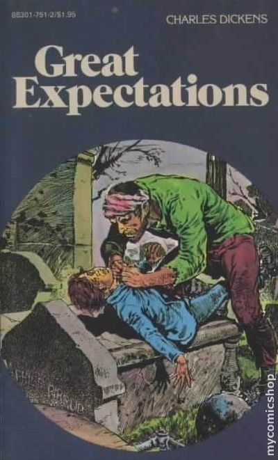
Image: mycomicshop.com
The low-rent gnarliness of that cover has stayed with me a long time. It’s a splendid gothic scene that’s reminiscent of those great EC Comics covers from the 1950’s with the lurid greens and blues against the mouldering gray of the cemetery. The lifeless colors of the outside world focus the attention on terrified child and his attacker. The suggestion of sexualized violence is a bit weird considering the target audience of these books was boys from 8-13, though there are traces of sexual violence all over the story. (I wonder if Peter Carey, whose version of the novel, Jack Maggs, makes good but explicit use of male-male sexual practices, ever stumbled upon this cover?) All the same, the cover certainly piqued my juvenile interest and provided my first taste of one of the great, if not the greatest, novelists of all time.
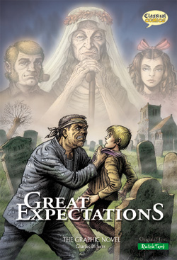
Image: comicbitsonline.com
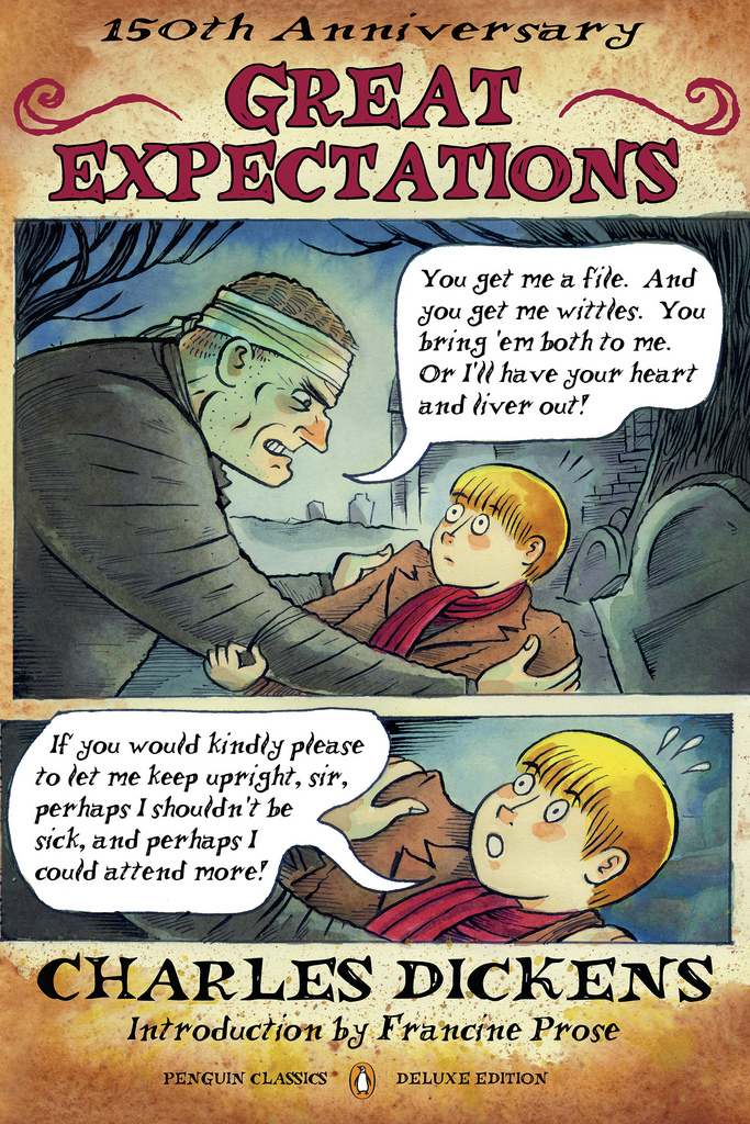
Image: robot6.comicbookresources.com
This first encounter between Magwitch and Pip has proven to be a durable entry point for illustrators of the novel (in whatever version). It makes perfect sense, as it entices younger readers to find out what’s going on in the text without alienating older audiences. Above, both the British Classical Comics graphic novel and the Penguin Deluxe Edition have chosen to feature it. I quite like the way that the Penguin, in otherwise a quite nice reprint of the full novel, emphasizes the comic-strip nature of the scene through paneling and word bubbles; something that the other versions—most of them actual comic books—don’t do. There are ironies to market production….
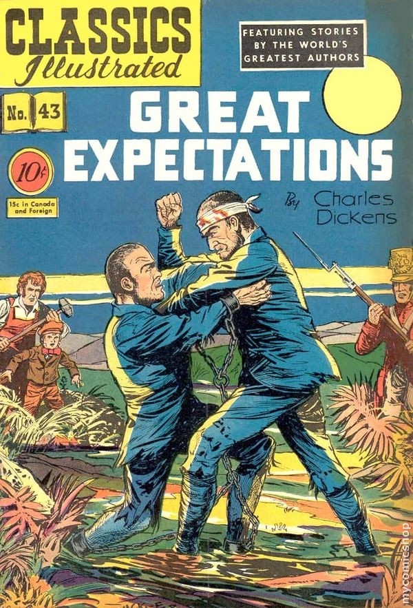
Image: mycomicshop.com
The original 1945 Classics Illustrated cover, featured above, provides probably the most strongly gendered cover I’ve seen, as two ragged-but-manly men struggle in the mud, a far cry from the desperate starving Magwitch and Compeyson of the text. I do like how the margins of the cover are also enticingly filled with potentially violent figures: on the right, a somewhat crazy-eyed soldier with gun in hand; on the left, gentle Joe swings his blacksmith’s hammer with a bit of bloodlust on his face. What right-thinking boy—be he British or American—could resist such strong appeals to his masculinity?
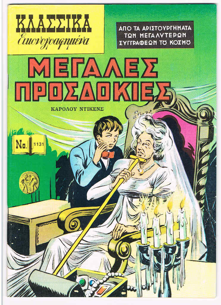
Image: classicscentral.com
I’d like to conclude, though, by looking at two less-gendered but perhaps more strange images. Above is the Greek cover for the Classics Illustrated edition, which features an obviously post-inheritance Pip (notice the classy bow tie) whispering conspiratorially into Miss Havisham’s ear. Without dramatizing a specific scene in the novel (at least not one I can identify at the moment—any thoughts, fellow Dickensians?) this strange image manages to nail the gothic circulation of secrets in the novel. There’s a cumulative and weird power to it, with its literalization of wealth in the form of treasure and the sinister looks on the faces of Miss Havisham and Pip. By making Pip, even unintentionally, look like a villain, this image captures in a seemingly offhand way the complex narratorial work of the novel in which Pip is one of the villains of the text: the polite country boy turned decadent prig.
Finally, the haunting image this post leads with captures the gothic strands of the text. Miss Havisham’s face is distorted mask, as much animal rage as human skull. Estella’s central positioning as the object of Pip’s gaze, as well as our own, duplicates her role in the text. Her look of disdain and barely-controlled anger quickly reveals the nature of this love triangle (and the obvious pleasure the artist has taken in making her look so beautiful and nasty—probably unintentionally—replicates the real misogyny in the text). Behind everyone looms the shadow of Magwitch, whose life is intricately bound together with all these characters, though we don’t know it. But what I like best is the depiction of Pip, a faceless screen for the reader. After all, he is a sort of everyboy, and this image encourages to identify with him and to become him, just as the text of the novel also encourages that identification. Brilliantly reflecting the depths of the novel as well as its surface, this image suggests that, after all, Great Expectations’ surprising visual popularity is warranted.
Recent comments
2 years 29 weeks ago
2 years 44 weeks ago
2 years 44 weeks ago
2 years 50 weeks ago
3 years 4 weeks ago
3 years 4 weeks ago
3 years 4 weeks ago
3 years 6 weeks ago
3 years 6 weeks ago
3 years 6 weeks ago