Like many of you, I am still mourning the loss of “Breaking Bad.” I’m not going to spoil it for you. So whether you’re one episode in, zero episodes in, or on the verge of completion…read on without trepidation. Also, this is going to be the first of two posts on our dearly departed “B.B.,” because I’m just that into it right now.
One of the first things about “Breaking Bad” that hooked me (and I have a feeling many of its viewers) was that the desert landscape in the show was so overwhelmingly beautiful. Nothing I say will do it justice, or to cop the style of “B.B.”’s reigning poet W.W., one might say “New Mexico, what is this I see in your landscape of saguaros and meth labs that is beyond all compare?” So here, bask in the glow of your computer screen reflecting this image:
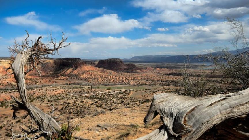
Image credit: pri.org
My experience with Westerns (films and regionalist fiction alike) is admittedly limited. My main touchstone for Western sensibilities is Willa Cather’s 1927 western novel, Death comes for the Archbishop. Set in the expanses of Santa Fe during the mid-nineteenth century, when New Mexico had just become a U.S. territory. As I watched "B.B."—I found myself deriving the usual sense of escapist and nostalgic pleasure I associate with regionalist novels. The nostalgic aesthetic is one the show has worked into an art like nothing on television has ever done before. Recall (or look for) scenes in Mexico shot in a heavily saturated tobacco filter (a move suggestive enough to offer material for its own post). The aesthetics of "B.B." are artfully rendered primarily through attention to color. As Vince Gilligan notes in an interview with GQ, there was a whole color scheme to portray the evolution of each character. Fans of infographics rejoice:
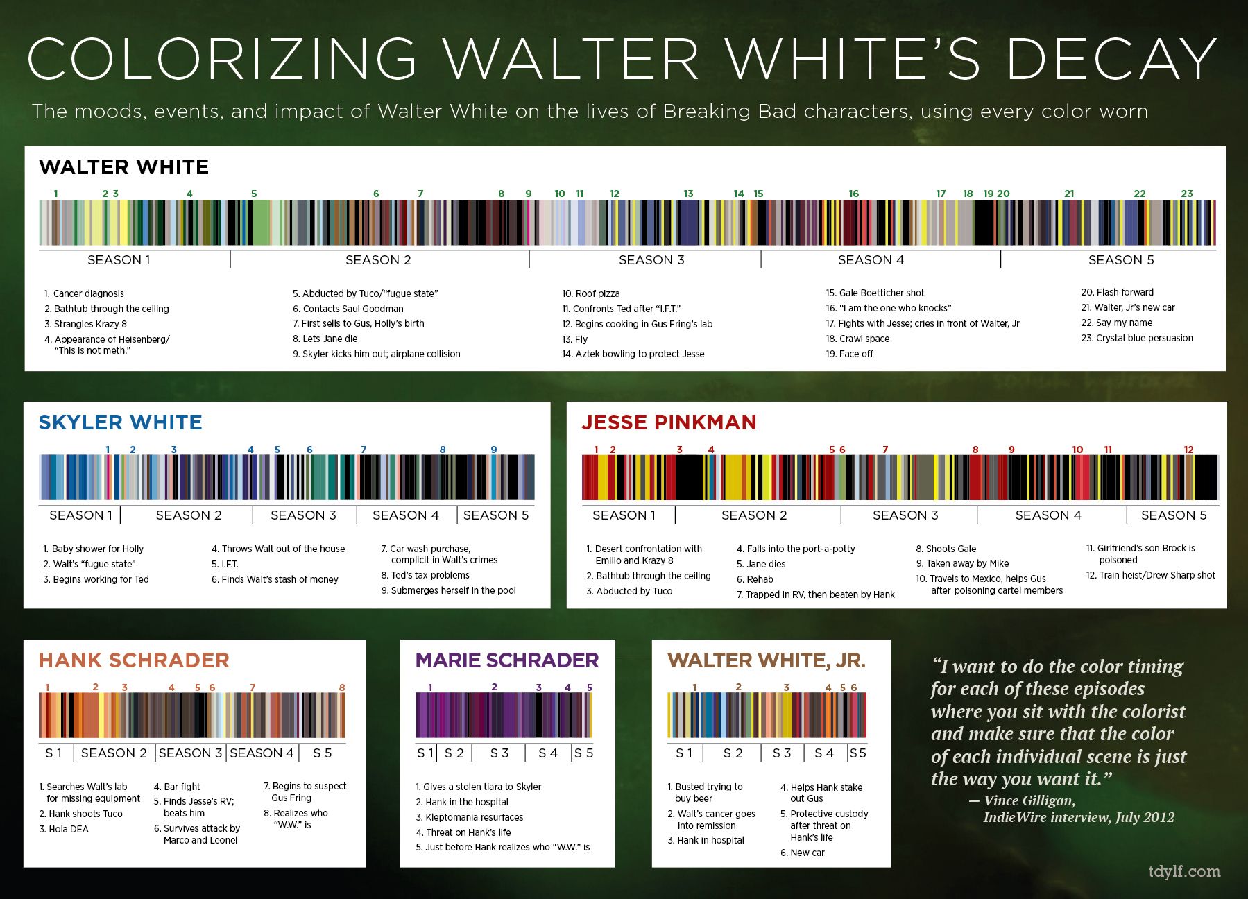
Image credit: GQ Magazine
From reading interviews with Vince Gilligan, I learned that the primo Westerns to start out with for understanding “B.B.” are Sergio Leone’s spaghetti Westerns (Westerns filmed by Sergio Leone in the 1960s, usually around Spain and Italy). The only one I’ve seen in this genre is The Good, The Bad, and The Ugly (1966) and perhaps I can fill the “Breaking Bad”-sized void in my heart by watching more. These Westerns looks so authentic in part because they’re set in the same Mediterranean climate. You could effectively trick an audience into believing any Mediterranean climate (from Southern Australia to central coastal Chile) was the “Wild West” for that matter.
But what makes this a uniquely 21st century Western is that the show reveals beauty in the mundane. Where Westerns of the '60s occasionally featured trains and saloons, “B.B.” features tacky strip malls, chain restaurants, a giant laundry processing facility, even the insides of a meth lab -- places that are beauteous because of their otherwise seemingly obvious lack of beauty.
What do we make of some of these scenes which tug at the heartstrings in the same way as the New Mexico desert? How troubling that places so polluted, or places so violent, can be so aesthetically pleasing. To that end, some of the shots from “B.B.” remind me of Richard Misrach’s work in Crimes and Splendors: The Desert Cantos of Richard Misrach (1987). Both draw the outlaw cowboy aesthetic of westerns to new conclusions that reflect the blending of our current cultural and geographic climate. From corporate crimes, to the collective effects of global warming, to the new school outlaws one finds in “Breaking Bad.”
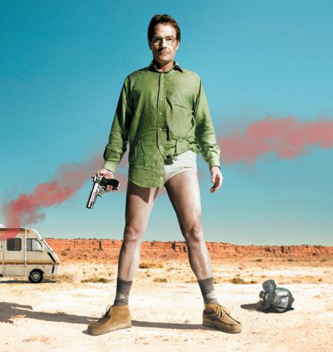
Image credit: nosebean.com
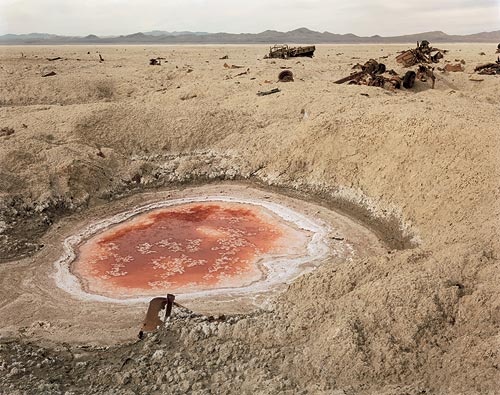
A scene from Misrach's book. Image credit: espaifotografic.cat
Once you have finished Breaking Bad, for your consideration I offer Emily Nussbaum’s piece from The New Yorker on the final episode, “Felina.” In my next post I’ll be in conversation with Nussbaum’s piece as I share my take of how the Western elements of the show and the backdrop of Santa Fe perfectly fit the hotly contested conclusion of “B.B.” Also, fair warning that that this next post will contain some necessary spoilers. (Don’t worry “B.B.” latecomers, I’ll insert a page break to preserve the sanctity of your viewing pleasure).


Recent comments
2 years 29 weeks ago
2 years 44 weeks ago
2 years 44 weeks ago
2 years 50 weeks ago
3 years 4 weeks ago
3 years 4 weeks ago
3 years 4 weeks ago
3 years 6 weeks ago
3 years 6 weeks ago
3 years 6 weeks ago