viz.
Visual Rhetoric - Visual Culture - Pedagogy
Site informationRecent Blog Posts
|
Reply to commentThe 12 States of America
Submitted by ladysquires on Thu, 2011-03-17 09:00
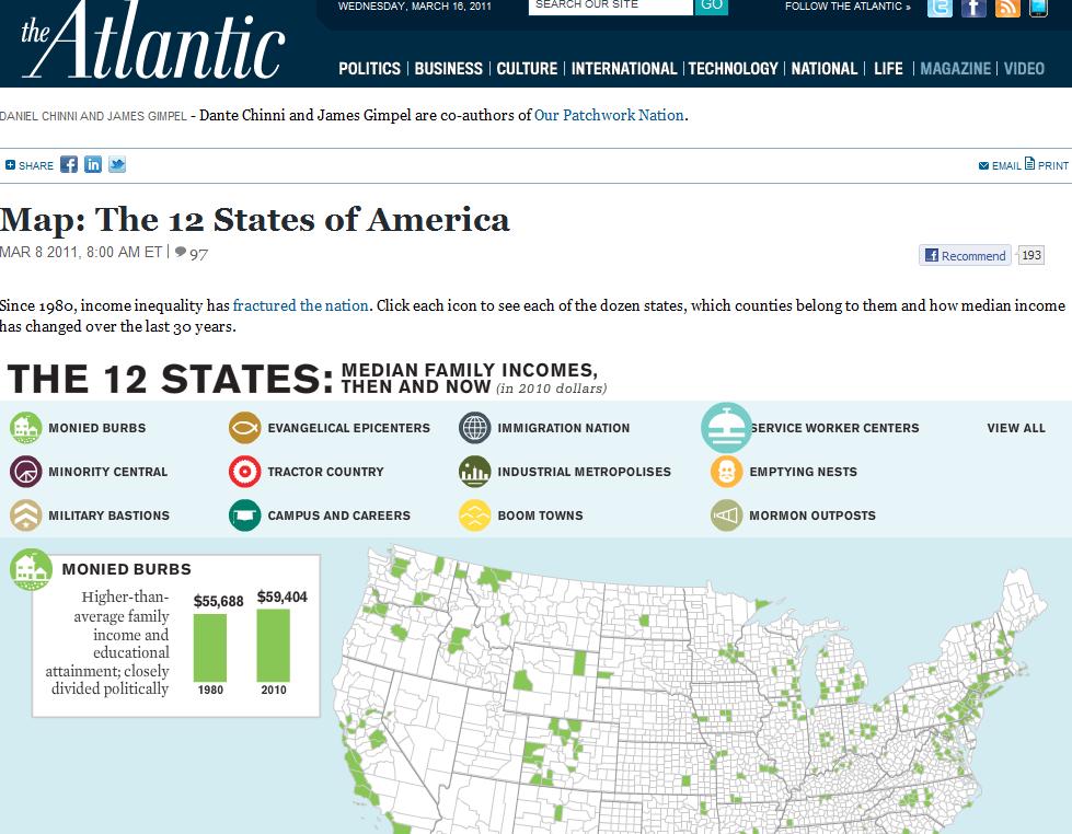
(Image Credit: The Atlantic) I adore interactive maps, especially ones that come in sexy colors and with a wealth of demographic data. The Atlantic has a new one up by Dante Chinni and James Gimpel, authors of Our Patchwork Nation, that juxtaposes demographic data for individual counties and the rise or fall in average incomes. Chinni and Gimpel use these relationships to identify twelve "county types," each of which have some relationship to a demographic data point and a rise or fall in income. Seven of the county types have seen a decrease in effective income (adjusted for inflation) between 1980 and 2010.
The story this map tells is one of stagnating or falling household incomes throughout major sections of America an ossifying income inequalities. The map rather effectively argues that the United States is economically segregated, but by grouping these county types according to other demographic markers, the map is also clearly trying to tell another set of stories as well, and it is these that I am somewhat less certain about. Why these data points? Given the lack of analysis, what relationship are we supposed to be seeing between race, religion, occupations, age, and incomes? And without any other forms of mediation, do these, in a way, reinforce certain stereotypes? For example, the designation of certain counties as "Minority Central" seems to sort of obliterate race/income disparaties within counties and cities. (There is also something off-putting about the language that I can't quite identify).
The selection of Evangelicalism and Mormonism as the only two religious identifiers further also embodies the tendency to suggest that Evangelical Protestantism and its derivatives are the only religions that really count when we talk about religion, even, as I demonstrated in my post on the ARDA maps, the most religious counties in the U.S. are actually those that are dominated by Catholics. In conclusion, while I find this interactive map helpful in some ways and basically rhetorically effective at its primary objective--illustrating income inequality--I find that its use of these other demographic data points oversimplifies and suggests relationships that need more intervention in order for the viewer to be able to determine if that relationship is causal or merely correlational. Tags:
ReplyYour contribution to the blog: Please Read Before PostingThe viz. blog is a forum for exploring the visual through identifying the connections between theory, rhetorical practice, popular culture, and the classroom. Keeping with this mission, comments on the blog should further discussion in the viz. community by extending (or critiquing) existing analysis, adding new analysis, providing interesting and relevant examples, or by making connections between that topic and theory, rhetoric, culture, or pedagogy. Trolling, spam, and any other messages not related to this purpose will be deleted immediately. Comments by anonymous users will be added to a moderation queue and examined for their relevance before publication. Authenticated users may post comments without moderation, but if those comments do not fit the above description they may be deleted. |
|
Recent comments
2 years 29 weeks ago
2 years 44 weeks ago
2 years 44 weeks ago
2 years 50 weeks ago
3 years 4 weeks ago
3 years 4 weeks ago
3 years 4 weeks ago
3 years 6 weeks ago
3 years 6 weeks ago
3 years 6 weeks ago