viz.
Visual Rhetoric - Visual Culture - Pedagogy
Site informationRecent Blog Posts
|
Reply to commentHow USA Really Voted on November 6
Submitted by Chris Ortiz y P... on Sat, 2012-11-17 10:10
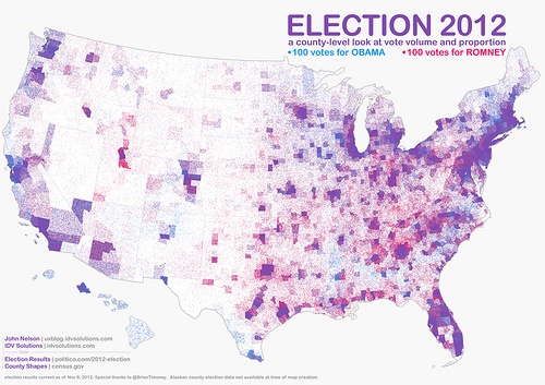
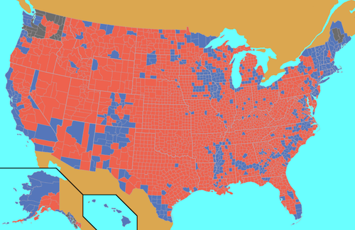
Image Credit: IDV Solutions What a wonderful map! This IS the popular vote on November 6, 2012. John Nelson gave us this map, and we thank him for it. It's called a "pointillist map:" one blue dot for every 100 votes for President Obama, randomly distributed in the county in which the votes were cast. One red dot for every 100 votes for Mr. Romney. You've heard of purple states? Well here's our purple country. Click the link on the image credit to find a large and hi-def version of this map. Then meet me back here, won't you? I'll be candid. There's an irrational part of me that wants the result of an election to match how much blue or red there is on the map. I know that's not how it works. This time, the state-level electoral college map came out pretty evenly red and blue. But take a look at the county-level map:
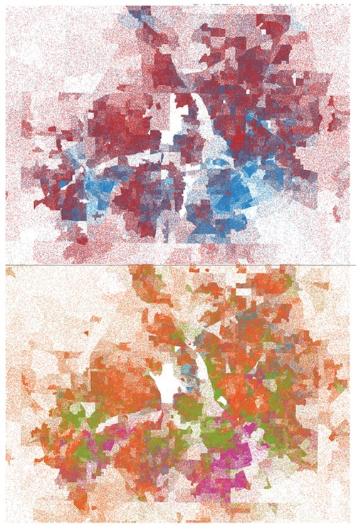
Image Credit: Wikipedia As usual, it looks like a sea of red with a few islands of blue, and yet, as we all know, President Obama was elected for four more years. I realize that it's a question of population density not geographical space, but now, at long last and thanks to Mr. Nelson, I can see that. Mr. Nelson tells us he was inspired to make this kind of map by his advisor, a Professor Kirk Goldsberry. Here's a pointillist map of the 2012 presidential election Professor Goldsberry did of the Dallas Fort Worth Area:
Image Credit: Kirk Goldsberry/KK Outlet The top map shows red and blue dots for Mr. Romney and President Obama respectively. The bottom map shows voters by ethnicity. (Can you guess? Try and then click the link to find out.) What a revelation! Of course, pointillist maps are only one of the new mapping techniques to show election data, but they are a powerful one. Looking at John Nelson's map I find myself thinking: so this is who we are. Image Credit: IDV Solutions One thing we seem to be is country and city. Do you notice how there is a ring of red around the purple-blue cities? That seems to hold true around the nation. ReplyYour contribution to the blog: Please Read Before PostingThe viz. blog is a forum for exploring the visual through identifying the connections between theory, rhetorical practice, popular culture, and the classroom. Keeping with this mission, comments on the blog should further discussion in the viz. community by extending (or critiquing) existing analysis, adding new analysis, providing interesting and relevant examples, or by making connections between that topic and theory, rhetoric, culture, or pedagogy. Trolling, spam, and any other messages not related to this purpose will be deleted immediately. Comments by anonymous users will be added to a moderation queue and examined for their relevance before publication. Authenticated users may post comments without moderation, but if those comments do not fit the above description they may be deleted. |
|
Recent comments
2 years 29 weeks ago
2 years 44 weeks ago
2 years 44 weeks ago
2 years 50 weeks ago
3 years 4 weeks ago
3 years 4 weeks ago
3 years 4 weeks ago
3 years 6 weeks ago
3 years 6 weeks ago
3 years 6 weeks ago