viz.
Visual Rhetoric - Visual Culture - Pedagogy
Site informationRecent Blog Posts
|
timturner's blogWhite (art)House
Submitted by timturner on Tue, 2009-06-23 16:07
Image credit: National Gallery of Art, Washington D.C., via the WSJ News that the Obamas have been updating the art displayed in the White House has prompted stories in both old and new media outlets (click through to see a list of sources). Eschewing the more traditional nineteenth-century landscape and portraiture usually typical of White House decor, the Obamas have chosen to highlight colorful, abstract, contemporary works by American artists of diverse backgrounds. (As the original WSJ article on this subject notes, the permanent White House art collection includes over 450 works but only five by African-Americans.) These works include the Ed Rushca painting "I Think I'll" from 1983 (from the permanent collection of the National Gallery of Art). Tags:
Digitial Immersion
Submitted by timturner on Mon, 2009-06-22 14:19
Image credit: Peter Greenaway, in the NYT Students of art, art history, and digital media environments will not want to miss this NYT review of an art installation by Peter Greenaway for the Venice Biennale. Greenaway's project centers around--recreates? or remixes?--Veronese's 1562 painting "The Wedding at Cana" (reproduced after the jump). Using a variety of new media techniques, Greenaway re-presents the image, and his interpretation of it, to his audience. The reviewer concludes with an argument about the best possibilities of new media technology to enhance perception: To a certain extent all the digital manipulation works its own temporary miracles. Even the inane conversation begins to resemble things that might have floated through Veronese's mind as he determined his figures' attire, body language and facial expression. And instead of the usual art-history-lecture spoon-feeding of information, you have the illusion of seeing and thinking for yourself with heightened powers. The next stop should be the Louvre and the real thing. If any of viz.'s readers are lucky enough to see it for themselves, we'd love to hear your thoughts. Hat tip to new media, and a colleague: first spotted at John Jones's Twitter feed Tags:
Digitizing Revolution
Submitted by timturner on Mon, 2009-06-15 10:33
Image credit: mousavi1388 on Flickr I wanted to call this post "The Revolution will be Twittered," but Andrew Sullivan (whose coverage of the Iranian protests has been ongoing) beat me to it. But we could also have gone with "The Revolution will be liveblogged, YouTubed, or Flickred." Here in the states, the development of events in Iran has been accompanied by a critique of the (at least initial) lack of coverage on cable news and the widespread reliance on new media technology to cover the events of the protests. In this case, it's hard to ignore the power/potential of these technologies in getting information out of a country that has tried to close its digital borders by shutting down Internet access and intensifying restrictions against foreign media correspondents. Torture and Legos
Submitted by timturner on Wed, 2009-04-22 12:19
John Jones sent along a link to this image, from the work of a photographer who documents events in the "war on terror" with Lego dioramas. (I have an earlier post on viz. on a somewhat similar subject, an artist who used Legos to create depictions of the Holocaust.) Bibliography Updated
Submitted by timturner on Wed, 2009-04-15 12:31
Apocalypse Infographed
Submitted by timturner on Sun, 2009-03-22 19:26
Just spotted a link to this at Andrew Sullivan's blog (h/t): check out the wonderful compilation of explanations of the current financial crisis by graphic designers at FlowingData. FlowingData is a site that "explores how designers, statisticians, and computer scientists are using data to understand ourselves better - mainly through data visualization. Money spent, reps at the gym, time you waste, and personal information you enter online are all forms of data. How can we understand these data flows? Data visualization lets non-experts make sense of it all." To my knowledge, the site hasn't been linked on viz. before--but I think it's something our readers would really like (but then, they probably already know about it). Shakespeare Portrait Unveiled
Submitted by timturner on Mon, 2009-03-09 12:48
There is a lot of noise in the press today about the unveiling of a portrait that is now believed to be of William Shakespeare (see here, here, here, here, or here). The painting is believed to be the original source for the only two surviving likenesses of Shakespeare from his era, both of which were produced in the decade after his death. This painting, inherited by the descendants of the playwright's patron, is believed to have been painted in Shakespeare's lifetime. There is no definitive proof to show that the painting is unquestionably of Shakespeare. The evidence includes its association with the family of Shakespeare's patron, its supposed resemblance to existing portraits, and the results of "scientific testing" and the nebulous testimony of "experts" who are quoted as being "90% certain" that this is a portrait of Shakespeare. The articles also rely heavily on the ethos of Stanley Wells, noted Shakespearean scholar and chair of the Shakespeare Birthplace Trust. (But as one of the commentators on the NYT blog entry notes, Wells is responsible for the inclusion of Edward III in the Oxford Shakespeare, a decision that has been met with considerable skepticism among Shakespeare scholars.) I wouldn't exactly say that I'm skeptical of the claim that this is a portrait of Shakespeare. But I am interested in the extent to which the reception of the portrait is shaped by everyone's apparent desire for this to be a portrait of Shakespeare. In the absence of definitive proof either way, everyone seems to have decided that it's simply more exciting to assume that it is than to be circumspect about whether it could be. Further, it's interesting to consider how the particular details of this story brings to life many of the fantasies of Shakespeare biography and criticism. The longstanding desire to discover Shakespeare's "lost" works--an event that would establish the critic as a celebrity of some standing among Shakespeareans--is often imagined as peeling an old playtext off the back of an abandoned painting in a dusty antique shop. In this case, life imitates art (or fantasy). UPDATE: Today there is a wonderful little item on the painting in the NYT, with the following question: We somehow want the young Shakespeare to look like Joseph Fiennes, fiery and slashing. But what if he looked like Ricky Gervais? Would the plays mean less to us? Crowd Sourcing for Context
Submitted by timturner on Wed, 2009-03-04 12:11
I may be a layman but it appears these people are examining X-Rays of a patient's abdomen. If this information was helpful I may be able to speculate further as to the color of their lab coats and the genders of the people shown. Image credit: boingboing via Flickr via Lane Medical Archive, Stanford University (copyright holder) Tags:
|
|
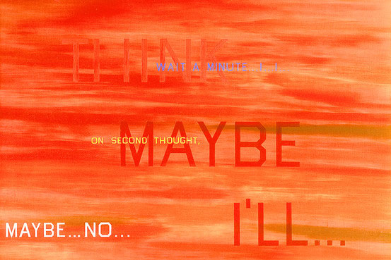
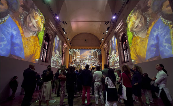
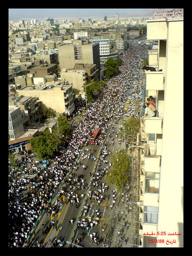


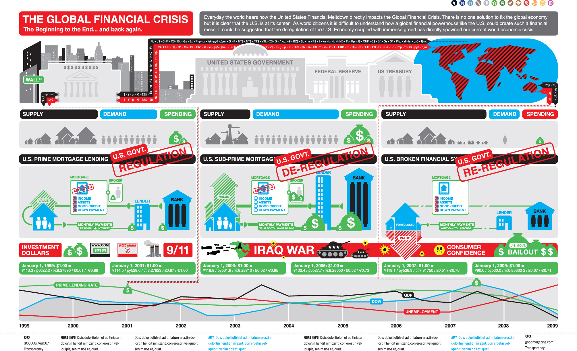 Image credit: cypher13 via flowingdata.com
 Image credit: AP Photo/Lefteris Pitarakis
 First spotted at
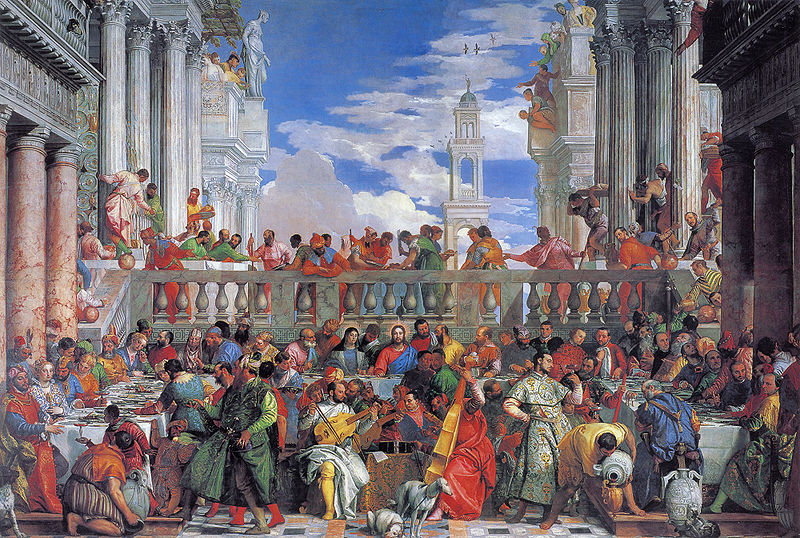
Recent comments
2 years 29 weeks ago
2 years 44 weeks ago
2 years 44 weeks ago
2 years 50 weeks ago
3 years 4 weeks ago
3 years 4 weeks ago
3 years 4 weeks ago
3 years 6 weeks ago
3 years 6 weeks ago
3 years 6 weeks ago