viz.
Visual Rhetoric - Visual Culture - Pedagogy
Site informationRecent Blog Posts
|
timturner's blogThe Magic of Photography (and Photoshop)
Submitted by timturner on Thu, 2009-02-19 18:12
A friend sent along a link to this story at urlesque.com touting a web site with side-by-side comparisons of the official photographs of fast food menu items alongside their rather depressing real-world counterparts. The Platonic Ideal has never seemed so far away.... Meet the *real* Egg McMuffin, after the jump. Tags:
Written on the Body
Submitted by timturner on Wed, 2009-02-18 12:34
Well, after today I will absolutely stop poaching all my Viz. entries from the The New York Times, but their home page is currently trumpeting a story on "The Body as Billboard" that I imagine any reader of this blog would be interested in. Tags:
Fallen Soldiers
Submitted by timturner on Mon, 2009-02-16 15:52
At his first televised press conference last week, President Obama received a question about a controversy that, though once debated quite energetically, had seemed for a time to recede into the background as the casualty rate for U.S. soldiers has fallen. The questioner wanted to know whether the new administration would order the Pentagon to reverse its policy of forbidding the publication of photographs showing the return of fallen soldiers from the wars in Iraq and Afghanistan. (President Obama responded by not commenting, since the policy is currently "under review.") The question, and the issue, were covered yesterday by The New York Times in a story and an editorial urging the President to overturn the policy. As the author of the former summarizes the issue, "Part of the debate that has developed turns on whether the return of soldiers is a private or public matter. While families have registered a range of opinions about allowing the news media at Dover, many have maintained that the return of a body is so deeply personal that they should be able to decide whether to keep it private." Above and beyond the questions raised by the difficult question of how to treat the images of what is essentially both a public and a private sacrifice (a soldier dying for his or her country is also lost to his or her family), the debate itself is simply a reminder of the power of images to move arguments. The New whitehouse.gov
Submitted by timturner on Wed, 2009-01-28 13:22
By now this is slightly old news, but in keeping with the previous post on Presidential photography, and because I thought it merited a mention here, I hope everyone has had a chance to check out the newly redesigned whitehouse.gov website: All of this is in keeping with the usual hybrid function of the White House website to serve as campaign tool (never to early to start thinking about 2012), information portal, and cog in the message machine. But this design in particular seems to aim at a couple of President Obama's stated ambitions: to get people more involved in government and to open the workings of the executive branch to more transparency. It's interesting to think about how (and whether) this redesigned website helps achieve these aims. If I were teaching in rhetoric this semester, I would certainly consider designing an assignment around these questions. Satire?
Submitted by timturner on Sun, 2008-07-20 16:07
Framing and defaming
Submitted by timturner on Wed, 2008-04-23 19:48
Last night while watching Barack Obama give his speech after the Pennsylvania primary, I got all excited about posting something on viz. for general amusement. But then when I read some other blogs, I realized I was not the only person to see what I saw. I forgot that in this Golden Age of the Internets, Original Ideas do not stay that way for long. But behold, anyway: Tags:
Worst Ad Ever?
Submitted by timturner on Mon, 2008-03-03 21:30
By reproducing it, I'm probably playing right into the hands of the creator of this image, but, I thought it deserved to be commented on here: The copy reads, "Terrorism-related deaths since 2001: 11,337 • Tobacco-related deaths since 2001: 30,000,000." Tags:
|
|
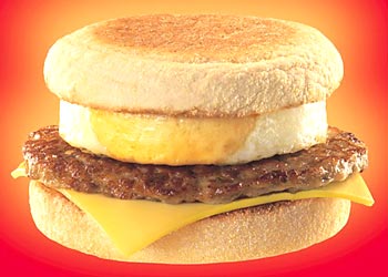 Image credit: http://www.thewvsr.com/adsvsreality.htm
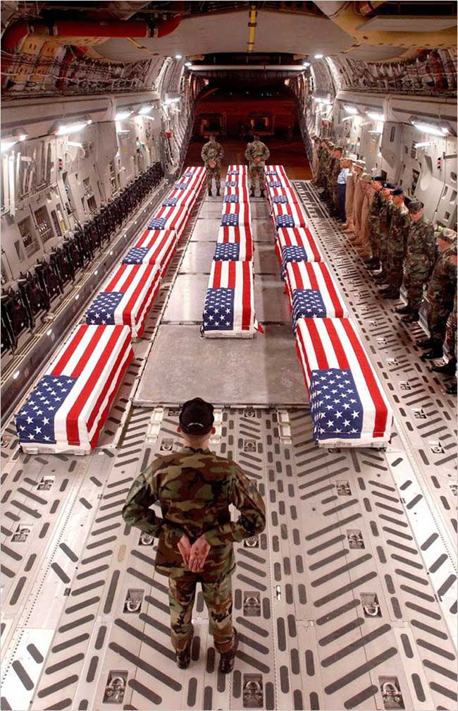 Image credit: thememoryhole.org, via Associated Press, NYT, 2/15/2009
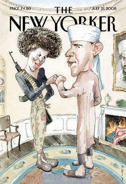 The recent New Yorker cover depicting Barack and Michelle Obama in radical drag, as it were, hasn't been discussed here on viz. It deserves a mention, since the nature and definition of satire has been discussed on the site before.
 Notice the three dudes in Abercrombie and Fitch t-shirts right behind the Senator. Supposedly the campaigns choose the people in those seats pretty carefully; one has to wonder, if in fact that's true, what was going through the head of the person who made this decision. Not that there's anything wrong with Abercrombie (well, Jezebel says it's "the epitome of everything about the America that is not 'ready' for" a President Obama), but still, it seems like a weird choice, no?
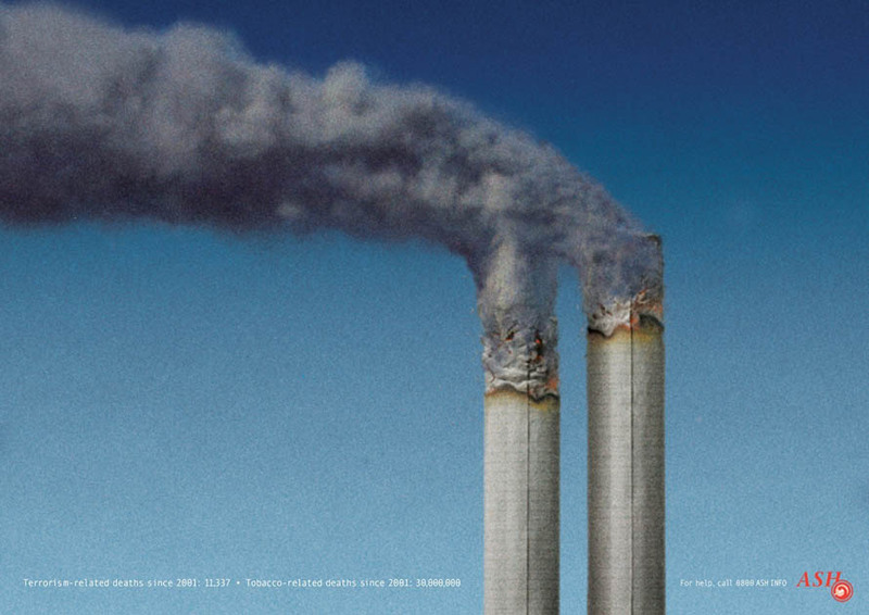
Recent comments
2 years 29 weeks ago
2 years 44 weeks ago
2 years 44 weeks ago
2 years 50 weeks ago
3 years 4 weeks ago
3 years 4 weeks ago
3 years 4 weeks ago
3 years 6 weeks ago
3 years 6 weeks ago
3 years 6 weeks ago