viz.
Visual Rhetoric - Visual Culture - Pedagogy
Site informationRecent Blog Posts
|
Taco Geography
Submitted by Laura T. Smith on Mon, 2010-03-29 20:03
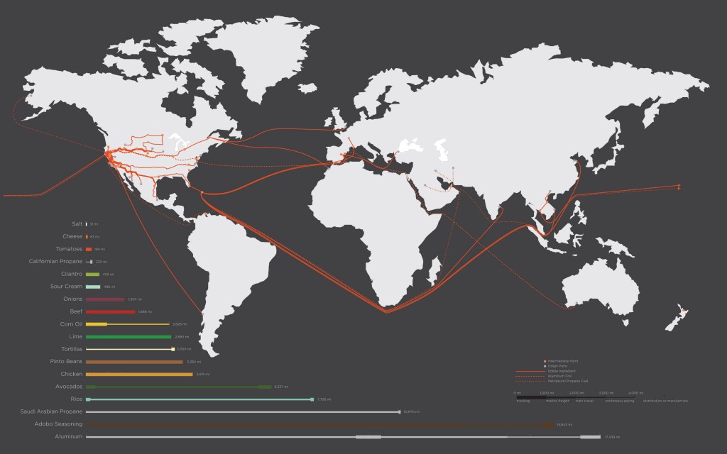
The folks over at Good Blog have published early results from a California College of the Arts assignment that took place in a landscape architecture class. Like a lot of classes here at UT, this class was asked to analyze the “tacoshed” for a single taco bought in San Francisco’s Mission District, from Juan’s Taco Truck. “Tacoshed” refers to the “geographical boundaries of a taco’s origins.” Because the project was a conducted by landscape architecture as well as art and design students, the presentation of results was a crucial part of the analysis, and in this case, the researchers collaboratively constructed the above map, visually charting the provenance a single taco. The map was created as each student researched the origins of a single ingredient in the total taco, from beans to cheese to avocado to the aluminum foil wrapping. Students found that a number of ingredients came from surprisingly close by, while others made long, complex journeys with multiple production stops. Aluminum foil and adobo seasoning proved to have the longest and most complex travel routes. The author, Twilight Greenaway, reports that, in all, the ingredients of the single taco journeyed a sum total of 64,000 miles, “or just over two and a half times the circumference of the earth.” According to the taco vendor, every component was purchased at Costco or Restaurant Depot, with an eye to price. The students’ impressive map indexes a range of data through a few different graphic systems. The map indicates origin points, such as farms, by grey squares, and intermediary production sites, such as plants and corporate offices, by red squares. Travel routes are also marked: solid red lines indicate food paths, dashed lines indicate aluminum foil’s path, and dotted lines represent the path of fuel, such as petroleum. A second information stream is contained below the map, as each taco component is listed in the order of distance travelled. Together, graphic and numerical indicators show the exact mileage through color-coded mileage bars: salt and cheese came an easy 31 and 65 miles, respectively, while aluminum foil travelled an astounding 19,000 miles. The point of the project, however, was not simply to bemoan the globalization of food or advocate for buying local. Rather, the class took a “close look at the embodied energy in each ingredient,” comparing the energy expenditure of local greenhouse tomatoes with tomatoes “shipped from the Southern Hemisphere, where they’d been grown in summer weather.” Similarly, they examined the politics of aluminum foil, which had travelled the farthest from home--a mine in New Zealand--but could be recycled and could continue on its epic journey in yet another form. The full results will be published in a book, but a summary of the study is forthcoming in Meatpaper Magazine. |
TagsRecent comments
|
Comments
really great map
This is awsome, Laura. I tend to think about food historically in similar terms. In a taco, for instance, you might have tomatoes and chilis from Central America on top of chicken that comes originally from Southeast Asia along with cheese from cows that were first domesticated in the Middle East (and maybe even some African rice as a side). You note that the point of the study is not bemoaning globalization, and with good reason: we've been globalized for centuries. The energy expense and economics of distance might be another story, but I can't help finding something almost magical in the globally interwoven state of human culture (a blendedness very often revealed in what's on our plate). Thanks for sharing this.