viz.
Visual Rhetoric - Visual Culture - Pedagogy
Site informationRecent Blog Posts
|
Cover Art for The New Yorker's 'Money Issue'
Submitted by noelradley on Fri, 2009-10-16 10:20
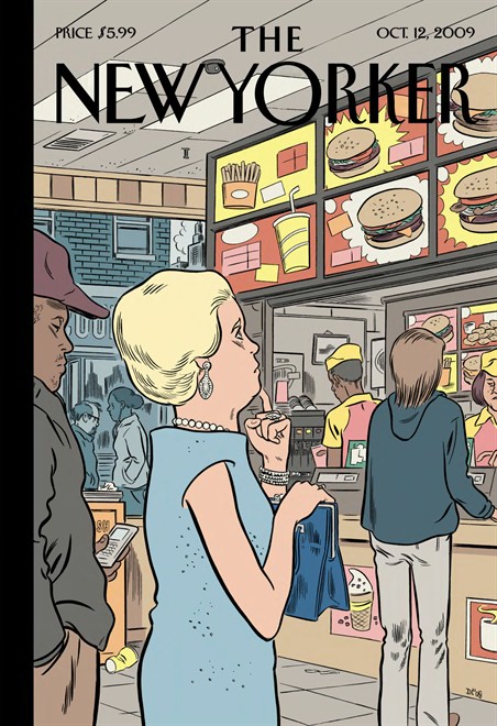
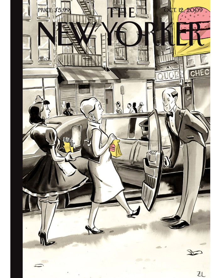
This video is an interview with Francoise Mouly, art director of The New Yorker, speaking about the multi-part cover of the Money Issue from this month, October 12, 2009. The 3-part cover begins with Dan Clowes, who created the image of a wealthy woman ordering a hamburger, which inspired Zohar Lazar's illustration of the woman carrying the fast food to her chaffeur-driven car, and then, finally, Mark Ulriksen's idea of depicting a poodle being fed the burger. Ulriksen notes that by his ending image, "You realize that some things never change for certain people."
Image Credit: Dan Clowes for The New Yorker Via The New Yorker
The three illustrators as Mouly says, "give multiple points of view," the second two illustrations acting as points of departure from the initial image. The interesting thing is that this is the first time that the magazine has done a multi-part cover. The difference in seeing Clowes' image in isolation, as opposed to seeing the developing argument, points out the way magazine covers usually make more-or-less a singular claim, acting as a larger representative symbol for the texts that will follow. But the unusual 3-fold sequence here allows for interventions on the predominant signifier. In the video, Clowes, Lazar, and Ulriksen give their comments, as well as Mouly's narration. Mouly has a previous book on the subject of cover art called Covering the New Yorker: Cutting Edge Covers from a Literary Institution.
Image Credit: Zohar Lazar for The New Yorker Via Zohar Lazar I was especially drawn to Mouly (probably because of her lovely accent) but also because of the way she has surfaced her work areas with copious imagery from the previous issues but also of all kinds. Along with the video of her next to the walls of cover art from the last century, I got the sense that The New Yorker is whole visual universe unto itself. Nothing loosey-goosey about the iconography here; these are highly situated, self-conscious aesthetic choices.You can search the archives for the monthly covers of The New Yorker. Tags:
|
TagsRecent comments
|
Comments
Irony
Thanks for posting this. I found it ironic that the three-part NYer cover commenting on the recession is the most expensive cover the magazine has ever produced (I think that is a safe assumption given that this cover is essentially the work of three covers). "You realize that some things never change for certain people." Indeed.
Interesting video
Thanks for posting this video! I was ambivalent about the cover when I saw it last week but, like most of my ambivalent responses to The New Yorker, it has proved malleable. The commentary provides an interesting window into the visual rhetoric of the cover as well as the collaborative strategies of the three-part format. It might be an interesting video to show to a class with a collaborative writing component.