viz.
Visual Rhetoric - Visual Culture - Pedagogy
Site informationRecent Blog Posts
|
Reply to commentAmerican Gothic on Mad Men
Submitted by Rachel Schneider on Mon, 2009-09-21 18:32
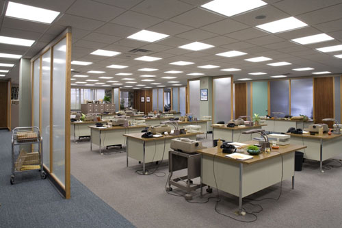
Image Credit: Chicago Tribune Mad Men, AMC's popular television show, has long garnered the attention of visual designers based on its subject matter (the advertising world of Madison Avenue in the early 1960s) and on its careful attention to authentic period detail. (The show's few missteps, as when it featured a 1987 Compact Edition of the OED, were widely reported on the Internet.) The show’s creator, Matthew Weiner, deliberately chose to set the show on Madison Avenue because advertising is "a great way to talk about the image we have of ourselves, versus who we really are." Since starting to watch the show, I've been fascinated with how the design elements, the character’s actions, and dialogue all work to construct a claim to authenticity about what the 1960s were that some immediately rush to challenge.
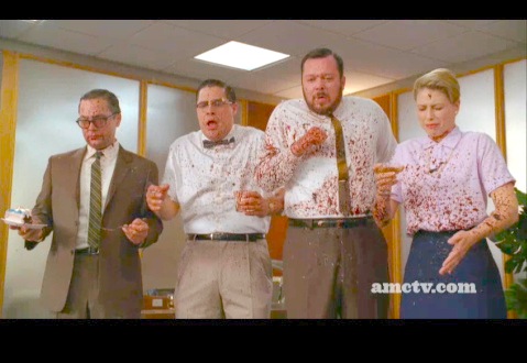
Image Credit: Flikr Last night's episode, "Guy Walks into an Advertising Office," significantly upset the show’s claims to ultra-realism in the sequence where the invading future boss and Brit Guy McKendrick loses his foot in a lawn mower accident in the Sterling Cooper offices. The reaction shot featuring several of the ad men covered in blood made such an impression on my friends that we had to use the DVR to re-watch the horror several times over. While this might be due to our lack of disgust, I think it also had to do with a different kind of argument that the show wants to make about the reality of life in the 1960s. War has come up several times during this season in conversations between Don Draper, the show's protagonist, and his father-in-law Gene. In this episode Smitty (the man who first drove the John Deere lawn mower into the party) discusses the Vietnam War draft before the accident. While this season is set in 1963, and so well before the major opposition to Vietnam, the blood spatter also rehearses the Kennedy Assassination to occur later this year. This show has not shied away from presenting culturally complex or challenging moment (as when the boss Roger Sterling performed in blackface earlier this season for his guests), but this show seems to be using visuals very carefully to define what kind of 1960s it describes. While the Slate in particular has offered great coverage of this, I look forward to seeing what other visual arguments the show might offer in the future. ReplyYour contribution to the blog: Please Read Before PostingThe viz. blog is a forum for exploring the visual through identifying the connections between theory, rhetorical practice, popular culture, and the classroom. Keeping with this mission, comments on the blog should further discussion in the viz. community by extending (or critiquing) existing analysis, adding new analysis, providing interesting and relevant examples, or by making connections between that topic and theory, rhetoric, culture, or pedagogy. Trolling, spam, and any other messages not related to this purpose will be deleted immediately. Comments by anonymous users will be added to a moderation queue and examined for their relevance before publication. Authenticated users may post comments without moderation, but if those comments do not fit the above description they may be deleted. |
|
Recent comments
2 years 29 weeks ago
2 years 44 weeks ago
2 years 44 weeks ago
2 years 50 weeks ago
3 years 4 weeks ago
3 years 4 weeks ago
3 years 4 weeks ago
3 years 6 weeks ago
3 years 6 weeks ago
3 years 6 weeks ago