


Playing with Darkness: A Problematic New Cover for The Jungle Book
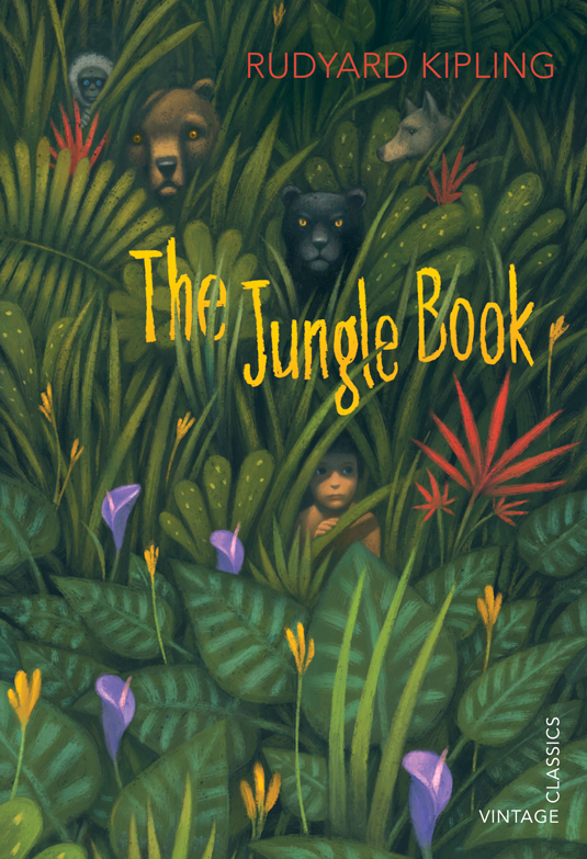
Image Credit: creativebloq.com
Following up on my last post’s discussion of the 2008 Alice in Wonderland cover, today I’m exploring another dark reimagining of a children’s book cover. The image above was designed for the Vintage Children’s Classics series. In Vintage’s own words, “Rudyard Kipling’s collection of fables have a much darker feel than the Disney musical, and we wanted to reflect this in the cover. We chose Italian illustrator, Gianni De Conno, to come up with an image which has engaging animal characters peering out from dense jungle foliage. The resulting cover illustration has both charm and intrigue, and a hypnotic feel from the staring faces.” But what makes the image “darker,” exactly? Certainly the literal color is much darker than the general color palette of the Disney film, as shown in the image below:
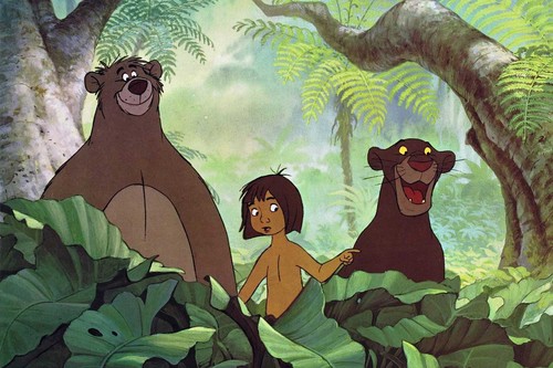
Image Credit: fanpop.com
The animals look considerably more realistic and therefore much more threatening, even though the animals pictured are the ones who help Mowgli in the story. The flowers, however, are bright and colorful, making Mowgli’s desire to stay in the jungle more understandable. The green foliage is rather neutral-looking, dark without being jagged or otherwise ominous. The center of the image’s darkness, I think, is in Mowgli’s half-shadowed face, which almost appears to be covered by a mask. His eyes are shaded by the plants looming over him, and in combination with the somberness of the more visible part of his face, this shading argues for a Mowgli who is more beast than man.
Of course, there are multiple complex racial issues involved in re-issuing The Jungle Book. There’s the initial question of whether Rudyard Kipling, author of “The White Man’s Burden,” should have his work promoted as a classic. If one is going to re-issue his work with visual accompaniment, then the image of the central character should have two characteristics: the hero should unambiguously be a person of color, as he is in the story, and he should not be portrayed as savage. This cover fails in both of these respects. The shade of the unshadowed portion of Mowgli’s skin could be that of a white person, or of a light-skinned person of color. It’s not clear. What the cover does is choose a shade that is non-threatening, to white readers, for its hero. Then, with a Mowgli who could be white, it becomes safe to play with the idea that this specific person has inhuman elements to his character. But the implication that he is inherently uncivilized can’t be separated from Mowgli’s explicit identity, in the story, as a person of color. The cover ends up both whitewashing Mowgli and reinforcing the idea that people of color are savages. So it’s certainly darker, but, I think, not only in the way that its commissioners and creator intended.
Add new comment