Alice or Wonderland: How Visual Representations of a Story Change Over Time
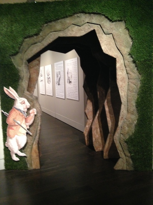
Image Credit: Deb Streusand. Taken at the Harry Ransom Center.
The Harry Ransom Center’s current public exhibit is on Alice’s Adventures in Wonderland, the children’s book by Lewis Carroll. It displays many fascinating artifacts related to the book, including a selection of about twenty-five different covers the story has had over the last century. (The picture above shows the entrance to the section of the exhibit containing the book covers.) These covers demonstrate what people have found most interesting and most attractive about the story over the years. This post will discuss just three of the covers, though I certainly recommend going to look at all of them if you have the opportunity.
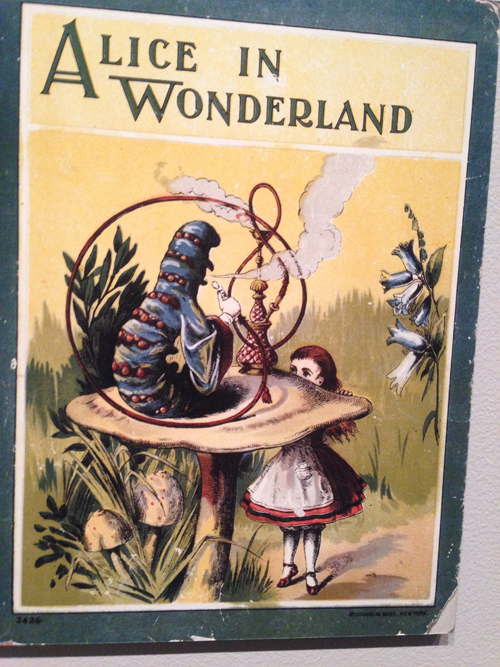
Image Credit: Deb Streusand
The above cover is from 1903. It emphasizes the magical and mysterious aspects of Wonderland, showing a mushroom and a caterpillar that are both far bigger than Alice. The exotic hookah and the accompanying puffs of smoke look rather magical as well. Alice’s eyes are wide with wonder, but most of her face is obscured – the story is more about Wonderland than it is about Alice. The cover shows no sign of concern about whether prominently displaying a hookah is an appropriate way to sell a book for children, which demonstrates some of the cultural changes that have taken place between 1903 and the present day.
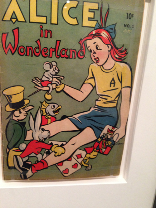
Image Credit: Deb Streusand
This cover of an Alice in Wonderland comic book from 1945, by contrast, emphasizes Alice over Wonderland. Alice is by far the largest thing in the picture. All the other entitities in the picture are much smaller, and even look like they could be toys, not living beings. The playing cards are flat and can be held in the hand – they are not the rather unmanageable characters they become in the actual story. Alice, in saddle shoes and letter sweater, is clearly immersed in the modern world. The background is plain and shows nothing of the Wonderland environment. In fact, it bears some resemblance to the cover of an Archie comic from the same year:
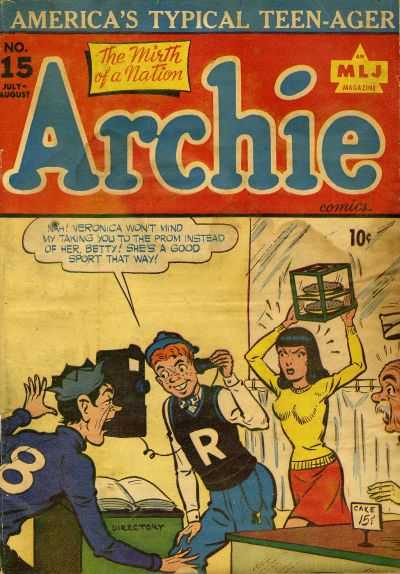
Image Credit: Comic Vine
The Archie comics are set in the real world, not in a wonderland, and this Alice looks like she would fit right in there. This cover sells Alice as someone the audience can relate to.
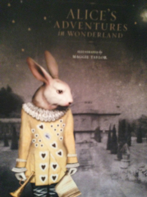
Image Credit: Deb Streusand
This much more recent book cover, from 2008, does not show Alice at all. It shows the White Rabbit, in color, against a dark and formal-looking house and garden. Rather than portraying Alice in Wonderland, it depicts a Wonderland creature in Alice’s England. The Rabbit brings the magic into this colorless background, but it is a rather forbidding environment for him. This cover seems more directed at adults who are interested in exploring the sinister aspects of the story, or perhaps children who like their fairytales dark.
These three covers demonstrate what were considered the most saleable or most interesting aspects of the story at their respective times. The 1903 cover sells the tale as magical and mysterious. In 1945, Alice needed to be an accessible figure to the readers. The 2008 cover argues, “this is not your grandmother’s Alice in Wonderland.” The book covers from these three time periods sell the same story in entirely different ways.


Add new comment