viz.
Visual Rhetoric - Visual Culture - Pedagogy
Site informationRecent Blog Posts
|
photography“And yet, every photograph cries out for an interpretation …”
Submitted by John Jones on Wed, 2009-01-28 00:32
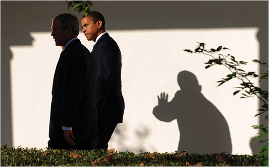
At his New York Times blog, documentary filmmaker Errol Morris has posted interviews with the head photo editors of the AP, Reuters, and AFP on the photographic record of the Bush administration. Morris asked each interviewee “to pick the photographs of the president that they believe captured the character of the man and of his administration” and then discussed the photos with them along with the reasons each chose the photos they did. With Standard Operating Procedure Morris has shown an acute interest in understanding the different ways in which the image is used to create reality, along with the ways in which that reality can be interrogated. In these interviews, Morris and each interviewee seem to share a different approach to how these images should be interpreted and what they mean. Although the discussions can sometimes be repetitive, they were a reminder to me of how much my judgments about our last president were based on these photo-ops.
via Word Presser Naomi-art
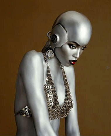
Submitted by kathrynjeanhamilton on Thu, 2008-12-04 15:57
Naomi Campbell -- not her career, not her art, but her body -- is the subject of Art Photo Expo's contribution to Miami's art festival, Art Basel Miami Beach, this year. Tags:
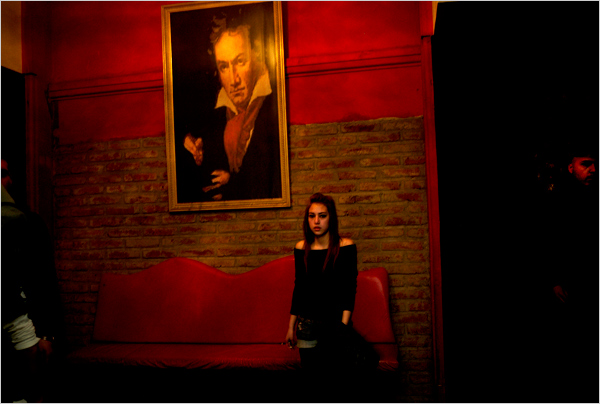
Poverty as poetry
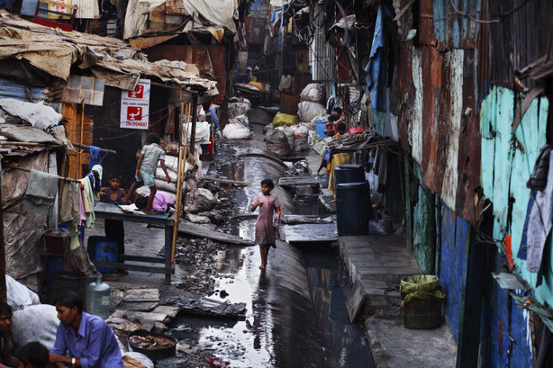
Submitted by kathrynjeanhamilton on Tue, 2008-11-18 17:35
On Tuesday, November 18, Slate featured pictures by photographer Jonas Bendiksen in "Today's Pictures." Tags:
Cipher-Obama
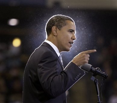
Submitted by kathrynjeanhamilton on Thu, 2008-10-30 15:41
Like Sarah, I've been paying a lot of attention lately to how journalists photograph the two presidential candidates. (And I apologize that this image is so tiny.) Tags:
Holy Man*
Submitted by Sarah Wagner on Sat, 2008-10-25 14:41
So earlier this week, I'm checking my news online and I come across this photo of Barack Obama:
Tags:
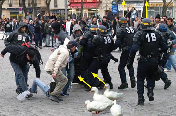
One of these things is not like the others
Submitted by kathrynjeanhamilton on Thu, 2008-09-18 16:23
This photograph ran in a photo essay accompanying a September 12 The New York Times story about Chile's recent "sexual revolution."
The article chronicles the sexual revolution in one of Latin America's most conservative countries by describing, in titillating specificity, a network of urban partiers among Chile's young elite. How to spot a faked photo
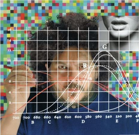
Submitted by John Jones on Mon, 2008-06-09 11:46
Scientific American has published a short guide listing five methods that researchers use to spot altered or retouched photographs.
For example, in the image above, some of the soldiers in the background have been “cloned” to make it appear that the crowd was more dense than it actually was. While the guide details the mostly algorithmic methods used by Hany Farid and his fellow researchers, it also has some practical tips which can be used to identify altered photographs with the naked eye.
Related: Tags:
Photo-retouching guru
Submitted by John Jones on Thu, 2008-05-29 10:24
The article should be great fodder for studying the rhetoric of the body and the use of photography in our society. |
|


 The New Yorker recently published
Recent comments
2 years 29 weeks ago
2 years 44 weeks ago
2 years 44 weeks ago
2 years 50 weeks ago
3 years 4 weeks ago
3 years 4 weeks ago
3 years 4 weeks ago
3 years 6 weeks ago
3 years 6 weeks ago
3 years 6 weeks ago