viz.
Visual Rhetoric - Visual Culture - Pedagogy
Site informationRecent Blog Posts
|
Mapping the Eighteenth Century: A Report from CSECS
Submitted by Rachel Schneider on Mon, 2009-11-09 19:03
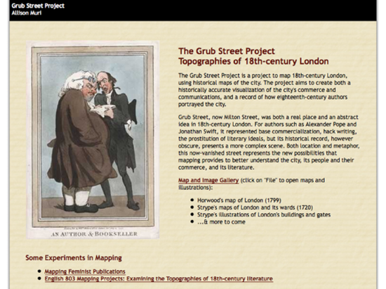
Image Credit: Screenshot from The Grub Street Project While I wrote in my last blog here that I would use this week’s blog to discuss my upcoming conference paper for MMLA, I was led astray this weekend by an excellent panel I attended at CSECS that I thought the viz. audience might enjoy. (Sorry, Gossip Girl fans. Tune in next week!) After deciding to attend the panel entitled “Mapping Culture: Topographies of London,” I was delighted to discover it featured not only a paper on Boswell’s enchanting London Journal, but also an excellent discussion about using mapping strategies to teach and research eighteenth-century texts. What united the various papers on the panel, which discussed such disparate texts as John Gay’s “Trivia,” the Mohock Club, Boswell’s aforementioned Journal, and Thomas De Quincey’s Confessions of an English Opium-Eater, was that each paper was based on material provided by The Grub Street Project, a website that unites topographical data with literary texts like Pope’s Dunciad. As explained by Allison Muri, both the panel’s chair and the website's designer, The Grub Street Project’s goal “is to visualize the literary and cultural history of London.” The About the Project page also notes that
As the incredibly topical (and topographical) texts of the early eighteenth-century require some previous processing for undergraduate students to understand the references, I was delighted to see how well The Grub Street Project works to help visualize these texts in intriguing ways. (I most enjoyed Kurt Kruger’s paper on “Gentleman and Topography in Boswell’s London Journal: 1762-1763,” and thought that his map of Boswell’s first month in London well represented how Boswell topographically conceives of gentlemanliness.)
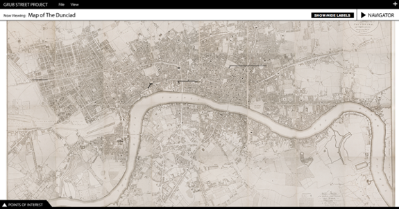
Image Credit: Screenshot from The Grub Street Project I also enjoyed how this panel raised interesting questions about the pedagogical purposes of visual material not only in explaining the eighteenth-century, but also in making arguments about the eighteenth-century to students and scholars alike. While I know that our own distinguished Sean McCarthy has led the way in showing how Google Maps can work in the writing classroom, visual data can often be difficult for certain kinds of students to interpret, and its conclusions can sometimes seem “obvious,” for better or worse. As I’ve been thinking this week about Chaim Perelman’s New Rhetoric for a class I’m taking with Trish Roberts-Miller, I wonder if there’s something about visual arguments that may appeal to the universal audience, but that are similarly difficult to understand as constructed, just as rhetors can forget that the universal audience itself is a rhetorical product. Our language encodes the value of visuals in such maxims as “a picture is worth a thousand words,” but how are we supposed to interpret that picture? And what safeguards are there to prevent misinterpretation? As we move into explicitly teaching digital literacies to students, however, these questions will help students to consider more carefully how they evaluate and analyze visuals as rhetorical objects. At any rate, The Grub Street Project has great functionality and is very intuitive to use. In addition to things like UT’s eComma, I am beginning to visualize a literature classroom that integrates web materials fully. |
|
Recent comments
2 years 29 weeks ago
2 years 44 weeks ago
2 years 44 weeks ago
2 years 50 weeks ago
3 years 4 weeks ago
3 years 4 weeks ago
3 years 4 weeks ago
3 years 6 weeks ago
3 years 6 weeks ago
3 years 6 weeks ago