viz.
Visual Rhetoric - Visual Culture - Pedagogy
Site informationRecent Blog Posts
|
Google Earth Pedagogies: Building My Assignment
Submitted by Laura T. Smith on Mon, 2010-03-01 15:06
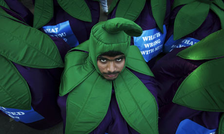
(Image Credit: Aijaz Rahi from guardian.co.uk) As I’ve been considering assignments for my students’ Google Earth “Food Geographies” exercise, I had expected to assign a classwide map topic—such as “Map Austin CSAs,” “Map Austin grocery stores,” or “Map a meal.” Now that I’ve previewed a number of Google Maps assignments, gotten some ideas about the pedagogical possibilities of Google Earth, and—most importantly—read my students’ first papers, I’m angling more toward letting their maps be self-driven. Indeed, I was struck by the food geographies already implicit in my students’ arguments. My students’ papers discussed a range of food-related topics (these will be familiar to everyone else teaching RHE 306), including the ethics, health, and possible dangers of genetically-modified foods, food-labeling policies (for genetically-modified foods as well as conventional foods), high fructose corn syrup, farm subsidies, obesity, fast food, slow food, organics, food processing, dietary variety, and corn politics. One student noted the relative acceptance of genetically-modified foods in the United States, citing tougher standards and strict labeling policies in Australia, India, Britain, and the European Union, noting the protests against the genetically-modified eggplant (pictured above and below) that have taken place in India in recent weeks, staged by environomental organization such as Greenpeace, as well as consumer groups and the public at large. Another student discussed differing worldwide farm subsidy policies, while another compared the rhetoric of the organic food movements in Britain and the United States. Another student researched the effects of U.S. corn politics, including subsidies and genetic modification, on Mexico’s corn growing and consumption. I found few papers where food hadn’t already taken on spatial and global meanings. Since I only have two class periods to spend, and because I expect the students’ food geographies to produce fruitful intersections, I’m now planning to ask them to create their own set of three placemarks on a class map, rather than creating individual maps. An alternate strategy might be to put students into map groups, so that all students who are researching genetic modification, for example, are creating a common map. There are two primary ways to create placemarkers in Google Earth—either one can create these manually or one can use a standardization template such as Spreadsheet Mapper. While manual placemarks are quick and intuitive and students can quickly create them and add text, links, and images, Spreadsheet Mapper allows for branded placemarks which have set fields (text, image, link) and a standard look (colors, fonts, layout). The standardization of Spreadsheet Mapper is appealing for creating a common, class map or group maps. I’m currently planning to introduce students to Google Earth by having them “draft” their placemarks in manual mode, during class. I think that the ease and immediacy of the manual mode will allow students to invent, get creative, and draw associations that the less intuitive Spreadsheet Mapper might stifle. The information for the placemarks will come from and connect to their semester-long research topics. Then, as a second draft, I’ll ask students to contribute their placemarks and placemark content into Spreadsheet Mapper to create one standardized, common map. I’m especially interested in requiring standard fields, including text, a link, and an image. Adding images like the ones presented here provide a further analytical framework as students can see how eggplant politics are hitting the streets in India, how interest groups are representing or organizing their causes, and how the faces of food politics, such as the organic movement, frame and market themselves in different parts of the world.
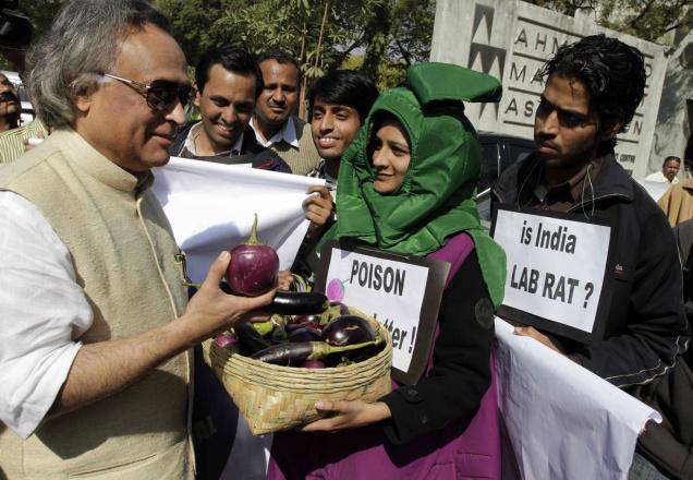
(Image Credit: tcenews.com) Here, images restore specificity, detail, and humanity to topics, crucial aspects that can paradoxically get lost in a semester-long research process, paired with the course’s demand for analytical writing. I'm hoping that these mapping exercises will reinvigorate the students' projects with creative energy and place human faces on the issues. Finally, I've recently decided to further expand the project by allowing students the option of writing their final paper as a Google Earth animated tour. I still have to figure out how this option will work, but I like the idea of extending our work with Google Earth into a larger project, and a significant product. |
|
Recent comments
2 years 29 weeks ago
2 years 44 weeks ago
2 years 44 weeks ago
2 years 50 weeks ago
3 years 4 weeks ago
3 years 4 weeks ago
3 years 4 weeks ago
3 years 6 weeks ago
3 years 6 weeks ago
3 years 6 weeks ago