
Beer'n'Bridges: the Look of Austin's City Council Race
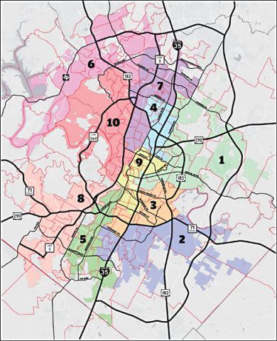
Austin voting districts, image from Austin Chronicle
Today’s a big deal Austin city government. Under a new districting plan, voters will select a radically different city council. We’ll exchange our six at-large members for a ten-member, geographically representative city council. The new structure of city council, combined with term limits ousting most sitting members, means we’ll have both new people and a new suture for governance. With so many seats up for grabs, there are dozens of candidates vying for support. All around the city, anywhere you can stick a sign you’ll find candidates’ names.
In the political culture where corporations are people, branding a candidate is big business. If candidates are themselves brands, then names are logos. And in Austin, apparently, your name had better look like a creative design firm or craft beer brand.
What can you tell from looking at the design of an Austin city council member’s name as a logo? Depends on what you’re looking for.
Environmentalists vs. Realtors
Austin’s city government is bipartisan, meaning candidates don’t run under party affiliations. So, we have to look at issues to track conflict. For decades, Austin governance has been defined by a spilt between environmentalists and the real estate community. While these two camps have remained at the center of Austin’s political debate, issues like affordability and transportation complicate the traditional balance. Making things even more complicated, the real estate and environmental organizations sometimes endorse the same candidate.
Is there an easy way to tell who’s on which team? Can we spot the division between real estate and environmental candidates by looking at their logos? Well, not really, but sort of.
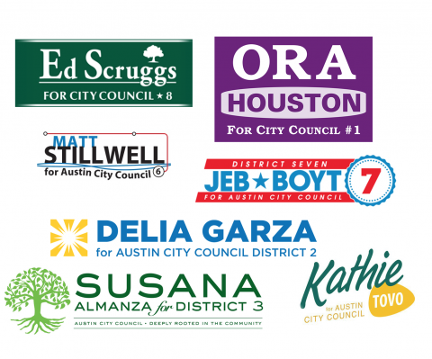
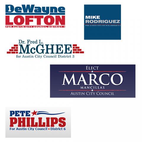
For instance, here’s a collection of images from candidates endorsed by real estate groups but not environmental groups:
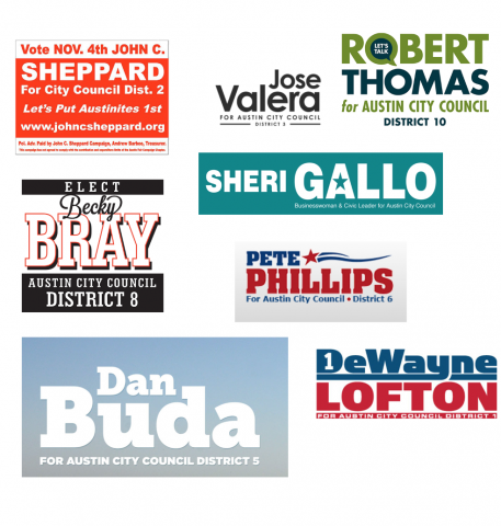
Logos from candiates' websites, endorsement information from Austin Chronicle
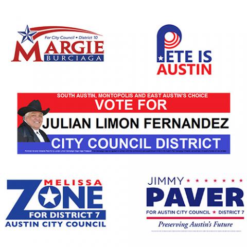
Except one obvious outlier, these signs are polished and professional. They’re fairly modern too. But are they that different than the environmental folks? Let’s take a look at candidates endorsed by environmental groups and not real estate organizations:
 Logos from candiates' websites, endorsement information from Austin Chronicle
Here, the environmentally backed candidates evoke green and hint to plant life. For the most part, they’re not terribly modern. You could even say they’re a little colorful but traditional.
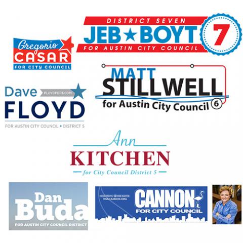
Okay, now compare these examples with branding from candidates endorsed by both environmental and real estate organizations:
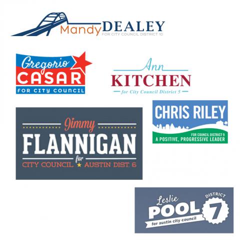 Logos from candiates' websites, endorsement information from Austin Chronicle
Branding for candidates with both real estate and environmentalist support tend to be the nicest. At best, they’re pretty with nice typeface and soft colors. At worst, they tend to all blur together. They also look vaguely familiar…
Austin Beer Works Aesthetic
The pretty cans and billboards of Austin Beer Works (ABW) embody what many would identify as the ideal Austin aesthetic: basic but attractive, cool but friendly, welcoming but not old fashioned. While the brains behind the ABW, Helms Workshop, are responsible for other iconic Austin imagery, the ABW aesthetic has saturated our city. Predictably, the AWB aesthetic has spilled into local political advertising.
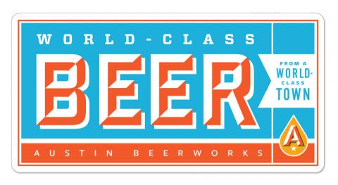 Image from Helms Workshop
Stop drooling, you animal. This is city politics, not a lake party. Even though some of these logos would look really great on a can or someplace you can buy a fancy-pants hotdog:
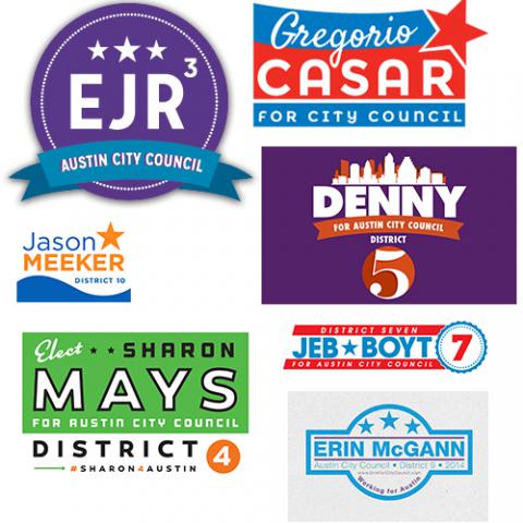
Images from candiates' websties
Like the ABW marketing, Austin candidates have fashioned themselves with logos featuring bright and bold complimentary colors, lots of simple sans-serif lettering, with the occasional restrained script.
For the most part, these logos look clean and professional. At best, the logo looks cool and spirited (Casar’s is a standout for sure.) At worst, the trendy approach results in a messy, confusing logo (who is “EJR”?).
Thanks, Obama
Surely, even those who blame Obama for ebola will admit that the president’s two campaigns produced some of the best-ever campaign branding. Isn’t that what Republicans refer to when they accuse supporters of being swept up by rhetoric?
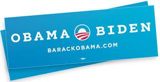
Image from Obama's website
Obama’s campaign branding did something really interesting with the colors of the US flag by changing, ever so slightly, the shade of blue. Candidates for Austin council have certainly taken note:
Images from candiates' websites
However, not everyone reflects the design of Obama’s America. Some candidates opt for a darker-than-the-flag blue or keep the traditional colors. Do these look more Republican, or at least conservative? Well, Marco’s looking a lot like an old McCain sticker:
Images from candiates' websites
Other candidates, many of whom are not endorsed by any major city organization, keep with tradition:
Images from candiates' websites
There is something certainly more modern about the light blue, compared with the royal. In a city with a lot of love for Obama, the light blue seems to work. Or does it? I guess we’ll find out tonight.
Predictor of success?
Is branding an indicator of a candidate’s success at the polls? On one hand, not a single candidate without any branding (and there are some) received a major endorsement. So, yeah, it seems like professional branding might indicate a candidate’s chances of getting into office. But does it have to be cute? After all, Obama-inspired, ABW design has not always secured a seat for Austin city government. Take, for example, the 2012 city council race between Randi Shade and Kathy Tovo.
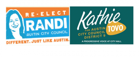
Images from candiates' websites
It was a tight race but in the end Tovo’s old school design didn’t keep her from office.
So Bad They’re Good
I like the ABW style, but that’s not to say it gets my vote. I voted for some of these gals and guys with old-fashioned, boring signage. But, at the same time, I didn’t vote for anyone with straight-up ugly signs. What do I mean by ugly? I mean this:
_0a208.png?itok=z2WELgGa)
Image from candiate's website
But, even if a particular sign doesn’t win or lose a particular vote in a particular cycle, it’s not to say that signs don’t influence elections. A good sign can embody enthusiasm, rally the base, get ‘em fired up and ready to go.
Of course, what it means to be aesthetically good is contextual. And, perhaps like context, politics are boundless. Because the line between what I like for ironic reasons and what I like for non-ironic reasons is difficult to locate, it’s not impossible for me to imagine getting pumped up about a really bad sign. This isn’t just because money in elections makes me uncomfortable. It’s also because I kind of like ugly stuff.
"Christopher 4 ATX" is not good-good. It’s real, real bad-good. It has that Tim-and-Eric-bad-public-television je ne sais quoi. Honestly, I kind of love it. And, after looking at a lot of logos over the past months, the pretty ones start to run together. It’s bad signs like this that I remember the most. Isn’t standing out above the riff raff half the battle? Be weird so you can keep weird?
But then again, did I vote for this guy? Nope. But would I have voted for this guy if he had the pedigree and position of the person I voted for? Totally. And I would’ve put this sign in my yard. It would have made me laugh every time I walked through my sad little yard. It would have made me happy. So, yeah, it appeals to my sensibilities (whatever that means.)
For our next election cycle, will we have fewer pretty signs? Is that what I want? I don’t know. But before I wish for more terrifically shitty branding in local elections I’m going to hope for more Leslie-inspired politics and imagery.
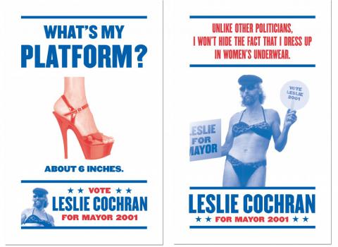
Image from GSD&M
Add new comment