viz.
Visual Rhetoric - Visual Culture - Pedagogy
Site informationRecent Blog Posts
|
David Maisel and Beautiful Disasters
Submitted by Calliope on Thu, 2013-05-02 16:28
American Mine (Carlin, NV 1), 2007 Image Credit: David Maisel You must be thinking, "Gosh, that's marvelous! What is it?" Well, I'll give you some hints about what it's not. It's not a computer-generated image (so you can rule out "digital vat of candy for a Willy Wonka film"). And it wasn't captured by NASA on a trip to Neptune. If you guessed geode, then you're getting warmer, but you're still way off in terms of scale. Perhaps it looks to you like a place where a leprechaun might stash his gold? Well, strangely, that guess may be closest of all. It turns out this absolutely mesmerizing photograph by David Maisel is an aerial view of a toxic manmade pond in Carlin Trend, Nevada, "the most prolific gold mining district in the Western Hemisphere" according to Maisel's website. The disorienting quality of the photo is a hallmark of Maisel's environmental photography, which explores the visually haunting, otherworldly transformations humans inflict on the Earth's surface. For decades, Maisel has been flying over and photographing sites of environmental wreckage, like the scored and chemically soaked basins of America's pit mines or the wasted lakebeds that once supplied Los Angeles with water. Beyond increasing awareness about these environmental disasters, Maisel's photographs enact a terrifying tug-of-war between ethics and aesthetics. As viewers experience and take pleasure in their sublime beauty, they are forced into the uncomfortable knowledge that these environmentally ruinous conditions have an irresistably attractive dimension.
A Workshop from a Visionary about Data Visualization
Submitted by james.wiedner on Thu, 2013-05-02 13:51
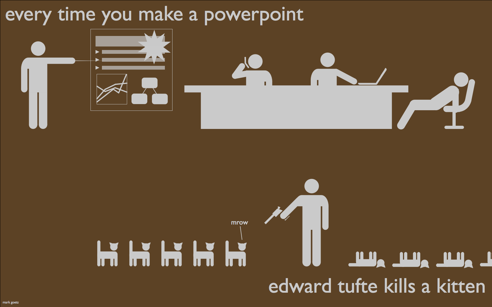
Source: Mark Andrew Goetz About 2 months ago Austin was lucky enough to be among the handful of cities selected as a stop on a one-day presentation and workshop featuring Mr. Edward Tufte. What's more: The DWRL agreed that covering the cost of admission for a few of their staffers to be money well spent (thanks, Will Burdette). For the uninitiated, Mr. Tufte is the granddaddy of all things related to visual representations of large amounts of data, complicated concepts, historical trends, and- quite literally- just about anything else you could think of. Hailed as “The Leonardo Di Vinci of Data," by the New York Times. Tufte was synthesizing massive amounts of information into beautiful visuals before the term “big data” had even pushed “the cloud” out of the way as the buzzword(s) of the moment.
Sources of Fame: Photographer or Subject?
Submitted by Laura Thain on Sat, 2013-04-27 16:47
An Arnold Newman "selfie" from 1987. Image credit: The Jewish Museum One of my favorite parts of the Harry Ransom Center’s current exhibition on Arnold Newman is the way it resists chronology. Newman’s photographs are organizes by particular attention to one of ten elements of Newman’s photography as artistic practice: “searches,” “choices,” “fronts,” “geometries,” “habitats,” “lumen,” “rhythms,” “sensibilities,” “signatures,” and “weavings.” What results is an exhibit that resists a notion of Arnold Newman’s transformation over time. Instead, the exhibit suggests, audiences might read Newman by his unique manipulation of photography’s formal elements throughout his entire career. The resistance to chronology is apparent, too, in the weaving, wandering nature of the physical exhibit. Temporary half-walls throughout the exhibition space designate no beginning or end point for audiences. Instead, the exhibit inspires audiences to accept Newman’s particular artistic practice across ten themes as definitive criteria for photographic excellence, and therefore evidence for celebrating the photographer himself. Such a construction has encouraged me to think about the relationship between celebrated photographer and celebrated subject. Are there ways that these two categories inform each other in the case of Arnold Newman? Can we trace, even amidst the Harry Ransom Center’s achronological curation, a chronological shift in fame from photographer to photographed? How does fame work as a mechanism for those who garner fame by representing it and perhaps cultivating it? Can those who represent fame create it as well?
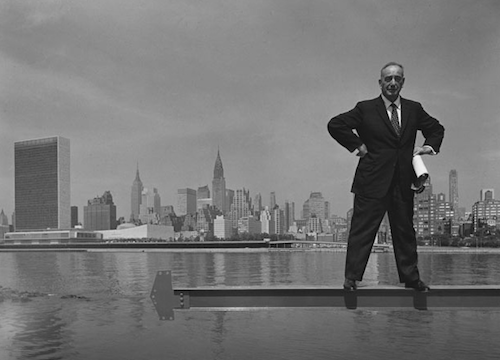
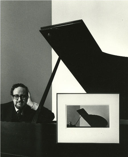
Musing About Aesthetics: Arnold Newman and Some Famous Architects
Submitted by Jay Voss on Wed, 2013-04-24 09:00
(Image credit: Harry Ransom Center) It shouldn’t be surprising, but I was drawn to the photographs of architects in the Harry Ransom Center’s ongoing exhibit, Arnold Newman: Masterclass. They made the exhibit for me. Those of you who’ve kept up with my blogging in recent months know that I appreciate the art of designing interior and exterior spaces, and so to see photographs of architects in the Arnold Newman exhibit…it was a highlight. Jim and Rachel posted earlier this week about how Newman liked to place his subjects in front of something relevant to their work. Thus Igor Stravinsky was photographed next to a Steinway. I suspect this strategy served two purposes. First, and perhaps most importantly, framing subjects with their objets d’art allowed Newman to establish an aesthetic through which his own audience could gage his portraits. (We’d assume the JFK portrait was by Newman even if the photograph wasn’t attributed, because of the contrived way the White House sits in the background.) This surely eased Newman’s routine, as he had a formula to bring to each new shoot. Secondly, framing subjects with their objets d’art allowed Newman to comment on his subjects’ work, in much the same way that we might consider a modern Shakespeare production to be an interpretation of a Renaissance text. All of this is obvious and provocative in Newman’s photographs of architects.
The Many Leaning Subjects of Arnold Newman
Submitted by Calliope on Tue, 2013-04-23 19:39
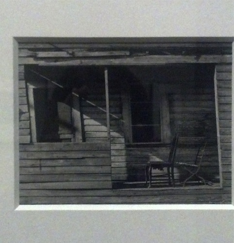
Image Credit: The Harry Ransom Center Porch and Chairs, West Palm Beach Florida, 1941 In between portraits of famous luminaries at the Harry Ransom Center's Arnold Newman Masterclass exhibit, there are a group of images from the photographer's early career that feel anonymous and private. They include pictures of landscapes, nameless figures, and modest structures--all subjects that seem to have been chosen for their compositional character rather than the associations they bring to mind. The above photograph from that period of a decontextualized porch and chairs resists our curiosity to see the whole house and place it in a particular setting, focusing us instead on form and line. The un-forthcomingness or formal starkness of this picture seems dramatically foreign to the photography of Newman's later career, the period of his well-known "environmental" portraits, which situated iconic individuals in settings that explained or extended their identities. (Rachel's post further glosses and complicates this term). Despite this, I'd like to point out some unifying threads between this quaint little study from West Palm Beach and a few, more recognizably Newmanian photographs, all of which are currently on display at the Ransom Center.
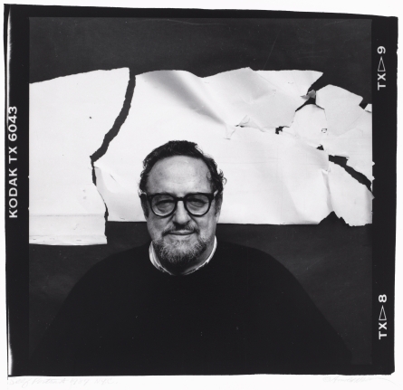
Framing Subjects: Arnold Newman’s Editorial Practice
Submitted by Rachel Schneider on Tue, 2013-04-23 01:18
Image Credit: The Harry Ransom Center Walking through the Harry Ransom Center’s Arnold Newman: Masterclass exhibit with a photographer friend helped me notice more than Newman’s numerous famous subjects. Creating a portrait requires more than just telling someone to smile or to stand in fair light; good photographers must understand how composition affects the final product. Framing matters, whether that’s done by putting wood around a picture or deciding where and how you crop the shot. The exhibit allows visitors to examine Newman’s artistic process, showing the evidence of how he edited his raw photographs into finished portraits. I want to look at in this post both his famous shot of Igor Stravinsky and his created “portrait” of Marilyn Monroe to think more about what we can learn about visual and non-visual editorial practice. Arnold Newman's Photos...And Some Photos Thereof
Submitted by james.wiedner on Mon, 2013-04-22 18:20
Image Credit: Photo from Arnold Newman Exhibit, Harry Ransom Center, taken by author; protected under Fair Use. On February 12th, the traveling exhibition Arnold Newman: Masterclass began a four-month stop at UT’s esteemed Harry Ransom Center. As Newman was a prolific photographer with a strong belief in the instructional potential of photographs, the chance to see his life’s work first-hand was nothing short of spine-tingling to those of us with an unusually strong interest in visual culture and artifacts, especially when they have pedagogical implications! (Pretty dorky, I know.)
Violent Encounters
Submitted by Laura Thain on Fri, 2013-04-19 17:39
Louisville Cardinal players react to Kevin Ware's leg injury during March Madness. Image Credit: Yahoo Sports I’ll admit, I stayed up way past my bedtime last night listening to the Boston police scanner, following as closely as I could the developments in the Boston Marathon bombing. In the wee hours of this morning, I thought about documenting the dozens of news items (as well as widespread speculation across message boards and social media) to take a tally of how much of the information proliferating in the uncertainty of Friday morning would be disproved by Friday afternoon. As I began the project, it soon proved futile—there was far too much information and I ran into (as I might have anticipated) problems discerning journalistic fact from fiction right from the get go. It was only when I stopped documenting and trying to quantify the evidence that I began to think about the relationship between violence and speculative practice and assemble a quite different archive. [GORE WARNING: the images beyond this cut are NSFW and may shock and disturb some viewers. Discretion is advised.]
Surface and Appearance in "Accidental Racist," Part 2
Submitted by Calliope on Wed, 2013-04-17 13:11
Image Credit: plus.google.com At the end of my last post I promised to examine Brad Paisley and LL Cool J's controversial duet "Accidental Racist" in light of Paisley's 2011 "Camouflage" homage. This follow-up post offers that analysis as well as some context from Paisley's pop-country contemporaries and a recent national dialogue about race. |
|


Recent comments
2 years 29 weeks ago
2 years 44 weeks ago
2 years 44 weeks ago
2 years 50 weeks ago
3 years 4 weeks ago
3 years 4 weeks ago
3 years 4 weeks ago
3 years 6 weeks ago
3 years 6 weeks ago
3 years 6 weeks ago