viz.
Visual Rhetoric - Visual Culture - Pedagogy
Site informationRecent Blog Posts
|
Visual Budget
Submitted by ebfrye on Wed, 2011-03-16 11:31
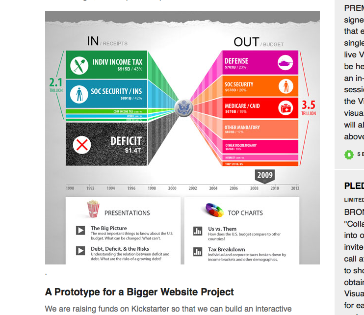
Image Credit: screenshot of Visual Budget, kickstarter.com Visualizations are a necessary part of the way the media interprets government spending for the average viewer. Those of us who are not math whizzes, who may have trouble keeping our own accounts, find a simple graph or pie chart to be a useful aid. However, those representations often present an oversimplified view. Enter Visual Budget, a "cutting-edge data-visualization web site" that attempts to explain the nuances of government spending to the common citizen. Apparently, even visualizing the budget can get pricey, hence the project's appearance on kickstarter.com. As much as I'm intrigued by the project's interactive features, I'm also interested in the rhetoric being used to promote the project. Here's the pitch:
One of the creators stresses the need to make the experience of the budget "cinematic." An animation director says, "It's all about storytelling." This is a striking contrast to the tendency of mainstream news media outlets to explain the budget in pared-down, "just the facts" terminology. But, I ask, does a shiny, suped-up visualization have the power to make us more informed and ultimately better citizens? |
|
Recent comments
2 years 29 weeks ago
2 years 44 weeks ago
2 years 44 weeks ago
2 years 50 weeks ago
3 years 4 weeks ago
3 years 4 weeks ago
3 years 4 weeks ago
3 years 6 weeks ago
3 years 6 weeks ago
3 years 6 weeks ago