viz.
Visual Rhetoric - Visual Culture - Pedagogy
Site informationRecent Blog Posts
|
The Octopus of Antwerp and Other Cold War Maps: Critical Cartographies I
Submitted by Jake Ptacek on Tue, 2011-11-01 08:00
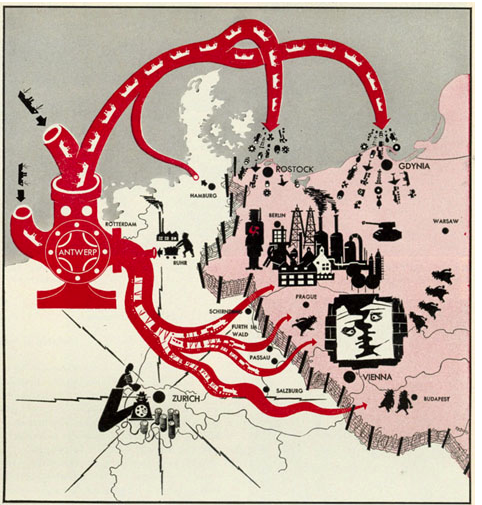
Image: Life Magazine via Newberry Library This is not the post I meant to write. My graduate research has increasingly involved reference to Charles Booth's Life and Labour of the People in London, a magisterial attempt to combine statistical data and cartography into an analysis of late-nineteenth century urban London experience. I had intended to post on Booth's groundbreaking "poverty maps", and the updated maps created by the London School of Economics (you can see their side-by-side comparison here). In my research for the post, though, I came across John Krygier's Making Maps blog, and I've become fascinated (and sidetracked) by the surprising power of cartography. Inspired to think about how maps and mapmaking critically constructs the world, what follows is a subjective and fairly non-rigorous tour of Western cartography during the Cold War era. Take that oil-pump / octopus above, from January 26, 1953. The polemical intent is fairly obvious--as the Newberry website points out, the ostensible purpose of the map is to display the flow of goods from "independently-minded Western Europeans" behind the Iron Curtain. But the over-the-top representation of Antwerp as somehow both an organism and machine adds powerful ideological content. And the sheer clutter of stuff depicted on the map--food, oil and ships falling from the tentacles, clusters of spies, communist soldiers, and factories in Berlin--creates an sense of overwhelming profusion. The map inverts our expectations, crowding the Communist Bloc with Western goods while leaving the rest of Europe almost blank. It's a sublime example of Krygier and Wood's argument about the purpose of mapping.
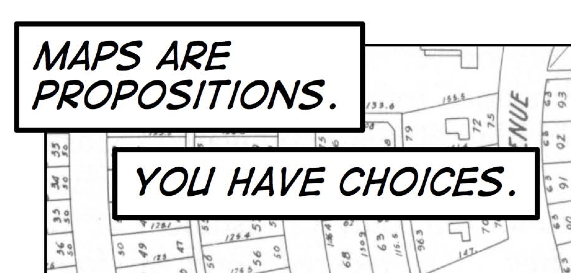
Image: C' est ne pas le monde, Krygier and Wood In "This is Not the World," a comic book-cum-manifesto, Krygier and Wood argue that far from neutrally or even ideally indexing or "representing" the world, maps are arguments, propositions about the organization of the world. This is the central axiom of critical cartography--that each map represents an explicit set of choices that add up to argumentation. Like any other text, then, maps are open to reading, porous, and require critical distance.
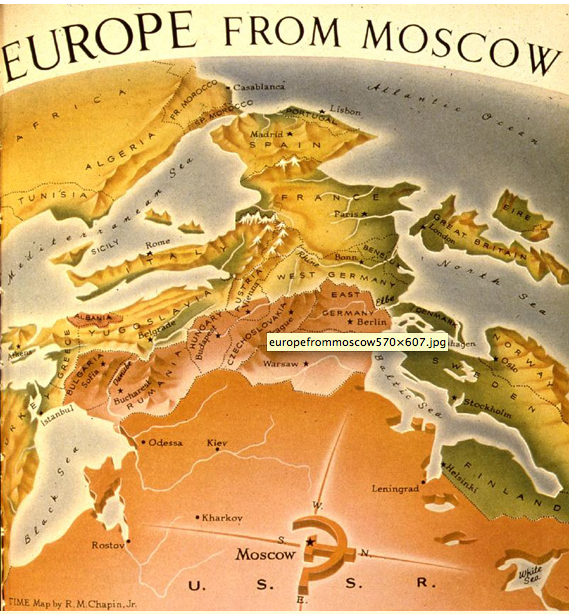
Image: Time Magazine via Newberry Library Undoing traditional expectations, R. M. Chapin's map, made for Time's October 2, 1950 issue, positions the viewer's eyeline from just behind Moscow. As the Newberry Library notes, the "progressively diminishing color intensities on the map suggest" blood "seeping downhill" from the USSR. It effectively repositions the viewer's gaze and, in its delirious shift in perspective--east faces up on the map--provokes anxiety. "Reading" the map forces us to recognize the distortions, even as we appreciate the skill, utilized by the cartographer.
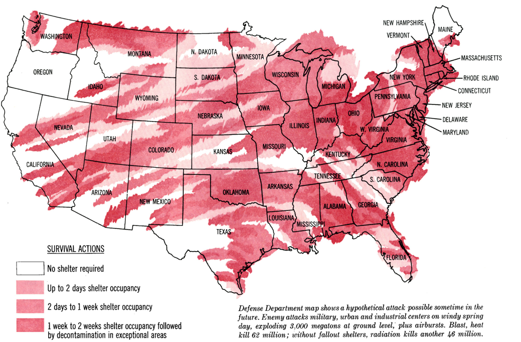
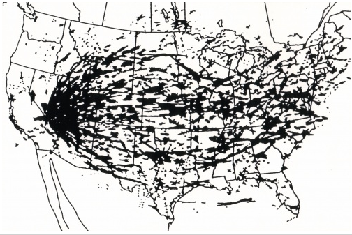
Image: Saturday Evening Post The above map, from the Saturday Evening Post, March 23, 1963, depicts presumed radioactive fallout from a hypothetical enemy attack. The (recent) map below, designed by Richard Miller, shows actual radioactive fallout in the US, dispersed by wind patterns, from nuclear tests in the American Southwest 1951-1962. In this case the Defense Department's propaganda tool disguised as "public safety" bulletin eerily mirrors the elegant argument produced by 21st century environmental and liberal narratives. Miller, however, replaces the shades of crayon-scribbles of red with provacatively neutral black, creating a beautiful inkblot of radiation across the US.
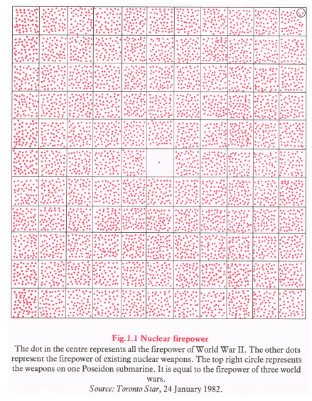
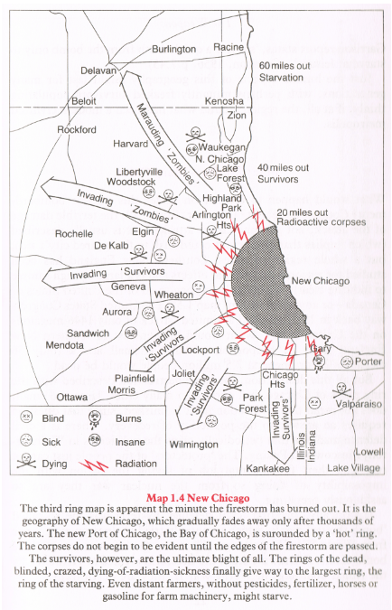
Image: Richard Miller via Making Maps Finally, two images from my new favorite cartographer (how many times in life does one get to say that?), William Bunge. The more I learn about Bunge the more interesting his life seems--pioneering cartographer, radical Marxist (later Stalinist), environmentalist, beloved teacher, anti-academic, and all-around provocateur. The interested are highly recommended to read an excellent blog post by Zachary Forest Johnson that includes a fairly thorough mini-biography and lots of images, here. The following two images need little more comment than Bunge provides. They come from his pioneering Nuclear War Atlas (1988), a book committed to demonstrating how geography could become "the queen of the peace sciences." As Forest Johnson notes, the book suffered from poor timing, coming out just a year before the fall of the Berlin Wall and the collapse of Soviet-style communism in East Europe, but nonetheless its images are startlingly compact and elegant.
Image: William Bunge, Nuclear War Atlas, via Indiemaps
Image: William Bunge, Nuclear War Atlas, via Indiemaps Though our society today faces radically different challenges than Bunge's late-Eighties western world, his conception of the liberating, peaceful power of geography remains essential. Especially as computers make cartography available to a much wider spectrum of users, understanding the critical power of maps becomes paramount. Next week I hope to examine how a few of Bunge's followers and admirers have taken up that task. |
|
Recent comments
2 years 29 weeks ago
2 years 44 weeks ago
2 years 44 weeks ago
2 years 50 weeks ago
3 years 4 weeks ago
3 years 4 weeks ago
3 years 4 weeks ago
3 years 6 weeks ago
3 years 6 weeks ago
3 years 6 weeks ago