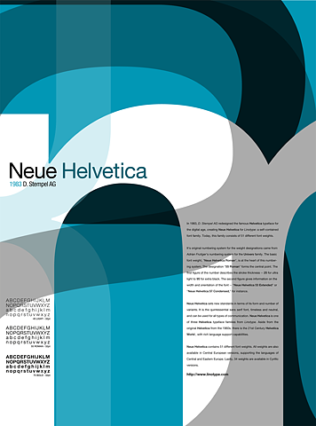
A few weeks ago I caught an episode of Independent Lens on PBS about the font Helvetica.
In the undisputed manifesto of modern graphic design, The New Typography, author Jan Tschichold argues in vaguely Heideggerian terms that modernity requires a typeface consistent with its worldview. In fact, typeface has always been consistent, in his opinion, with the worldview of the civilization that used it, insofar as he sees that worldview as an expression of the relationship between with individual, the whole of society, and the technae they employ to shape and frame the world around them.
Then over the last week I caught sight of this pair of advertisements for the typeface Helvetica font featured on Ffffound.com.
 http://viz.dwrl.utexas.edu/files/helvetica-ad.jpg alt="sexist helvetica ad" class="center" width="180">
Image from Ffffound.com.

Image from Ffffound.com.
What kind of worldview does a font like Helvetica express? What does Helvetica mirror in the style, say, of the men in the first advertisement, with their neatly shaped hair and their tightly efficient neckties? Where does the woman fit in this worldview?
Comments
Helvetica - A Modern Worldview
This is a great ad.
I found a larger version of it here:
http://farm1.static.flickr.com/36/114732870_bab0bdae2c_b.jpg
To answer the question what world view does a font like helvetica express:
Largely based on the film mentioned and the notion of Helvetica being a modern typeface. I would argue that Helvetica reflects the ideals of modernity. Rational scientific thinking for the betterment of mankind. The view that with reasoning everything can be solved.
Just read the type about what these "men" are saying.
"Helvetica would lend itself to your new house style.."
"We'll have the text in 8 on 12 Helvetica...."
"Helvetica with italic. It's Just the sort of thing for this ad."
These businessmen are selling you the font with their rational justification of its benefit. Why... well Helvetica is easy on the eyes and legible from afar. It fits with almost anything and does not have any unnecessary frills or style. One Size fits all. It is the the essential san serif font. or it at leased Helvetica thinks it is. Or modernity mindset makes it so.
The clean comb-overs and business suit are a conservative corporate look that says you mean business. Just like Helvetica. Its your key to success.
the thing that is strange and out of place is the women. She does not use the same logic as the Men and has an (*) by her quote.
"helvetica of course" * is all she says in simple agreement
The (*) is linked to the word "Men" in the bold advertising copy "Helvetica the typeface all print *men are talking about. as if to made reference to the one eception being a female "print man"
Perhaps she is submissive to the male dominated option of Helvetica's usefulness as the perfect advertising font. Maybe she is victim of its appeal in her own shopping habits.
On, one had she could be perceived as the consumer. But she is treated no differently in terms of her relationship to the other figures. Perhaps she is their for simple aesthetic reasons, to appeal to the male dominated advertising industry. Either-way she is very out of place.
I'm at a loss. would be interested to hear others thoughts about her roll in this advert.