viz.
Visual Rhetoric - Visual Culture - Pedagogy
Site informationRecent Blog Posts
|
ModernismBel Geddes, Surprising Office Buildings of the Early Twentieth Century, and an American Work Ethic
Submitted by Jay Voss on Wed, 2012-11-28 18:36
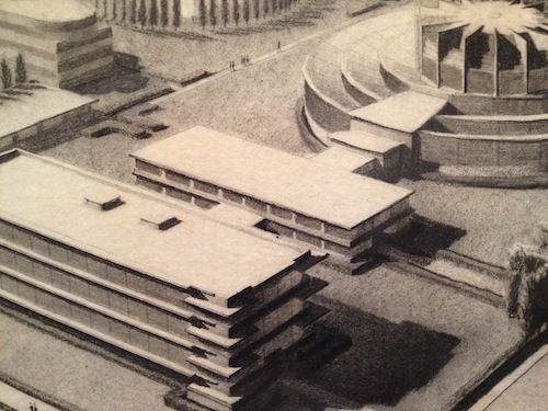
(Image credit: Harry Ransom Center) The other day I was walking through the Harry Ransom Center and noticed some very cool designs for office buildings that Bel Geddes penned in the late 1920s (pictured above). I wasn’t surprised that he had come up with such things, of course – the ongoing Bel Geddes exhibition at the Center, “I Have Seen the Future: Norman Bel Geddes Designs America,” features an exceptional range of content, from baseball stadiums to cruise ships to Worlds Fair exhibits. By I did stop for a second and wonder “Why an office building?” It’s Bel Geddes design for the Toledo Scale Factory Machine Shop. What’s so striking about the design is its focus on aesthetics. This isn’t surprising, of course, given that in most everything Bel Geddes ever designed, function follows form. But this notion is quite contrary to the Modernist architecture of the period, and I couldn’t help but think of Frank Lloyd Wright’s Johnson Wax Building. Aesthetically the structures are similar, but Wright’s focus is on his building’s interior, which he made into a temple of work. The exterior of Wright’s building is completely in the service of its interior. But somehow Wright’s trademark consideration of lighting resulted in a building that looks like Bel Geddes’. Yet they are vastly different structures, despite appearances. Except for cost considerations. When Toledo Scale’s president presented Bel Geddes plans to the company’s board of directors, he warned that the building “would cost lots of money and be extremely different, even weird looking.” Wright’s plans inspired a similar response.
Some Notes on the Harry Ransom Center's Architecture
Submitted by Jay Voss on Wed, 2012-02-15 10:00
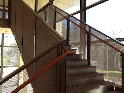
Image Credit: Jay Voss Over the next few weeks viz. will be rolling out a series of blog posts related to the Harry Ransom Center’s upcoming King James Bible and Belle Geddes exhibitions, and in preparation I thought it’d be fun to take a moment and consider the architecture of the Ransom Center. The building stands out from its comrades on the University of Texas at Austin campus, many of which boast a discernibly Spanish feel. Gorgeous arabesques withstanding, it’s quite easy to compare most of UT-Austin’s buildings with the Alhambra in Granada, or the Monastery of Santa Cruz in Sahagún, for example. UT-Austin’s buildings tend to be clad in a white limestone (which can be blinding in the Texas sun), and feature gorgeous soffits clad in turquoise and burgundy. But the Ransom center is different. It’s a cube of gray concrete and might be the only building on campus that I can think of that doesn’t feature a single soffit. Despite the seeming simplicity, there’s much more going on here than what might seem obvious to the cynical. In my humble opinion, the architecture of the Ransom Center is emblematic of an important shift in architectural practice over the past thirty years.
|
|
Recent comments
2 years 29 weeks ago
2 years 44 weeks ago
2 years 44 weeks ago
2 years 50 weeks ago
3 years 4 weeks ago
3 years 4 weeks ago
3 years 4 weeks ago
3 years 6 weeks ago
3 years 6 weeks ago
3 years 6 weeks ago